- IELTS Scores
- Life Skills Test
- Find a Test Centre
- Alternatives to IELTS
- Find Student Housing
- General Training
- Academic Word List
- Topic Vocabulary
- Collocation
- Phrasal Verbs
- Writing eBooks
- Reading eBook
- All eBooks & Courses
- Task 1 Lessons & Tips
- Describing a Graph

How to Describe an IELTS Academic Writing Task 1 Graph
On the following pages there are lessons to teach you how to write an academic IELTS writing task 1 but in this first lesson you’ll get an overview of how to answer a task 1.
You can also view a video of this lesson:

Once you have studied the general structure, you can view other examples by looking at the model graphs that are on this site.
Alternatively, follow on with these lessons to a variety of strategies and tips to achieve the writing score you need.
Steps to Respond to a Task 1
To analyse this, we’ll look at a line graph. Look at the following question and the graph.
You should spend about 20 minutes on this task.
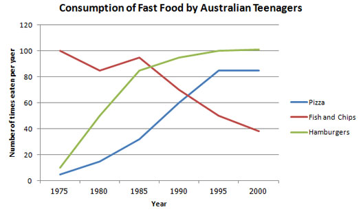
The line graph below shows changes in the amount and type of fast food consumed by Australian teenagers from 1975 to 2000.
Summarize the information by selecting and reporting the main features and make comparisons where relevant.
Write at least 150 words.
There are three basic things you need to structure an IELTS writing task 1.
- Introduce the graph
- Give an overview
- Give the detail
We’ll look at each of these in turn.
Introduce the Graph
You need to begin with one or two sentences that state what the IELTS writing task 1 shows. To do this, paraphrase the title of the graph, making sure you put in a time frame if there is one.
Here is an example for the above line graph:
The line graph compares the fast food consumption of teenagers in Australia between 1975 and 2000, a period of 25 years.
You can see this says the same thing as the title, but in a different way.
Give an Overview
You also need to state what the main trend or trends in the graph are. Don’t give detail such as data here – you are just looking for something that describes what is happening overall.
One thing that stands out in this graph is that one type of fast food fell over the period, whilst the other two increased, so this would be a good overview.
Here is an example:
Overall, the consumption of fish and chips declined over the period, whereas the amount of pizza and hamburgers that were eaten increased.
This covers the main changes that took place over the whole period.
You may sometimes see this overview as a conclusion. It does not matter if you put it in the conclusion or the introduction when you do an IELTS writing task 1, but you should provide an overview in one of these places.
Give the Detail
You can now give more specific detail in the body paragraphs.
When you give the detail in your body paragraphs in your IELTS writing task 1, you must make reference to the data.
The key to organizing your body paragraphs for an IELTS writing task 1 is to group data together where there are patterns . To do this you need to identify any similarities and differences .
Look at the graph – what things are similar and what things are different? As we have already identified in the overview, the consumption of fish and chips declined over the period, whereas the amount of pizza and hamburgers that were eaten increased.
So it is clear that pizza and hamburgers were following a similar pattern, but fish and chips were different. On this basis, you can use these as your ‘groups’, and focus one paragraph on fish and chip and the other one on pizza and hamburgers.
Here is an example of the first paragraph:
In 1975, the most popular fast food with Australian teenagers was fish and chips, being eaten 100 times a year. This was far higher than Pizza and hamburgers, which were consumed approximately 5 times a year. However, apart from a brief rise again from 1980 to 1985, the consumption of fish and chips gradually declined over the 25 year timescale to finish at just under 40.
As you can see, the focus is on fish and chips. This does not mean you should not mention the other two foods, as you should still make comparisons of the data as the questions asks.
The second body then focuses on the other foods:
In sharp contrast to this, teenagers ate the other two fast foods at much higher levels. Pizza consumption increased gradually until it overtook the consumption of fish and chips in 1990. It then levelled off from 1995 to 2000. The biggest rise was seen in hamburgers as the occasions they were eaten increased sharply throughout the 1970’s and 1980’s, exceeding that of fish and chips in 1985. It finished at the same level that fish and chips began, with consumption at 100 times a year.
Full Model Answer:

The line graph compares the fast food consumption of teenagers in Australia between 1975 and 2000, a period of 25 years. Overall, the consumption of fish and chips declined over the period, whereas the amount of pizza and hamburgers that were eaten increased.
(194 words)
Now you've been through this first introductory lesson, you can go to the next lesson or start viewing some model answers.
More Task 1 Academic Lessons:
Prepositions in Graphs Quiz: Between; from; to; at; of; in; with; by
Prepositions in Graphs: Practice using prepositions in the IELTS test. View a model answer and practice using a gap fill.
Which Tenses for IELTS are the Most Important?
Candidates often ask which tenses for IELTS are needed in order to do well in the exam. This lesson goes through the grammar tenses and how they apply to the test.
Learn Compare and Contrast Language for IELTS Graphs
Compare and Contrast Language: In the academic IELTS task 1, you have to know the right language if you want to get a band 7 or higher. Practice your IELTS language for bar charts in this task 1 writing lesson.

Take an IELTS Quiz to test your IELTS knowledge
IELTS Quizzes to test and train you on the writing task and task 2 of the IELTS test. Gap fills and multiple choice.
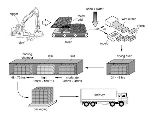
IELTS Process Diagram Strategies and Tips
IELTS Process Diagram: In task 1 of IELTS writing you usually have to describe some kind of graph or chart. But sometimes you get a process. It is therefore crucial that you know how to do this. This easy to follow lesson explains how.
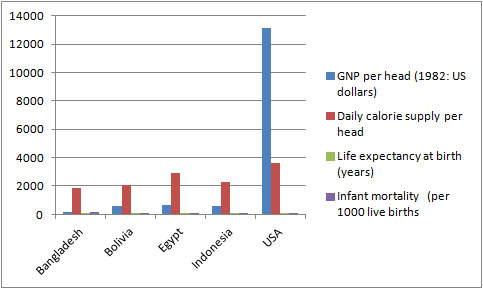
IELTS Table: Tips and techniques for a high score.
IELTS Table advice for a high score. Learn how to describe an IELTS table, which is just another way to present data.
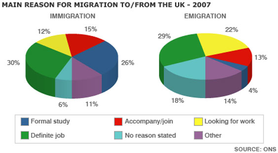
IELTS Pie Chart Strategies and Tips for a Band 7, 8 or 9
This IELTS pie chart lesson provides you with tips and advice on how to describe an IELTS Pie Chart in order to get a Band 7, 8 or 9.
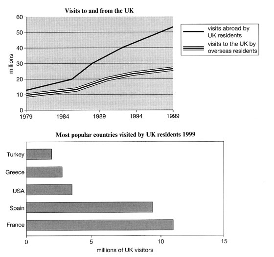
IELTS Bar and Line Graph: How to describe two graphs together
This Bar and Line Graph example shows you how you can write about two charts together in the IELTS test for task 1, with strategies and techniques.
Writing Tips for a Graph in the Future in IELTS Academic
Graph in the future: Sometimes graphs in IELTS refer to a future time. You must know the language to write about these. In this lesson, learn how to write about an IELTS graph in the future. Getting the tenses right is an important part of the IELTS writing task 1.
IELTS Task 1 Line Graph Structure Using Groups
For an IELTS Task 1 Line Graph there are different ways to organise your answer. Grouping information is a good way to get a logically structured response.
Describing Graph Trends Using the Language of Change
Describing graph trends: In IELTS you must know how to describe the trends that you see in the graph you are given. This lesson provides practice with some common language used to describe trends.
Tips for Organising an IELTS Line Graph
Organising an IELTS Line Graph - This lesson shows you have to improve the coherency of your graph in order to achieve a high band score.

Describing IELTS Graphs: Tips to avoid a common mistake
IELTS Graphs: A common mistake In IELTS graphs is to get the subject of the graph wrong. This lesson explains how this mistake is made and show you what you need to do to avoid it. There is a also a practice exercise.
Describing an IELTS task 1 graph over time
This lesson shows you how to write an IELTS task 1 graph or chart that is over time.
Any comments or questions about this page or about IELTS? Post them here. Your email will not be published or shared.
Before you go...
Check out the ielts buddy band 7+ ebooks & courses.
Would you prefer to share this page with others by linking to it?
- Click on the HTML link code below.
- Copy and paste it, adding a note of your own, into your blog, a Web page, forums, a blog comment, your Facebook account, or anywhere that someone would find this page valuable.
Band 7+ eBooks
"I think these eBooks are FANTASTIC!!! I know that's not academic language, but it's the truth!"
Linda, from Italy, Scored Band 7.5
IELTS Modules:
Other resources:.
- All Lessons
- Band Score Calculator
- Writing Feedback
- Speaking Feedback
- Teacher Resources
- Free Downloads
- Recent Essay Exam Questions
- Books for IELTS Prep
- Student Housing
- Useful Links

Recent Articles
Alternatives to the IELTS Exam
Mar 22, 24 12:32 PM
Common Questions about the IELTS Speaking Test
Mar 09, 24 05:28 AM
IELTS Computer Delivered Practice Tests Plus Band Score
Mar 01, 24 02:38 AM

Important pages
IELTS Writing IELTS Speaking IELTS Listening IELTS Reading All Lessons Vocabulary Academic Task 1 Academic Task 2 Practice Tests
Connect with us
Copyright © 2022- IELTSbuddy All Rights Reserved
IELTS is a registered trademark of University of Cambridge, the British Council, and IDP Education Australia. This site and its owners are not affiliated, approved or endorsed by the University of Cambridge ESOL, the British Council, and IDP Education Australia.

Describing graphs, charts, diagrams and tables for band 9 in IELTS writing + Best structures and useful vocabulary
The ability to describe graphs, charts, diagrams, and tables is crucial for achieving a high score on the IELTS writing test. This skill demonstrates your proficiency in English and ability to analyze and communicate complex information clearly. This article provides a comprehensive guide on excelling in describing various types of graphs, charts, diagrams, and tables in IELTS writing.
Understanding the nuances of different types of visual data is the first step toward mastering their description. Each type of graph or chart presents unique challenges and opportunities for analysis. Here’s how to approach each one:
Line Graphs
Line graphs depict data points over time, illustrating trends, growth rates, declines, and periodic fluctuations. They can feature single or multiple lines to allow comparisons between different datasets over identical time periods, making them invaluable for showing changes and trends.
Answering Strategies
To excel in describing line graphs, consider the following strategies:
- Start with paraphrasing the information provided by the line graph in your introduction. This involves rewording the graph’s title and any accompanying descriptions to introduce the topic without directly copying the text.
- Include essential axis information in your introduction if necessary, such as the categories being compared (e.g., years, quantities) and the units of measurement. This sets a clear context for your analysis.
- The overview or overall statement is crucial. It should summarize the main trends observed in the graph, including any significant changes or patterns. This part is considered the most important statement in your IELTS Writing Task 1, as it provides a snapshot of your analytical abilities.
- Ensure that each sentence in your body paragraphs is supported by specific numbers and dates from the graph. This factual support is vital for credibility and accuracy. Double-check to make sure all the data mentioned is correct.
- Use a variety of linking words to connect your ideas and ensure the coherence of your essay. Try to avoid repeating the same linking words, as a range of connectors demonstrates linguistic flexibility.
- Aim for around 180 words for Writing Task 1. This is generally considered an appropriate length to adequately describe and analyze the data without being overly verbose or too brief.
Best Essay Structure
- Introduction : Paraphrase the line graph’s title and introduce the main categories and units of measurement.
- Overview : Provide a summary of the main trends and key features. This is the pivotal part of your essay.
- Discuss each main trend in detail, including rises, falls, and periods of stability. Use data points, including numbers and dates, to support your descriptions.
- Compare and contrast data where multiple lines are present, highlighting significant differences or similarities.
- Conclusion : Reinforce the most significant trend(s) observed or conclude by comparing the initial and final data points.
Basic Vocabulary to Use
- Increase: rise, grow, climb
- Decrease: fall, drop, decrease
- Stability: remain stable, level off, maintain
Advanced Vocabulary to Use
- Sharp increase: surge, skyrocket, sharply rise
- Gradual decrease: gradually decline, slowly fall, taper off
- Long-term stability: consistently maintain, remain steady, show no significant fluctuation
Read Also : IELTS Writing Task 2 Essay Types and Structures + Samples
Bar charts are utilized to compare quantities across different categories or time periods. Each bar represents a category, and its height or length corresponds to its value or quantity. Bar charts can effectively showcase differences or similarities between groups.
- Paraphrase the bar chart information for a concise introduction, typically fitting into one sentence.
- Include units of measurement in the introduction if relevant (“Units are measured in…”).
- Add essential details such as country names, category names, and dates in the introduction to set the context.
- Identify key features of the bar chart, such as the highest and lowest bars, main differences, or notable trends, for the overview.
- Compile key features into a coherent overview, crucial for Task Achievement score.
- Ensure the essay contains more than one body paragraph, ideally two, to adequately cover the chart’s information.
- Organize the information logically across paragraphs, deciding on a logical division for each paragraph’s focus.
- Support each statement in the body paragraphs with specific numerical data from the chart.
- Use a range of complex sentence structures to demonstrate linguistic capability and enhance readability.
- Employ a variety of linking devices to articulate comparisons and contrasts, improving Coherence and Cohesion.
- Linking devices examples include “whereas,” “compared to,” and “in comparison with” to structure your analysis clearly.
- Practice using model answers to learn effective sentence structures and linking word applications.
- Introduction : Introduce the chart by paraphrasing the title.
- Overview : Offer a summary of the most significant data points or overall trends.
- Detail comparisons between categories.
- Discuss any noticeable trends or patterns.
- Conclusion : Provide insights or implications based on the data.
- High: high, higher, highest
- Low: low, lower, lowest
- Average: average, moderate, middle
- Substantial difference: significant disparity, marked difference, considerable variance
- Slight variation: minor fluctuation, slight deviation, negligible difference
- Steady growth: consistent growth, steady increase, uniform rise
Read Also : Cohesive Devices for Band 9 in IELTS Writing: The ultimate guide
Pie charts display data as circular charts divided into slices to illustrate numerical proportions as a whole. Each slice’s size indicates the proportion of the part it represents, making pie charts ideal for showing the distribution or composition of a dataset.
- Start by paraphrasing the pie chart information for a clear, concise introduction.
- Include “Units are measured in…” if units of measurement are relevant and not previously mentioned.
- Always highlight the largest and smallest proportions in the overview to provide a clear snapshot of the data distribution.
- For tasks with two pie charts from different time periods, emphasize key changes or trends observed.
- Use specific pie chart language such as “accounts for,” “comprises of,” and “represents” to describe data accurately.
- Structure body paragraphs to focus on comparing and contrasting key changes or trends over time when describing multiple pie charts.
- Point out significant proportions, including dominant or notably small categories, to give a balanced view of the data.
- Mention significant categories that have seen growth or decline, supporting observations with specific data points.
- Ensure the essay flows logically, starting with notable features in the overview and moving to specifics in the body paragraphs.
- Use a range of linking words and phrases for cohesion and smooth transitions between points.
- Support each point made with accurate data from the chart, demonstrating attention to detail and factual accuracy.
- Incorporate complex sentence structures to convey comparisons and changes effectively, showcasing language proficiency.
- Vary vocabulary when describing proportions and changes to avoid repetition and maintain reader engagement.
- Introduction : Describe what the pie chart shows, including the dataset and period if applicable.
- Overview : Give an overview of the distribution or the most notable proportion(s).
- Compare and contrast different slices of the pie.
- Discuss any notable data points or trends.
- Conclusion : Sum up the key findings or the significance of the distribution.
- Large part: majority, largest portion, most significant section
- Small part: minority, smaller segment, least significant section
- Equal parts: equally divided, similar size, comparable sections
- Predominant section: overwhelmingly dominant, largest share, majority stake
- Insignificant fraction: negligible portion, minor slice, insignificant piece
- Proportional distribution: equitable distribution, proportional allocation, balanced share
Read Also : 15 Sentence Structures for Band 9 Writing in IELTS + Sample passage
Tables organize data in rows and columns, allowing for comparison of information across different variables. Tables can display a wide range of data types and are versatile in presenting detailed information for analysis.
- Include all key features in the overview to provide a comprehensive snapshot of the table’s data; merely mentioning one key feature is not enough for a high score.
- Organize your essay into structured body paragraphs, focusing on different aspects or sets of data for clarity.
- Avoid detailing every single data point; instead, group details by providing averages, ranges, or summaries to convey the information efficiently.
- Be selective with the information you include in your report to avoid overwhelming with too many details.
- Ensure your essay exceeds 150 words but aim for it to be under 200 words to meet task requirements while maintaining conciseness.
- Utilize a variety of linking devices such as “compared to,” “as opposed to,” “in terms of,” and “while” to enhance coherence and demonstrate analytical depth.
- Strive for variety in sentence structures to keep the description engaging and avoid monotony.
- Accept that some words will be repeated due to the limited number of synonyms for certain terms; focus on demonstrating paraphrasing skills and maintaining accuracy to show linguistic competence.
- Remember, the goal is to present the table’s data in a clear, organized manner that highlights your ability to analyze and summarize complex information effectively.
- Introduction : Present the table and what it represents.
- Overview : Summarize the key findings or general trends observed.
- Provide detailed comparisons and analyses of the data presented.
- Highlight significant trends, outliers, or patterns.
- Conclusion : Conclude with the implications or insights gained from the table.
- Increase: rise, grow, upsurge
- Decrease: fall, decline, reduction
- Consistency: consistent, steady, uniform
- Marked increase: significant rise, sharp increase, notable growth
- Steep decline: dramatic fall, steep downturn, sharp drop
- Statistical significance: statistically significant, notable discrepancy, significant divergence
Read Also : Common grammar mistakes to avoid in the IELTS writing section
Flowcharts/process diagrams
Flowcharts and process diagrams are graphical representations of a process or a sequence of steps and decisions. They depict the flow from one step to the next, using different symbols to represent actions, decisions, and outcomes, making them useful for explaining complex processes.
- Study and understand the question first, comprehending the task, the type of the diagram, the number of steps, and the relationship between each step.
- Start with the first step and describe each stage sequentially until you reach the end, ensuring a logical flow of information.
- Write a single sentence in the introduction by paraphrasing the question, but remember that an overview is essential and contributes significantly to the score. This overview should offer a brief explanation using the key stages of the process.
- Avoid simply transcribing diagrammatic information into words; instead, organize the data well for better understanding and clarity.
- Use correct linking words to effectively transition and connect the stages of the process, enhancing the coherence of your description.
- Include supporting information from the diagram to enrich the discussion in the body paragraphs, avoiding overly generic statements.
- Pay attention to the speech and tense used, favoring simple present and present perfect tenses, and be mindful of using active and passive verbs appropriately.
- Introduction : Introduce the process depicted by the flowchart.
- Overview : Provide a brief overview of the process stages.
- Detail each step in the process, including decision points.
- Use sequential language to maintain clarity.
- Conclusion : Summarize the outcome of the process or its overall efficiency.
- Start: begin, start, initiate
- Next: then, next, following
- End: end, conclude, finish
- Initiation: commencement, inception, initiation
- Progression: subsequent step, following phase, next stage
- Culmination: culmination, conclusion, finalization
Read Also : How to use Complex Sentences in IELTS writing?
Mastering the art of describing various types of graphs, charts, and diagrams is a pivotal step toward achieving your desired score in IELTS Writing Task 1. However, understanding these strategies is just the beginning. To truly excel, consistent practice and feedback are crucial.
This is where Preptical shines as an invaluable resource. By taking Preptical’s online IELTS mock tests , you gain the opportunity to apply what you’ve learned in a simulated exam environment. More importantly, Preptical offers personalized feedback from experienced examiners, providing you with actionable insights into your performance.
Embrace the chance to refine your skills, understand your strengths and weaknesses, and approach your IELTS preparation with confidence. Start your journey with Preptical today—it’s the best way to practice, improve, and succeed.
Want to test your IELTS writing skills? Take our free quiz.
Your content goes here, ielts prep quiz.
" * " indicates required fields
Step 1 of 7 - IELTS Prep Quiz
Share This Post!
Related posts.

15 Sentence Structures for Band 9 Writing in IELTS + Sample passage

IELTS on Computer: The Ultimate Guide to computer-based IELTS

How to Master Matching Questions in the IELTS Listening Test

Top 10 Templates for IELTS Speaking Test to get band 9
IELTS Writing Task 2 Essay Types and Structures + Samples
Leave a comment cancel reply.
Useful Vocabulary for Writing an IELTS Graph Essay

When it comes to IELTS writing task 1, 25% of your marks are for the range of words you use. That means IELTS graph vocabulary is a very important component to review as you prepare for the Writing Task 1. You can start by checking out this IELTS writing task 1 vocabulary guide . And below, I’ll provide an overview of words and useful phrases to incorporate into your writing so that you can get top marks on the lexical resource category and a high band score overall. Basically, the better your IELTS writing chart vocabulary, the higher score you’ll get. It’s not hard, but there is a clear formula to doing well.
How to Use IELTS Graph Vocabulary in Writing Task 1
Because IELTS writing task 1 involves describing a graph or chart of some type, it will help to have a handle on IELTS writing chart vocabulary — words and phrases that help you write about the information on the chart or graph.
How are graphs described in IELTS? Let’s walk through the best vocabulary for the task, step by step.
1. Start With Introduction Phrases
Often ESL students start their essay with ‘The graph shows…’. While this is fine, the verb ‘shows’ could be replaced by a more exciting and high-level vocabulary word. Here are four different prompts to start your essay:

- The graph illustrates the trends in…
- The graph reveals information about the changes in…
- The graph provides the differences between…
- The graph presents how X has changed over a period of…
- DO NOT write the word below or above in your introduction. i.e. The graph above/below shows…
2. Add Suitable Adverbs
Adverbs help express a relation of place, time, circumstance, manner, cause, and degree, and can greatly add some color and interest to your writing as well as show off your range of vocabulary. Unlike adjectives (which describe nouns), adverbs describe verbs, or actions. Here’s a great list of adverbs to use:
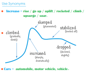
3. Use Appropriate Synonyms
Again using a variety of nouns and verbs for words like rise and fall will help increase your overall score. Here are some suggestions:
4. Add Time Phrases
Below are some excellent time phrases with sentence examples:
Using IELTS Graph Vocabulary in a Model Essay
Look at the sample IELTS writing Task 1 graphs on the British Council website . Below is my model answer with useful words in bold:
The bar charts illustrate the trends in computer ownership, with a further classification by level of education, from 2002 to 2010.
Over the period, it can be observed that there was a significant surge in the percentage of the population that owned a computer. In the year 2002, only about 58% of the population owned a computer, whereas by 2010 , this gradually increased to where over three-quarters of individuals had a home computer.
Looking at the information by level of education reveals that higher levels of education correspond to higher levels of computer ownership in both of those years. In 2002, a significantly low percentage of the population who did not finish high school had a computer, but this figure skyrocketed by 2010, going from 15% to over 40%. There were also dramatic climbs , of approximately 30 percentage points, for those with a high school diploma or an unfinished college education (reaching 65% and 85%, respectively, in 2010).
To conclude, during the last decade, there has been a substantial growth in computer ownership across all educational levels.
Other IELTS Graph Vocabulary Resources
Keep in mind that IELTS writing task 1 may contain one of several different types of infographic: a bar chart, pie chart, line graph, diagram, etc. Regardless of the type, you’ll want to have a good handle on IELTS writing chart vocabulary.
For more specific guides to the different kinds of graphs, charts, and graphics you may find on IELTS writing task 1, check out the following resources:
- How to Describe a Bar Chart
- How to Describe a Pie Chart
- How to Describe a Map
- How to Describe a Process Diagram
You can also check out Magoosh’s IELTS linking words PDF for transitions between ideas. Hopefully you’ll start to incorporate some of these key words and phrases, as well as the above suggestions, in your IELTS Task 1 Writing. If you still don’t feel comfortable doing so, consider dedicating more time to your IELTS studies with Magoosh’s fun, engaging IELTS prep for extra practice.

Eliot Friesen-Meyers is the Senior Curriculum Manager for Magoosh IELTS and TOEFL. He attended Goshen College (B.A.), New York University (M.A.), and Harvard University (M.T.S.), gaining experience and skills in curriculum development, ESOL instruction, online teaching and learning, and IELTS and TOEFL test prep education. Eliot’s teaching career started with Literacy Americorps in Pittsburgh, Pennsylvania, and later, taught ESL programs at Northeastern University, University of California-Irvine, and Harold Washington College. Eliot was also a speaker at the 2019 TESOL International Conference . With over 10 years of experience, he understands the challenges students face and loves helping them overcome those challenges. Come join Eliot on Youtube , Facebook , and Instagram . Recent blog posts Complete Guide to IELTS Writing Task 1 Complete Guide to IELTS Writing Task 2
View all posts
More from Magoosh

11 responses to “Useful Vocabulary for Writing an IELTS Graph Essay”
I would like to get sample of all types of graph eassy
IELTS Liz offers a pretty good range of graphs and charts for IELTS Writing Task 1 (Academic) . You can also get a nice selection of these on the official IELTS websites . And last but not least, Magoosh offers a good selection of these types of questions with a Magoosh IELTS Premium subscription. 🙂
Thank you Magoosh for the comprehensive guide. I’m a subscriber to you GMAT course and is now checking out IELTS.
Wanna ask, I read and watched many other sources that says we should not write a conclusion. However, yours did.
So, is it permissible or not permissible?
The concluding sentence is optional–if you have time to write a concluding sentence after writing and reviewing your essay, then it looks good to have a concluding sentence. If you don’t have time to write a concluding essay or you’d rather focus on other parts of your essay, then it’s totally fine to leave it out. You can read more about this in our Complete Guide to IELTS Academic Writing Task 1.
“Growth” is not an noun? Because in the board it’s saying that it is a verb
Thanks for pointing this out! It seems like a mistake on our part. We should probably change that to “grow”. I’ll make a note for our writing team to make this change 🙂
I appreciate you very much. Your blog on Useful Words for Writing an IELTS Graph Essay was the outstanding blog ever. You have given so much good information about the new english words & grammar in your post, which will help me in future. Always keep data like this on your website
I have two significant questions. The first one is related to the unit of measurement in over view. Is it academic? And the second one is of conclusion. Do we need to write conclusion?
Hi Aakash, I’m afraid I don’t understand your first question. Can you please provide some more information? For your second question: a conclusion is not necessary. You can add one if you’d like, but it’s more important to spend time analyzing the graph.
This is one of the best among the essay I’ve read recently.
Thanks for the feedback! 🙂
Leave a Reply Cancel reply
Your email address will not be published. Required fields are marked *
- Ebooks & Courses
- Practice Tests
How To Write an IELTS Line Graph Essay
Here is the 5 steps process I recommend for planning and writing IELTS line graph essays:
1) Analyse the question
2) Identify the main features
3) Write an introduction
4) Write an overview
5) Write the details paragraphs
I’m going to take you through the whole process step-by-step as we work on a practice question.
Many students are reluctant to spend time on steps 1 and 2 as they want to spend as much of the 20 minutes allowed for the essay as possible actually writing it. However, it is essential that you do them as they are the key to writing a high-scoring IELTS line graph essay.
Before we begin, here’s a model essay structure that you can use as a guideline for all IELTS Academic Task 1 questions.
Ideally, your essay should have 4 paragraphs:
Paragraph 1 – Introduction
Paragraph 2 – Overview
Paragraph 3 – 1 st main feature
Paragraph 4 – 2 nd main feature
Now that we have all these tools we need, we’re ready to begin planning and writing our IELTS line graph essay.
Here’s our practice question:
The graph below shows radio and television audiences throughout the day in 1992.
Summarise the information by selecting and reporting the main features, and make comparisons where relevant.
Write at least 150 words.
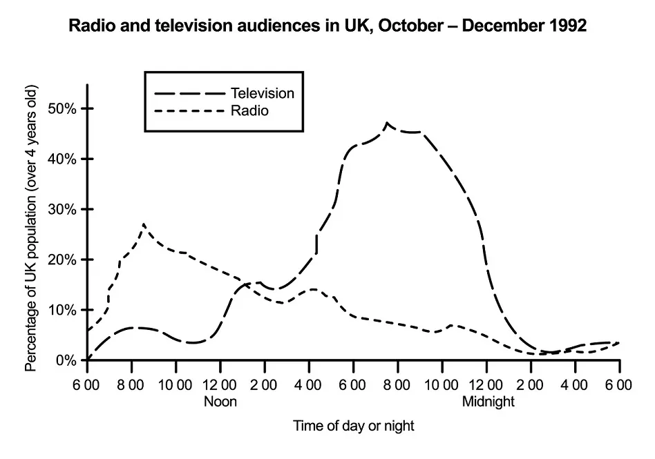
Source: Official IELTS website
Step 1 – Analyse the question
The format of every Academic Task 1 question is the same. Here is our practice question again with the words that will be included in all questions highlighted .
The graph below shows radio and television audiences throughout the day in 1992.
Every question consists of:
- Sentence 1 – A brief description of the graphic
- Sentence 2 – The instructions
- The graphic – chart, graph, table, etc.
Sentence 2 tells you what you have to do.
You must do 3 things:
1. Select the main features.
2. Write about the main features.
3. Compare the main features.
All three tasks refer to the ‘ main features ’ of the graphic. You do not have to write about everything. Just pick out 2 or 3 key features and you’ll have plenty to write about.
Step 2 – Identify the Main Features
The graphic in IELTS line graph questions should not be difficult to interpret. Each question has been created to test your language skills, not your mathematics ability.
All you are looking for are the main features. These will usually be the easiest things to spot. There will be lots of information in the graphic to help you identify them.
Here are some useful questions to ask?
- What information do the 2 axes give?
- What are the units of measurements?
- What are the time periods?
- What can you learn from the title and any labels?
- What is the most obvious trend?
- Are there any notable similarities?
(I give more detail on how to use these questions, plus downloadable checklists for identifying the main features of all 7 different types of IELTS Academic Writing Task 1 questions, in the lesson on How To Understand & Analyse Task 1 Questions .)
So, what main features stand out in our practice graphic?
Here's our IELTS line graph again.

The timeline will give you the biggest clues as to the most significant trends. Look for general trends.
There are 2 main features/trends in this line graph:
Main feature 1: The peak time for TV audiences is in the evening (8 pm).
Main feature 2: The peak time for radio audiences is in the morning (8 am).
The general trends you select will be the starting point for your essay. You will then go on to add more detail. However, with just 20 minutes allowed for Task 1, and a requirement of only 150 words, you won't be able to include many details.
We’re now ready to begin writing our essay. Here’s a reminder of the 4 part structure we’re going to use.
Step 3 – Write an Introduction
In the introduction, you should simply paraphrase the question, that is, say the same thing in a different way. You can do this by using synonyms and changing the sentence structure. For example:
Introduction (Paragraph 1):
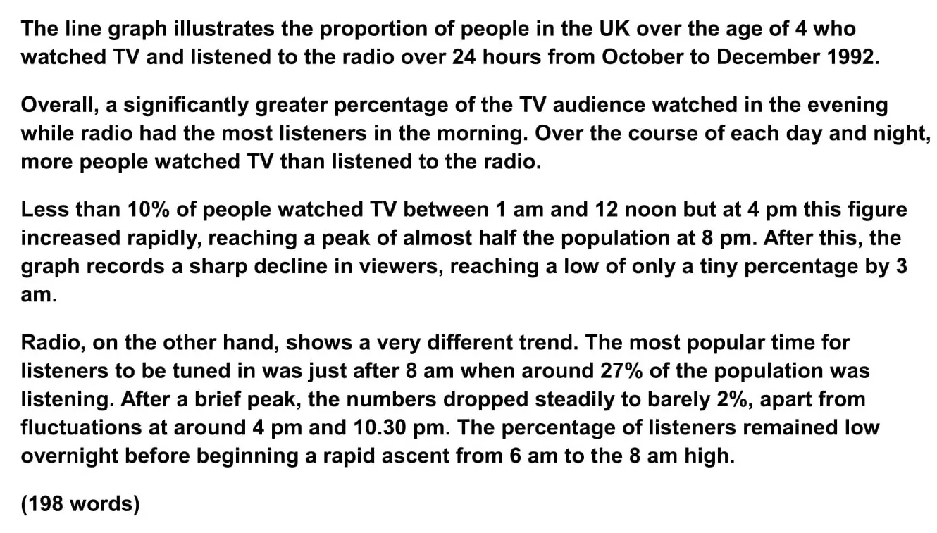
The line graph illustrates the proportion of people in the UK who watched TV and listened to the radio over 24 hours from October to December 1992.
This is all you need to do for the introduction.
Step 4 – Write an Overview (Paragraph 2)
In the second paragraph, you should report the main features you can see in the graph, giving only general information. The detail comes later in the essay. You should also make any clear comparisons you spot.
This is where we write about the general trends. Here are the ones we picked out above.
Now form these ideas into two or three sentences with a total of around 40 words. State the information simply using synonyms where possible. No elaborate vocabulary or grammar structures are required, just the appropriate words and correct verb tenses.
For example:
Overview (Paragraph 2):
Overall, a significantly greater percentage of the TV audience watched in the evening while radio had the most listeners in the morning. Over the course of each day and night, more people watched TV than listened to the radio.
Step 5 – Write the 1st Detail Paragraph
Paragraphs 3 and 4 of your IELTS line graph essay are where you include more detailed information about the data in the graphic. In paragraph 3, you should give evidence to support your first key feature. Don’t forget to make comparisons when relevant.
Here is our first main feature again:
And this is an example of what you could write:
Paragraph 3 :
Less than 10% of people watched TV between 1 am and 12 noon but at 4 pm this figure increased rapidly, reaching a peak of almost half the population at 8 pm. After this, the graph records a sharp decline in viewers, reaching a low of only a tiny percentage by 3 am.
Step 6 – Write the 2nd Detail Paragraph
For the fourth and final paragraph, you do the same thing for your second key feature.
Here’s an example of what you could write:
Paragraph 4 :
Radio, on the other hand, shows a very different trend. The most popular time for listeners to be tuned in was just after 8 am when around 27% of the population was listening. After a brief peak, the numbers dropped steadily to barely 2%, apart from fluctuations at around 4 pm and 10.30 pm. The percentage of listeners remained low overnight before beginning a rapid ascent from 6 am to the 8 am high.
Here are the four paragraphs brought together to create our finished essay.
Finished IELTS Line Graph Essay
This sample IELTS line graph essay is well over the minimum word limit so you can see that you don’t have space to include very much detail at all. That’s why it is essential to select just a couple of main features to write about.
Now use what you’ve learnt in this lesson to practice answering other IELTS line graph questions. Start slowly at first and keep practicing until you can plan and write a complete essay in around 20 minutes.
Want to watch and listen to this lesson?
Click on this video.
Would you prefer to share this page with others by linking to it?
- Click on the HTML link code below.
- Copy and paste it, adding a note of your own, into your blog, a Web page, forums, a blog comment, your Facebook account, or anywhere that someone would find this page valuable.
Like this page?
Ielts academic writing task 1 – all lessons.
IELTS Academic Writing – A summary of the test including important facts, test format & assessment.
Academic Writing Task 1 – The format, the 7 question types & sample questions, assessment & marking criteria. All the key information you need to know.
Understanding Task 1 Questions – How to quickly and easily analyse and understand IELTS Writing Task 2 questions.
How To Plan a Task 1 Essay – Discover 3 reasons why you must plan, the 4 simple steps of essay planning and learn a simple 4 part essay structure.
Vocabulary for Task 1 Essays – Learn key vocabulary for a high-scoring essay. Word lists & a downloadable PDF.
Grammar for Task 1 Essays – Essential grammar for Task 1 Academic essays including, verb tenses, key sentence structures, articles & prepositions.
The 7 Question Types:
Click the links below for a step-by-step lesson on each type of Task 1 question.
- Table Chart
- Process Diagram
- Multiple Graphs
- IELTS Writing
- IELTS Line Graph
- Back To Top
* New * Grammar For IELTS Ebooks
$9.99 each Full Set Just $ 23.97
Find Out More >>
IELTS Courses

Full details...

IELTS Writing Ebook
Discount Offer
$7 each Full Set Just $ 21

Find out more >>
Testimonials
“I am very excited to have found such fabulous and detailed content. I commend your good work.” Jose M.
“Thanks for the amazing videos. These are ‘to the point’, short videos, beautifully explained with practical examples." Adari J.
"Hi Jacky, I bought a listening book from you this morning. You know what? I’m 100% satisfied. It’s super helpful. If I’d had the chance to read this book 7 years ago, my job would be very different now." Loi H.
"Hi Jacky, I recently got my IELTS results and I was pleased to discover that I got an 8.5 score. I'm firmly convinced your website and your videos played a strategic role in my preparation. I was able to improve my writing skills thanks to the effective method you provide. I also only relied on your tips regarding the reading section and I was able to get a 9! Thank you very much." Giano
“After listening to your videos, I knew I had to ditch every other IELTS tutor I'd been listening to. Your explanations are clear and easy to understand. Anyways, I took the test a few weeks ago and my result came back: Speaking 7, listening 9, Reading 8.5 and Writing 7 with an average band score of 8. Thanks, IELTS Jacky." Laide Z.
Contact
About Me
Site Map
Privacy Policy
Disclaimer
IELTS changes lives.
Let's work together so it changes yours too.
Copyright © 2024 IELT Jacky
All Right Reserved
IELTS is a registered trademark of the University of Cambridge, the British Council, and IDP Education Australia. This site and its owners are not affiliated, approved or endorsed by the University of Cambridge ESOL, the British Council, and IDP Education Australia.

- IELTS Writing Task 1: Linking words for describing a graph
In order to get 6.0-7.5 and higher, you need to effectively combine your ideas. This skill is assessed by the examiner and it is one of the marking criteria - Coherence / Cohesion, i.e. consistency and coherence / integrity.

In order to get 6.0-7.5 and higher, you need to effectively combine your ideas. This skill is assessed by the examiner and it is one of the marking criteria - Coherence / Cohesion, i.e. consistency and coherence / integrity. How many words do you need to write?
Short answer - enough; it should not be every third word in your answer, in the meantime your ideas should be well connected. Think of these words as sugar or salt: if too much it will be too sweet or too salty.
How to effectively start a paragraph:
- According to the graph/figures … - It is clear that … - It can be seen that … - It is noticeable that ...
these words will help connect your ideas:
Contrast words
- In contrast
- whereas/while
- On the other hand
Linking phrases
- In addition
- Furthermore
- Overall, it could be seen that ...
- According to the data ...
- It is clear that ...
Time expressions
- in the year 2000
- at the end/beginning of the period
- over/throughout/during the period in question
- between 1998 and 2000
The last Paragraph:
How to master IELTS Writing: Task 1 & Task 2
- How to write an answer to ANY type of Essay task
- How to write an answer to ANY type of Graph task
- How to structure your answer
- What to write in each paragraph
- What grammar to use
- How to link your ideas
- What vocabulary to use
- What you should write to get a high score
Bonus: IELTS Punctuation PDF Guide Everything you want to know to have correct punctuation in your IELTS Writing for 7.0-9.0 Score (31 pages, .PDF)
- You are here:
- Prepare for IELTS
- IELTS Writing
- Academic Task 1
- How to check IELTS Results
- IELTS Academic and IELTS General: differences and similarities
- Computer delivered IELTS
- IELTS Band Scores and English levels comparison chart
- IELTS Exam: Test structure and Format
- Essay Structure
- Detailed Analysis
- Academic Task 2
- IELTS Vocabulary
- IELTS Listening
- IELTS Reading
- IELTS Speaking
- IELTS Writing Course
- Punctuation Guide
- Teacher Training: How to Teach IELTS
- Teacher Training: IELTS Writing for Teachers
- IELTS Training Sessions for Teachers
- Master IELTS General: Letters
Search form
Describing a graph of trends over time.
Look at the exam question, line graph and answer and do the exercises to improve your writing skills.
Instructions
Do the preparation exercise first. Then read the exam question and answer and do the other exercises.
Preparation

Check your vocabulary: multiple choice
Check your writing: gap fill, worksheets and downloads.
What percentage of people in your country use the internet? Is this changing? What new technology are people starting to adopt?

Sign up to our newsletter for LearnEnglish Teens
We will process your data to send you our newsletter and updates based on your consent. You can unsubscribe at any time by clicking the "unsubscribe" link at the bottom of every email. Read our privacy policy for more information.
CHARTS AND GRAPHS ESSAY EXAMPLES
IELTS Writing Task 1 Academic Charts And Graphs Essay Examples
View High Band Score Examples Of IELTS Writing Task 1 Academic Charts And Graphs Essays
IELTS Writing Task 1 – Table Essay Example 3
IELTS Writing Task 1 Academic table essay example that is a band score 8. The question is: The table below gives information about the problems faced by children in two primary schools in 2005 and 2015. Take a look at the sample answer
IELTS Writing Task 1 – Table Essay Example 2
IELTS Writing Task 1 Academic table essay example that is a band score 8. The question is : The table illustrates the proportion of monthly household income five European countries spend on food and drink, housing, clothing, and entertainment. Take a look at the sample answer.
IELTS Writing Task 1 – Table Essay Example 1
IELTS Writing Task 1 Academic table essay example that is a band score 8. The question is: The following table gives statistics showing the aspects of quality of life in five countries. Take a look at the sample answer.
IELTS Writing Task 1 – Pie Chart Example Essay 1
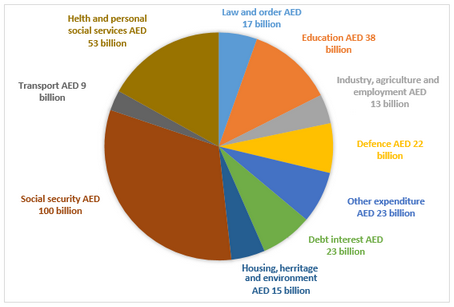
IELTS Writing Task 1 Academic pie chart essay example that is a band score 8. The question is: The chart below shows how much money is spent in the budget on different sectors by the UAE government in 2000. Take a look at the sample answer.
IELTS Writing Task 1 – Line Graph Essay Example 2
IELTS Writing Task 1 Academic line graph essay example that is a band score 8. The question is: The line graph illustrates the amount of spreads consumed from 1981 to 2007, in grams. Take a look at the sample answer.
IELTS Writing Task 1 – Line Graph Essay 1
IELTS Writing Task 1 Academic line graph essay example that is a band score 8. The question is: The line graph below shows changes in the amount and type of fast food consumed by Australian teenagers from 1975 to 2000. Take a look at the sample answer.
IELTS Writing Task 1 – Bar Chart Example Essay 3
IELTS Writing Task 1 Academic bar chart essay example that is a band score 8. The question is: The chart shows the percentage of drugs taken by girls and boys in a school in New Zealand. Take a look at the sample answer.
IELTS Writing Task 1 – Bar Chart Example Essay – 2
IELTS Writing Task 1 Academic bar chart essay example that is a band score 8. The question is: The chart below shows the number of men and women in further education in Britain in three periods and whether they were studying full time or part-time. Take a look at the sample answer.
IELTS Writing Task 1 – Bar Chart Essay Example 1
IELTS Writing Task 1 Academic bar chart essay example that is a band score 8. The question is: The chart below gives information about Someland’s main exports in 2005, 2015, and future projections for 2025. Take a look at the sample answer.
Related Posts

Writing Task 1 Academic – Band Score 6
Most of the students studying for the IELTS Test have said they find the IELTS…

IELTS Writing Task 1 – Process Example Essay 2
IELTS Writing Task 1 Academic process essay example that is a band score 8. The…

Vocabulary for Describing Graphs and Charts (IELTS)
To achieve a good score in IELTS Academic Writing Task 1, candidates are often required to present various types of data, including line graphs, bar charts, tables and multiple graphs.
These representations of data typically involve numerical values and percentages, and differ from maps or process descriptions. To achieve a high band score, it is essential to provide an accurate and robust description, while effectively analysing the data presented. A mere 150-word response is not sufficient to achieve the desired band score; it is essential to maintain variety in vocabulary usage and avoid redundancy. In this article you will find vocabulary for describing graphs and charts.

Check Also: IELTS Synonyms Words List A to Z + PDF 300+ List of Vocabulary Words for IELTS Practice Book & Tips for IELTS Writing Task 1 & 2
The chart/data/graph/table/pie chart/bar chart/diagram vocabulary:
- Conveys information regarding…
- Presents data on…
- Offers insights into…
- Elucidates the reasons behind…
- Draws conclusions from (a survey)…
- Gives information about/on …
- Provides information about/on …
- Explains why …
- Describes …
Types of Graph Changes

These verbs and example sentences illustrate different ways to describe significant increases in various contexts:

These verbs and example sentences demonstrate different ways to describe significant decreases or declines in various contexts:

These adverbs can be used to emphasize the extent or speed of changes and trends when describing graphs and charts:
These adjectives can be used to describe various degrees and intensities of changes when interpreting data in graphs and charts:

These adverbs can be used to indicate subtle or gradual changes in graphs and charts, emphasizing the small scale or slow pace of these changes:
These adjectives can be used to describe smaller or less noticeable changes in graphs and charts, emphasizing the gentle or modest nature of these trends:
You May Also Like
20+ Example Sentences in the Present Perfect Tense


99% Failed This Easy English Quiz – Can You Pass?

Linking Words and Phrases – List & Examples
Thanks for this IELTS lesson. Awesome vocabulary!
- Memberships
- Institutional Members
- Teacher Members

RESOURCES: Reading / Writing / Listening / Speaking / Argument / SPSE / Reading Tests / Summary / Dictogloss / Grammar / Vocab / Critical Thinking / Instant Lessons / Medical English / Graphs / New 2024 /
Graphs & Charts
Graph and Chart Lessons
Describing graphs – the basics [updated 2023].
This lesson begins by labelling the key features of a graph and naming different graph / chart types. It then provides practice in describing a range of different lines (peak, plummet, etc..). This is followed by a fun activity where in pairs students describe and plot the lines on four graphs. Example . Level: ** * ** [B2/C1] TEACHER MEMBERSHIP / INSTITUTIONAL MEMBERSHIP
£5.00 – Add to cart Checkout Added to cart
Describing graphs: analysis and evaluation (updated 2023)
This lesson begins with describing basic graphs and suggesting what they could represent. it then provides the language necessary for describing, analysing and evaluating. this is followed by students researching and analysing graphs/charts/tables from the office of national statistics (ons) and giving a short presentation on their findings. example. level: ** * ** [b1/b2/c1] teacher membership / institutional membership, describing results (questionnaire data) [new 2023].
This lesson teaches students how to describe the results from a questionnaire. It provides language for describing quantities, group sizes, specific features and reporting verbs. It includes model answers and a range of practice activities. Example Level: ** *** [B1/B2/C1] TEACHER MEMBERSHIP / INSTITUTIONAL MEMBERSHIP

This lesson helps to improve students’ awareness and understanding of the difference between description, analysis and evaluation. It includes paragraph analysis, a detailed language review reference sheet and graph and sentence level quotation analysis. – see worksheet example. Time: 120mins. Level *** ** [ [B2/C1] TEACHER MEMBERSHIP / INSTITUTIONAL MEMBERSHIP
Terms & Conditions of Use
Memberships (Teacher / Institutional)
Full access to everything - £80 / £200 / £550
Join today * x
Describing Graphs: The basics
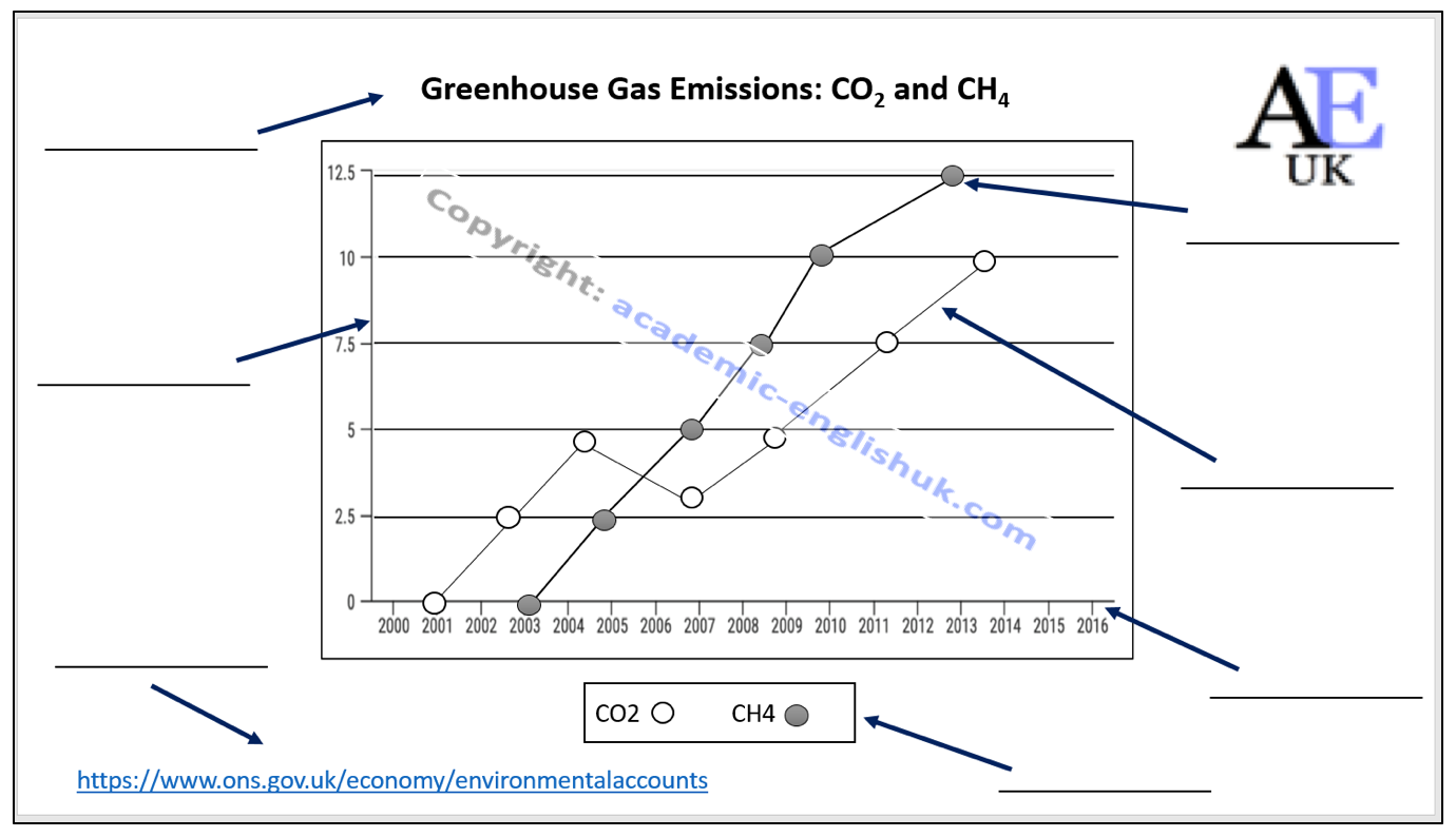
This lesson shows how to label and describe a graph using a variety of language (increase, grow, fall, plummet, fluctuate, etc..). It focuses on adjective and verb collocations for natural precise descriptions and also includes a range of practice activities to improve graphical analysis.
A short video on the describing graphs lesson
Video Worksheet – click here
The basic features of a graph.
Example: Writing
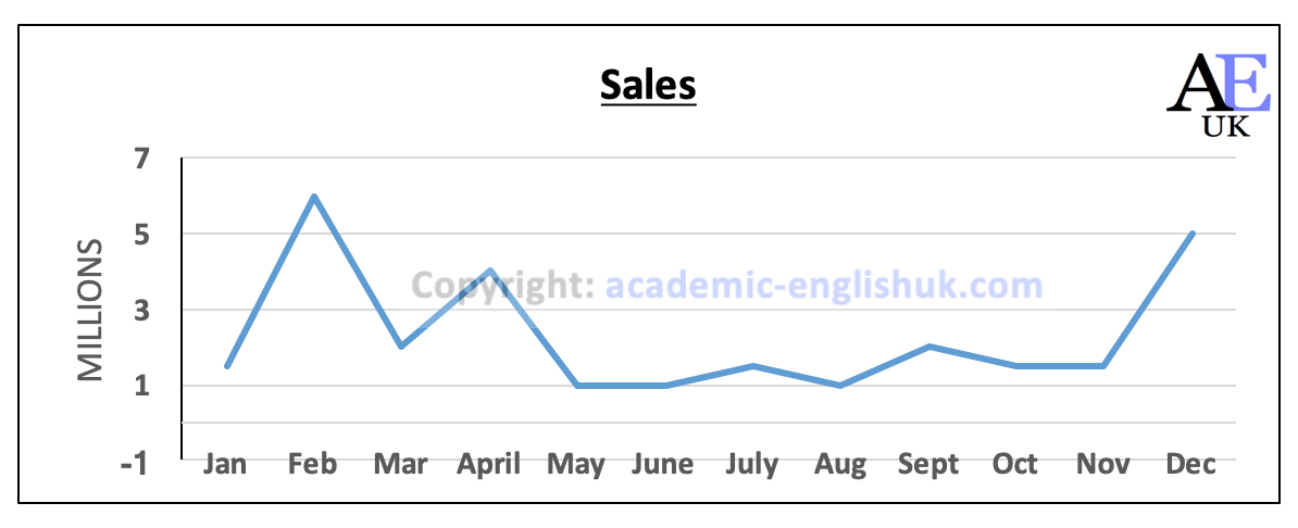
Write a description of this graph.
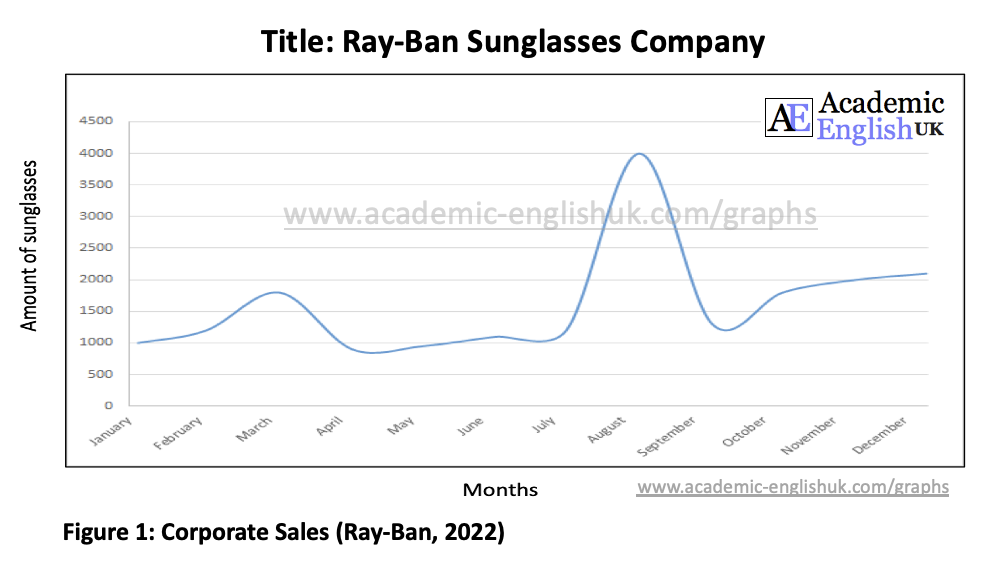
The graph shows Ray-Ban sunglasses sales over 12 months in 2022. Sales began at the start of the year at 1000 and grew steadily to around 1800 in March. Sales then gradually fell to hit their lowest level of the year in April at around 900 pairs sold. Sales stabilised at approximately 1000 throughout May to July. However, in mid-July sales soared and in August peaked at 4000. Sales then plummeted and bottomed out in September at 1250. Sales then rose steadily, and the year finished at 2000 sales .
More exercises in the paying download ‘Describing graphs (the basics)’
Speaking: Pair Work activity – describe a graph
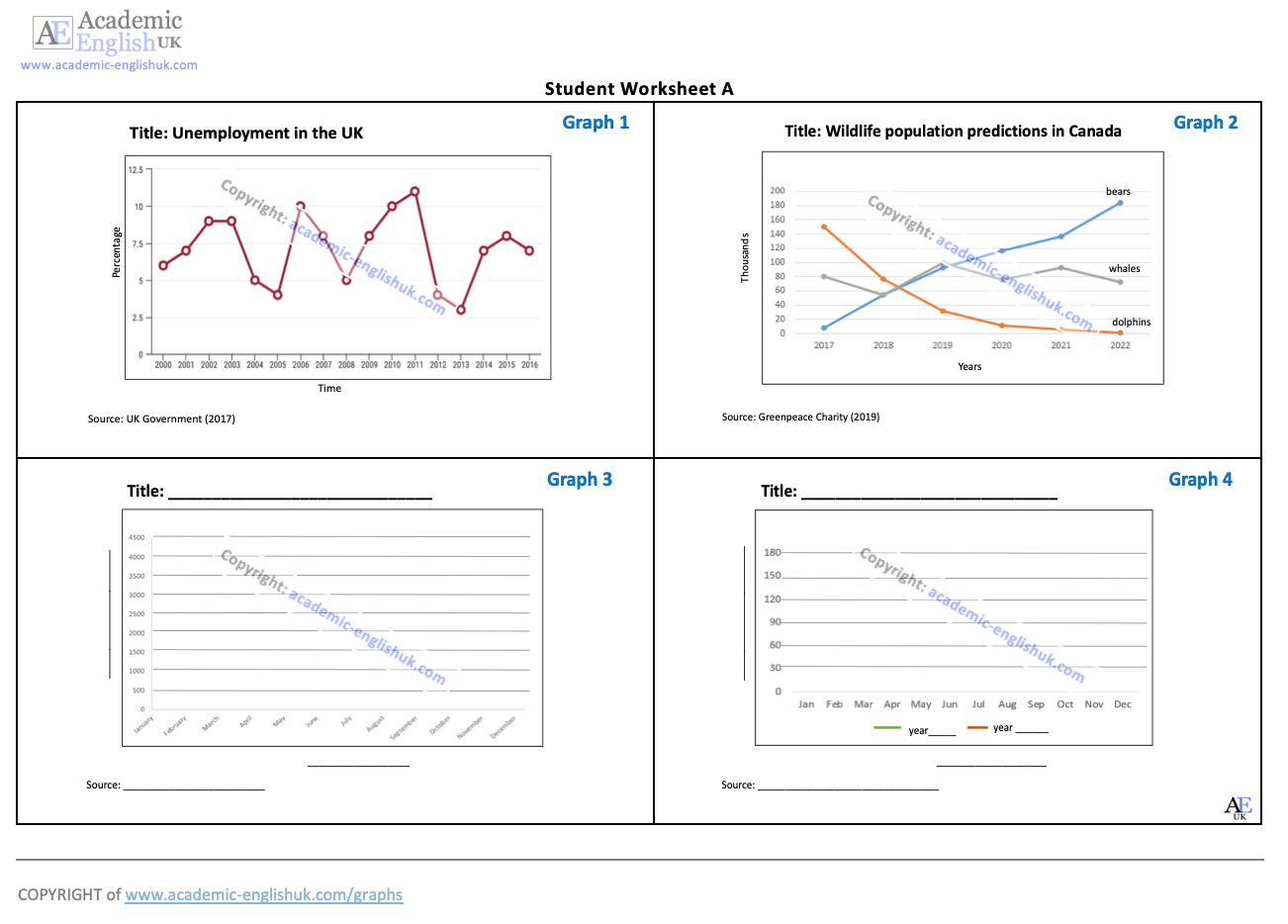
Basic definition of analysis & evaluation
i. Analysis is ‘identifying’ the key highs and lows on a graph
ii. Evaluation is ‘the reasons’ why there are highs and lows on a graph.
1. Describe this graph (analysis) and then suggest the reasons for these trends (evaluation)
18 more different graphs / charts / tables with paid version.
Other topics: life satisfaction / divorce / religion / mental health / alcohol / mobile phones / murder / technology / leisure / population growth / life expectancy / etc..
Describing Results: Questionnaires
This webpage provides information on how to describe the results from a questionnaire. It provides language for describing quantities, group sizes, specific features and reporting verbs. It includes model answers and a range of practice activities (bar charts, pies charts and tables).
A short video on the describing results lesson
Describing Results Example
This pie chart has been created from a questionnaire which asked 500 students what the main causes of their mental health issues at university were.
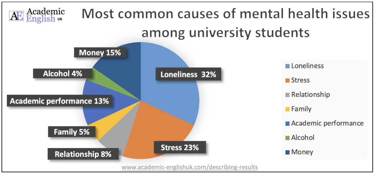
Read through these short descriptions of the above data and highlight the reporting verbs and linking words . Then highlight the phrases for describing quantity and adjective collocations. You may need to study the describing results language development below first. Download descriptions here.
- Descriptions
- Reporting verbs & linking words ANSWERS
- Describing quantity and adjective collocations ANSWERS
- The most significant finding from the questionnaire is that approximately a third of respondents (32%) said that loneliness was the main cause of their mental health issue at university. This was in contrast to a small number of students (4%) saying that alcohol was the primary cause.
- Although the majority of students stated that loneliness and stress were the most significant mental health issues at university at 55%, academic performance and money problems were also reported to be fundamental at 28%.
- A small minority of students (4%) contended that their mental health issues were attributed to alcohol abuse, whereas a similar number (5%) declared family issues were the main contributing factor.
- Although the majority of students stated that loneliness and stress were the most significant mental health issues at university at 55%, academic performance and money problems were also reported to be fundamental (issue) at 28%.
- A small minority of students (4%) contended that their mental health issues were attributed to alcohol abuse, whereas a similar number (5%) declared family issues were the main contributing factor .
Describing Results Language Development
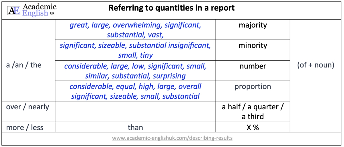
This lesson teaches students how to describe the results from a questionnaire. It provides language for describing quantities, group sizes, specific features and reporting verbs. It includes model answers and a range of practice activities. Example Level: * * * ** [B1/B2/C1] TEACHER MEMBERSHIP / INSTITUTIONAL MEMBERSHIP
Description, analysis and evaluation (writing)
Description: To give a clear and detailed picture of something.
Analysis: T o make a methodical and detailed examination.
Evaluation: To make judgements about the value of information.
A short 9-minute video on description, analysis and evaluation in writing.
Video Worksheet Download – go here
PDF Lesson Download
Academic description, analysis & evaluation [new 2021]
This lesson helps to improve students’ awareness and understanding of the difference between description, analysis and evaluation. It includes paragraph analysis, a detailed language review reference sheet and graph and sentence level quotation analysis. – see worksheet example. Time: 120mins. Level *** ** [ [B2/C1] TEACHER MEMBERSHIP / INSTITUTIONAL MEMBERSHIP
Language Review
Graphs and Charts Downloads
This lesson begins by labelling the key features of a graph and naming different graph / chart types. It then provides practice in describing a range of different lines (peak, plummet, etc..). This is followed by a fun activity where in pairs students describe and plot the lines on four graphs. Example . Level: ** * ** [B2/C1] TEACHER MEMBERSHIP / INSTITUTIONAL MEMBERSHIP
More digital resources and lessons

online resources
Medical English

New for 2024

DropBox Files
Members only

Instant Lessons

Marking Criteria

OneDrive Files

Critical Thinking

Topic-lessons

Feedback Forms

6-Week Course

SPSE Essays

Free Resources

Charts and graphs

AEUK The Blog
12-Week Course
Advertisement:.

EASTER SALE 20% off
Offer ends April 7th 2024
Take me there
You have Successfully Subscribed!
- A Beginner’s Guide to IELTS
- Common Grammar Mistakes [for IELTS Writing Candidates]
Writing Correction Service
- Free IELTS Resources
- Practice Speaking Test
Select Page
Describing an IELTS Line Graph [An Annotated Sample Answer]
Posted by David S. Wills | Mar 13, 2023 | Model Essays | 0
In task 1 of the IELTS writing test, you could be asked to describe a line graph. This is actually very common and so it’s really important that you can do this well.
Today, I am going to show you a typical IELTS line graph and then give you some advice on how to describe it effectively. This will include my own sample band 9 answer, which I will annotate so that you can more easily understand it.
You can read my full guide to describing line graphs here .
The Line Graph – Bakery Sales
Here is our line graph for today:
The graph below gives information about the sales of the three most commonly purchased items in a particular bakery for the year 2014. Summarise the information by selecting and reporting the main features, and make comparisons where relevant.
This is a pretty straightforward line graph and I don’t think there are any particular difficulties here. However, it is important to read the question carefully and analyse the graph before you begin writing.
Note that this is not about all of the sales in this bakery. Specifically, it is about “the three most commonly purchased items.” You should mention that in your introduction or else it may seem as though only three items are available in this place.
What do you Need to Do?
With any graph description, you need to describe the data accurately for your reader. That means your language must be clear and precise. Also, you should not attempt to describe every little detail. Note the phrase “selecting and reporting the main features.” This means you have to be selective. You should also “make comparisons where relevant.”
Looking at this chart, we can see that each of the three lines had a pretty different trend from the others. One line went up and then down. Another went down and then up. A third just moved slowly up. Your job is to explain this effectively.
Remember to group your data logically. There are various ways to do this, but here’s how I will structure my essay:
Why have I organised my information like this?
As I said, there are different ways to do it effectively, but I felt that a good way was to group the final changes together. That’s because it is in these final months that there are substantial changes in the sales positions of these three items.
Normally, I would have grouped the sales of bread and buns together and then kept pies separate. That’s because pies seem to be at a very different level. However, because the sales of pies rose above buns at the end, it seems like an awkward way of grouping the information .
Learn more about task 1 structure here .
Common Problems to Avoid
It is worth mentioning a few mistakes that people often make in IELTS writing task 1. To begin with, you might have noticed the phrase “a particular bakery.” A lot of people try to paraphrase the question and this is a good option for task 1, but it can lead to problems. A “particular bakery” means a single business whose name we have not been given.
In such situations, I almost always write “an unknown ____.” For example, my first line for this essay will be:
- The line graph shows information about sales in an unnamed bakery in the year 2014.
Speaking of paraphrasing, you should also not include any reference to “below.” Whilst the task description is above the graph, your essay will be on a separate piece of paper or on a computer screen. To say “below” would be false information.
You also really need to avoid vague language that fails to convey the ideas expressed in the graph. This is actually one of the most common problems people make in task 1. Always make it clear to your reader that the data refers to sales (in dollar terms) of three select items from one bakery.
Sample Band 9 Answer
Here is how I would answer the question:
The line graph shows information about sales in an unnamed bakery in the year 2014. There are three items listed and their sales varied substantially during the period. In January, bread was by far the most commonly purchased product, with $80,000 of this sold. This was twice as much as the next highest item, buns, and eight times greater than the third one, pies. Over the next two months, however, bread sales plummeted to almost half their initial value while sales of buns increased by fifty percent. From March through to September, buns remained the most profitable item as bread sales fluctuated wildly in second place. Meanwhile, sales of pies slowly and steadily increased. Towards the end of the year, there were more changes. Sales of bread took off from October onwards, surpassing those of buns to become the most profitable item again and reached $80,000 in sales in December. Sales of buns continued to drop, falling into third place after pie sales shot in November and December.
Annotated Version
Now let’s look at the purpose of these sentences:
Final Comments
My structure was simple but effective and my language was accurate enough to convey the data. I picked only the important parts and glossed over the rest. Remember that you don’t have much time to complete this task!
Notice how few numbers there are. Many IELTS candidates make the mistake of cramming lots of numbers into their descriptions. This shows a lack of thinking and it is also a means of avoiding words. However, IELTS is an English test! You need to use words rather than copying numbers from a graph.
About The Author
David S. Wills
David S. Wills is the author of Scientologist! William S. Burroughs and the 'Weird Cult' and the founder/editor of Beatdom literary journal. He lives and works in rural Cambodia and loves to travel. He has worked as an IELTS tutor since 2010, has completed both TEFL and CELTA courses, and has a certificate from Cambridge for Teaching Writing. David has worked in many different countries, and for several years designed a writing course for the University of Worcester. In 2018, he wrote the popular IELTS handbook, Grammar for IELTS Writing and he has since written two other books about IELTS. His other IELTS website is called IELTS Teaching.
Related Posts
Caring for Elderly Relatives [Model Answer]
August 14, 2023
The Effects of Media Influence [IELTS Sample Essay]
January 14, 2020
Bad Behaviour in Schools [IELTS Task 2]
October 29, 2022
Sample IELTS Letter (English Lessons)
January 3, 2023
Leave a reply Cancel reply
Your email address will not be published. Required fields are marked *
This site uses Akismet to reduce spam. Learn how your comment data is processed .
Download my IELTS Books
Recent Posts
- Past Simple vs Past Perfect
- Complex Sentences
- How to Score Band 9 [Video Lesson]
- Taxing Fast Food: Model IELTS Essay
- Airport Vocabulary
Recent Comments
- Daisey Lachut on IELTS Discussion Essays [Discuss Both Views/Sides]
- David S. Wills on Describe a Historical Period
- Siavash on Describe a Historical Period
- fabliha on IELTS Speaking Partners
- tufail khan on IELTS Discussion Essays [Discuss Both Views/Sides]
- Lesson Plans
- Model Essays
- TED Video Lessons
- Weekly Roundup
IELTS Mentor "IELTS Preparation & Sample Answer"
- Skip to content
- Jump to main navigation and login
Nav view search
- IELTS Sample
20 Recent IELTS Graph samples with answers
The chart below shows how much money is spent in the budget on different sectors by the uae government in 2000..
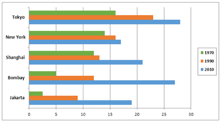
The charts below show the growth in the population in some of the world’s largest cities as well as the population distribution in urban and rural areas.
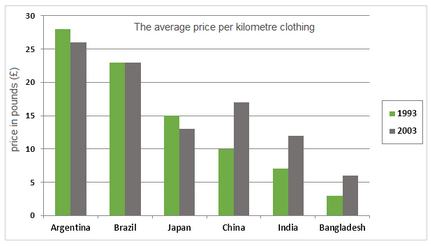
The average prices per kilometre of clothing imported into the European Union from six different countries in 1993 and 2003 are shown in the bar chart below.
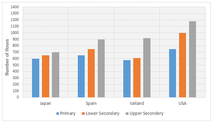
The bar charts below show the number of hours each teacher spent teaching in different schools in four different countries in 2001.
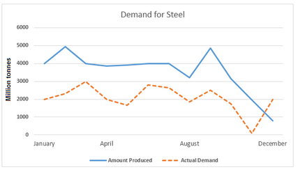
The line graphs below show the production and demand for steel in million tonnes and the number of workers employed in the steel industry in the UK in 2010.
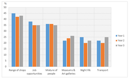
The bar charts and line graph below show the results of a survey conducted over a three-year period to discover what people who live in London think of the city.
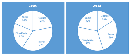
The pie charts below show the online sales for retail sectors in New Zealand in 2003 and 2013.
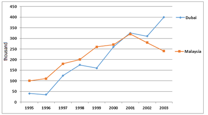
The number of tourists visiting Malaysia and Dubai from 1995 to 2003 is presented below.
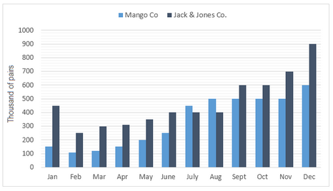
The bar chart below shows the estimated sales of jeans for two companies next year in Turkey. The pie chart shows the projected market share of the two companies in jeans at the end of next year.
The graph below shows a survey result of 4000 participants who expressed what important aspects they have learned from the internship they have completed.
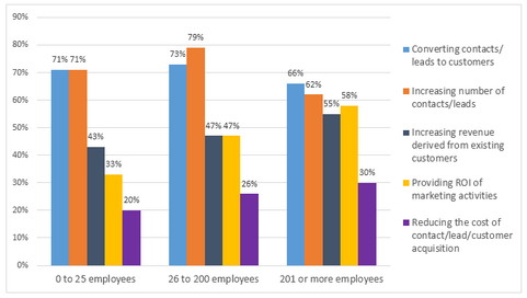
The graph below shows the top priorities by business companies in the USA in 2016.
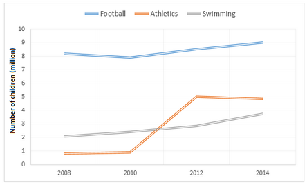
The graphs below show the average monthly expenditure on children’s sports and participation in different sports in the UK from 2008 to 2014.
The pie charts below show the online shopping sales for retail sectors in Australia in 2010 and 2015.

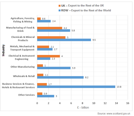
The bar chart below shows Scotland’s exports to the rest of the UK and the rest of the world for the year 2014.
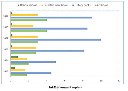
The chart below shows the changes in sales of four different types of books from 2002 to 2012.
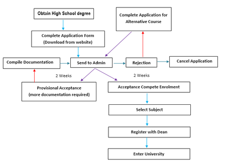
The diagram shows the procedure for university entry for high school graduates.
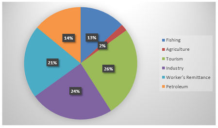
The chart below shows Morocco’s income from different economic sectors in 2003 as well as its income from fishing from 1982 to 2003.
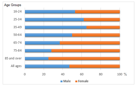
The bar chart below shows the proportions of English men and women of different ages who were living alone in 2011. The pie chart compares the numbers of bedrooms in these one-person households.
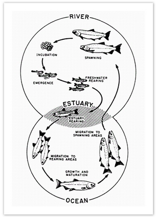
The diagram below shows the life cycle of a salmon, from egg to adult fish.
The table below shows the worldwide market share of the notebook computer market for manufacturers in the years 2006, 2007 and 2014.

- Academic Writing Task 1
IELTS Materials
- IELTS Bar Graph
- IELTS Line Graph
- IELTS Table Chart
- IELTS Flow Chart
- IELTS Pie Chart
- IELTS Letter Writing
- IELTS Essay
- Academic Reading
Useful Links
- IELTS Secrets
- Band Score Calculator
- Exam Specific Tips
- Useful Websites
- IELTS Preparation Tips
- Academic Reading Tips
- Academic Writing Tips
- GT Writing Tips
- Listening Tips
- Speaking Tips
- IELTS Grammar Review
- IELTS Vocabulary
- IELTS Cue Cards
- IELTS Life Skills
- Letter Types

- Privacy Policy
- Cookie Policy
- Copyright Notice
- HTML Sitemap
- 1(877)219-7556 1(877)733-3925
Fully unique works only
Your privacy is our concern
Writing that is plagiarism free
Free Describing the Graph Essay Sample
The graph in task 1 indicates the percentage number of teachers who read a newspaper every day. On Monday, 60 percent of the teachers read the newspaper. This value decreased steadily to 40 percent in Tuesday and 33 percent in Wednesday. It is observed that Thursday recorded the least value, since only 30 percent of the teachers read the newspaper. However, there was a sharp increase afterwards. The value increased to 40 percent on Friday and further to 80 percent on Saturday. Sunday recorded the highest value since 90 percent of the teachers were found to read the newspaper.
According to the information given in the graph, weekdays had the least number of teachers who read newspaper probably due to most of the teacher’s time being used in teaching students in their classes. As a matter of fact, the value decreased progressively from Monday all the way to Thursday. Then from Friday, the value increased significantly all through to Sunday. The graph shows that most of the teachers read the newspaper during weekends perhaps due to the fact that at this time they do not have classes to teach.
The second graph shows the trend in domestic access to modern technology in the homes in the United Kingdom. Information captured in the graph ranges between 1997 and 2003. The technology least used is internet with only 10 percent in 1998/99 and rising steadily to about 45 percent by 2002/03. Access to home computer was second least among domestic users with about 30 percent in 1996/97 and later it had a gradual rise to 55 percent in 2002/03. Access to mobile phone had the highest rate of increase, from about 18 percent in 1996/97 to 70 percent in 2002/03. On the other hand, use of CD player was still high in 1996/97, with a value of 60 percent, which rose steadily to about 83 percent in 2002/03. From the information represented in the graph, it can be concluded that use of mobile phone technology had the highest increase among all the other technologies.

Have NO Inspiration to write your essay?
Ask for Professional help
Search Free Essay
Please note!
Some text in the modal.

- Newsletters
- Account Activating this button will toggle the display of additional content Account Sign out
Camp Is Having a Moment on Television
Shows like palm royale , feud: capote vs. the swans , and the gilded age share a core sensibility..
The more you watch of Palm Royale —the new Apple TV+ show starring Kristen Wiig as a wannabe socialite trying to make it into the upper crust of 1969 Palm Beach, Florida—the more it may feel as if a microdose of LSD is starting to kick in.
Though Wiig’s sunny caricature of a Southern accent won me over from the pilot, I knew I was onto something special when, midway through the miniseries, Allison Janney’s queen bee falls in love with a beached whale while a handsome man soon falls, quite literally, from outer space. In what other show, pray tell, would we get to hear Wiig utter the magnificent lines “Take me right here on this ethnic rug. Go get your trumpet. I want you to play ‘Edelweiss’ in me real slow”? That’s right. I’ll wait.
Thanks to a sense of self-awareness and a commitment to not taking itself too seriously, Palm Royale is a fast, fun, and occasionally quite funny series that charts the efforts of Maxine (a brilliant Wiig, whose ditzy charm has rarely been better deployed) to break into high society at the eponymous Palm Royale beach club. Her chief rival is Evelyn (Janney), who is perpetually dressed in a series of stunning silk caftans while she sits atop the social milieu in the absence of Maxine’s ailing aunt-in-law Norma (comedy icon Carol Burnett, who proves she can still make us laugh with very few lines of discernible dialogue). The show begins to feel overstuffed in its later episodes, as Maxine and husband, Douglas (Josh Lucas), scramble to keep afloat in their new world, but it’s never boring.
In fact, Palm Royale shares a lot of its DNA with a certain other period series starring an ensemble of fabulous middle-aged women. I am talking, of course, about HBO’s The Gilded Age , albeit imbued with the pleasant lightheadedness of having downed a few poolside mai tais. Indeed, it seems that camp is having a moment on television: With the recent release of buzzy, star-studded shows like Palm Royale , FX’s Feud: Capote vs. The Swans , and the latest season of The Gilded Age , we are positively drowning in shows about the glitzy world of the well-to-do that I can only—facetiously, of course—describe as being catnip for a gay man with a streaming subscription.
There are obvious similarities between the three series. The Gilded Age follows the battle between new money and old in 1880s New York, while this latest addition to the Feud anthology is based on the fallout between writer Truman Capote and his bevy of wealthy female friends following his lampooning them in a gossipy 1975 essay . In all these shows, we follow groups of elite, wealthy, and catty women who are fighting to maintain their grip on social power to the exclusion of all others. In all these shows, the extravagances and intricacies of this moneyed class are both venerated and vilified. And in all these shows, the wardrobe budget is the real star.
But the similarities go beyond the surface, touching on a slippery sensibility that has been famously defined by Susan Sontag in her landmark 1964 essay “Notes on ‘Camp.’ ” First, Palm Royale and its ilk revel in the artifice, theatricality, and visual glamor of the rich worlds they inhabit—what Sontag referred to as “the spirit of extravagance.” That glamor is on display not only in the subjects’ lives and storylines but also in the style through which they are depicted on screen. There is nothing natural about the homes in which these wealthy characters reside, whether they be seaside belle epoque estates in Rhode Island decked out with murals of the sky, or warm Mediterranean Revival palazzos that are drowning in stuffed birds and fern wallpaper.
When we watch these shows, we’re tuning in as much for the over-the-top costumes and production design as for the plot. It’s what Sontag would call our “visual reward”—and boy are we rewarded. Indeed, the costumes in this season of Feud were so sumptuously camp that they were even highlighted in a New York Times style piece detailing how the show depicted Capote’s 1966 Black and White Ball and how designer Zac Posen re-created some of the gowns for New York’s high society ladies.
The very fact of the Times’ interest in a show like Feud (the brainchild of Ryan Murphy, the current king of TV melodrama, who prefers the word baroque over camp to describe his work) points to another element of camp in these series’ appeal: a unique blend of high-low culture. Contrast the chatter surrounding these shows with the reception of the long-running soap operas about the wealthy that were synonymous with the ’80s and ’90s, from Dynasty to The Young and the Restless to The Bold and the Beautiful . Those soaps were typically viewed as trash popular television, but this current slate of shows, while equally lavish, entertaining, and catty, are framed as prestige productions with big stars and bigger budgets. They take viewers into a high-culture world of exclusive balls, pricey art auctions, and martini luncheons, but through the historically low-culture medium of television. The stakes—box seats at the opera, beach club membership—are deadly serious for the characters, even as they are remarkably silly for us viewers. To cite Sontag, these shows are “serious about the frivolous, frivolous about the serious.”
However, there are different planes to camp. Sontag distinguished between “pure” or “naive” camp and “deliberate” camp, observing, “The pure examples of Camp are unintentional; they are dead serious.” Feud and Palm Royale fall more within the “deliberate” category, possessing some measure of fun and self-awareness (even if Murphy’s series does wallow in Capote’s addiction problems somewhat movingly, thanks mainly to a brilliant, preening performance by Tom Hollander). The Gilded Age , by contrast, must fall under peak camp by virtue of taking itself seriously. Although HBO’s period drama imagined itself to be sumptuous, important television, it failed spectacularly, particularly in its bloated, boring first season. But it was that failure—“the sensibility of failed seriousness,” per Sontag, in a production that had the “proper mixture of the exaggerated, the fantastic, the passionate, and the naive”—that also made it so wonderfully camp. In short, the perfect series for a large swath of cynical viewers who happily called it “the worst show on television ,” while still tuning in every week, addicted to hating it as much as they loved it.
There are plenty of other TV shows about the world of the wealthy and those trying to infiltrate it, but they don’t quite rest on the “innocence” that Sontag ascribed to camp. Netflix’s Ripley —the upcoming black-and-white adaptation of The Talented Mr. Ripley , starring Andrew Scott—is too dogged and dour; HBO’s Succession , while at times sardonic, had a jagged edge of seriousness; The White Lotus , although funny, was too consciously satirical to be camp. (I would argue, however, that Jennifer Coolidge’s award-winning turn as Tanya in both the first and second seasons was camp at its finest.)
There’s an ineffability to campiness, a special quality that you know when you see it. The best camp, just like the grasshopper cocktail that Wiig’s character sips throughout Palm Royale , may seem like a ridiculous order, but it goes down easy with just the right balance of alcohol and sugar. Just kick back, relax, and let the booze settle in.

IMAGES
VIDEO
COMMENTS
Introduce the Graph. You need to begin with one or two sentences that state what the IELTS writing task 1 shows. To do this, paraphrase the title of the graph, making sure you put in a time frame if there is one. Here is an example for the above line graph: The line graph compares the fast food consumption of teenagers in Australia between 1975 ...
Graph description is related to the section of findings, where researchers often present their data in graphs, or tables, or charts and provide a description to highlight the major trends. Graph description is a basic and important skill in academic writing. Steps in writing a graph description Structure of graph description.
Vertex (or Node): A fundamental unit of a graph, representing a point or an entity. Edge: A connection between two vertices in a graph, representing a relationship or interaction. Directed graph (or Digraph): A graph in which edges have a direction, indicating a one-way connection from one vertex to another.
The ability to describe graphs, charts, diagrams, and tables is crucial for achieving a high score on the IELTS writing test. This skill demonstrates your proficiency in English and ability to analyze and communicate complex information clearly. ... Best Essay Structure. Introduction: Describe what the pie chart shows, including the dataset and ...
The graph above/below shows… 2. Add Suitable Adverbs. Adverbs help express a relation of place, time, circumstance, manner, cause, and degree, and can greatly add some color and interest to your writing as well as show off your range of vocabulary. Unlike adjectives (which describe nouns), adverbs describe verbs, or actions.
An activity which helps students use a range of suitable lexis for describing graphs. The session can be used for IELTS preparation or for more general academic writing skills. Time required: 60-70 minutes . Additional materials required: sample task: One copy per student, or display on the board :
Describing graphs - the basics [updated 2023] This lesson begins by labelling the key features of a graph and naming different graph / chart types. It then provides practice in describing a range of different lines (peak, plummet, etc..). This is followed by a fun activity where in pairs students describe and plot the lines on four graphs.
In the first part of IELTS Academic Writing, you can come across different types of graphs: a line or bar graph, a table, a map, a process, two graphs or two tables. You select words and grammatical constructions depending on the type of graph you are writing about. For example, if you got a process (e.g. water cycle on Earth) you use words ...
Step 4 - Write an Overview (Paragraph 2) In the second paragraph, you should report the main features you can see in the graph, giving only general information. The detail comes later in the essay. You should also make any clear comparisons you spot. This is where we write about the general trends.
How to Describe a Graph. In IELTS writing task 1, you will be asked to describe some sort of visual data. It could be a line graph, a bar chart, a table, a map, a pie chart, or a process diagram. ( Here's a full list.) In this article, we're going to ignore some of these and look at how to describe a graph.
The graph below shows how people buy music. Summarise the information by selecting and reporting the main features, and make comparisons where relevant. The graph illustrates trends in music buying habits between 2011 and 2018. It presents three different methods: streaming, downloading and buying CDs. Overall, both downloads and physical sales ...
IELTS Writing Task 1: Linking words for describing a graph. In order to get 6.0-7.5 and higher, you need to effectively combine your ideas. This skill is assessed by the examiner and it is one of the marking criteria - Coherence / Cohesion, i.e. consistency and coherence / integrity. In order to get 6.0-7.5 and higher, you need to effectively ...
Worksheets and downloads. Describing a graph of trends over time - exercises 709.07 KB. Describing a graph of trends over time - answers 161.51 KB. Describing a graph of trends over time - essay 509.41 KB. Describing a graph of trends over time - writing practice 379.48 KB.
IELTS Writing Task 1 - Bar Chart Essay Example 1. IELTS Writing Task 1 Academic bar chart essay example that is a band score 8. The question is: The chart below gives information about Someland's main exports in 2005, 2015, and future projections for 2025. Take a look at the sample answer. View high band score examples of IELTS writing task ...
Start by saying what the charts show. In an exam, change the words in the question to write the first sentence of your answer, e.g. These charts show = These charts illustrate. The second paragraph should provide an overview of the key features of the information. The other paragraphs should describe the patterns or trends in more detail.
Vocabulary for Describing Graphs and Charts (IELTS) To achieve a good score in IELTS Academic Writing Task 1, candidates are often required to present various types of data, including line graphs, bar charts, tables and multiple graphs. These representations of data typically involve numerical values and percentages, and differ from maps or ...
2. Start by saying what the charts show. In an exam, change the words in the question to write the first sentence of your answer, e.g. These charts show = These charts illustrate. 3. The second paragraph should provide an overview of the key features of the information. 4. The other paragraphs should describe the patterns or trends in more detail.
Guidelines. Your teacher will allocate one of the graphs / charts / tables below. Open the specific ONS webpage link and find the specific section and graph / chart / table. Analyse and evaluate the graph / chart / table using language sheet 1. You must follow the 3 key stages (describe the key elements (labelling), analysis and evaluation).
For example, my first line for this essay will be: The line graph shows information about sales in an unnamed bakery in the year 2014. Speaking of paraphrasing, you should also not include any reference to "below." Whilst the task description is above the graph, your essay will be on a separate piece of paper or on a computer screen.
Recent IELTS Graph 8: The number of tourists visiting Malaysia and Dubai from 1995 to 2003 is presented below. Write a report for a university lecturer describing the information shown in the diagrams below. Click here for Answer: Recent IELTS Graph 9: The bar chart below shows the estimated sales of jeans for two companies next year in Turkey.
Free Describing the Graph Essay Sample. The graph in task 1 indicates the percentage number of teachers who read a newspaper every day. On Monday, 60 percent of the teachers read the newspaper. This value decreased steadily to 40 percent in Tuesday and 33 percent in Wednesday.
DESCRIBING GRAPHS AND CHARTS. The function of a line graph is to describe a TREND pictorially. You therefore should try and describe the trend in it. If there are many lines in the graph (s), then just generally describe the trend. If there is only one or two, then use more detail. So, describe the movement of the line (s) of the graph giving ...
The very fact of the Times' interest in a show like Feud (the brainchild of Ryan Murphy, the current king of TV melodrama, who prefers the word baroque over camp to describe his work) points to ...