- Art Degrees
- Galleries & Exhibits
- Request More Info

Art History Resources
- Guidelines for Analysis of Art
Formal Analysis Paper Examples
- Guidelines for Writing Art History Research Papers
- Oral Report Guidelines
- Annual Arkansas College Art History Symposium
Formal Analysis Paper Example 1
Formal Analysis Paper Example 2
Formal Analysis Paper Example 3
VISIT OUR GALLERIES SEE UPCOMING EXHIBITS
- School of Art and Design
- Windgate Center of Art + Design, Room 202 2801 S University Avenue Little Rock , AR 72204
- Phone: 501-916-3182 Fax: 501-683-7022 (fax)
- More contact information
Connect With Us
UA Little Rock is an accredited member of the National Association of Schools of Art and Design.

How to Analyze Art – Formal Art Analysis Guide and Example
What is this Guide Helpful for?
Every work of art is a complex system and a pattern of intentions. Learning to observe and analyze artworks’ most distinctive features is a task that requires time but primarily training. Even the eye must be trained to art -whether paintings, photography, architecture, drawing, sculptures, or mixed-media installations. The eyes, as when one passes from darkness to light, need time to adapt to the visual and sensory stimuli of artworks.
This brief compendium aims to provide helpful tools and suggestions to analyze art. It can be useful to guide students who are facing a critical analysis of a particular artwork, as in the case of a paper assigned to high school art students. But it can also be helpful when the assignment concerns the creation of practical work, as it helps to reflect on the artistic practice of experienced artists and inspire their own work. However, that’s not all. These concise prompts can also assist those interested in taking a closer look at the art exhibited by museums, galleries, and cultural institutions. They are general suggestions that can be applied to art objects of any era or style since they are those suggested by the history of art criticism.
Knowing exactly what an artist wanted to communicate through his or her artwork is an impossible task, but not even relevant in critical analysis. What matters is to personally interpret and understand it, always wondering what ideas its features suggest. The viewer’s attention can fall on different aspects of a painting, and different observers can even give contradictory interpretations of the same artwork. Yet the starting point is the same setlist of questions . Here are the most common and effective ones.
How to Write a Successful Art Analysis
Composition and formal analysis: what can i see.
The first question to ask in front of an artwork is: what do I see? What is it made of? And how is it realized? Let’s limit ourselves to an objective, accurate pure description of the object; from this preliminary formal analysis, other questions (and answers!) will arise.
- You can ask yourself what kind of object it is, what genre ; if it represents something figuratively or abstractly, observing its overall style.
- You can investigate the composition and the form : shape (e.g. geometric, curvilinear, angular, decorative, tridimensional, human), size (is it small or large size? is it a choice forced by the limits of the display or not?), orientation (horizontally or vertically oriented)
- the use of the space : the system of arrangement (is it symmetrical? Is there a focal point or emphasis on specific parts ?), perspective (linear perspective, aerial perspective, atmospheric perspective), space viewpoint, sense of full and voids, and rhythm.
- You can observe its colors : palette and hues (cool, warm), intensity (bright, pure, dull, glossy, or grainy…), transparency or opacity, value, colors effects, and choices (e.g. complementary colors)
- Observe the texture (is it flat or tactile? Has it other surface qualities?)
- or the type of lines (horizontal, vertical, implied lines, chaotic, underdrawing, contour, or leading lines)
After completing this observation, it is important to ask yourself what are the effects of these chromatic, compositional, and formal choices. Are they the result of randomness, limitations of the site, display, or material? Or perhaps they are meant to convey a specific idea or overall mood? Does the artwork support your insights?
Media and Materials: How the Artist Create?
- First of all, the medium must be investigated. What are these objects? Architecture, drawing, film, installation, painting, performing art, photography, printmaking, sculpture, sound art, textiles, and more.
- What materials and tools did the artists use to create their work? Oil paint, acrylic paint, charcoal, pastel, tempera, fresco, marble, bronze, but also concrete, glass, stone, wood, ceramics, lithography…The list of materials is potentially endless, especially in contemporary arts, but it is also among the easiest information to find! A valid catalog or museum label will always list materials and techniques used by artists.
- What techniques, methods, and processes are used by the artist? The same goes for materials, techniques are numerous and often related to the overall feeling or style that the artist has set out to achieve. In a critical analysis, it is important to reflect on what this technique entails. Do not overdo with a verbose technical explanation.
Why did the artist choose to make the work this way and with such features (materials and techniques)? Are they traditional, academic techniques and materials or, on the contrary, innovative and experimental? What idea does the artist communicate with the choice of these media ? Try to reflect, for example, on their preciousness, or cultural significance, or even durability, fragility, heaviness, or lightness.
Context, Biography, Purpose: What’s Outside the Artwork?
Through formal analysis, it is possible to obtain a precise description of the artistic object. However, artworks are also documents, which attest to facts that happen or have happened outside the frame! The artwork relates to themes, stories, specific ideas, which belong to the artist and to the society in which he or she is immersed. To analyze art in a relevant way, we also must consider the context .
- What are the intentions of the artist to create this work? The purpose? Art may be commissioned, commemorative, educational, of practical use, for the public or for private individuals, realized to communicate something. Let’s ask ourselves why the artist created it, and why at that particular time.
- The artist’s life also cannot be overlooked. We always look at the work in the light of his biography: in what moment of life was it made? Where was the artist? What other artworks had he/she done in close temporal proximity? Biographical sources are invaluable.
- In what context (historical, social, political, cultural) was the artwork made? Artwork supports (or may even deliberately oppose) the climate in which it is immersed. Find out about the political, natural, historical event; the economic, religious, cultural situation of its period.
- Of paramount importance is the cultural atmosphere. What artistic movements , currents, fashions, and styles were prevalent at the time? This allows us to make comparisons with other objects, to question the taste of the time. In other words, to open the horizons of our analysis.
Subject and Meaning: What does it Want to Communicate?
We observed artwork as an object, with visible material and formal characteristics; then we understood that it can be influenced by the context and intentions of the artist. Finally, it is essential to investigate what it wants to communicate. The content of the work passes through the subject matter, its stories, implicit or explicit symbolism.
- You can preliminarily ask what genre of artwork it is, which is very helpful with paintings. Is it a realistic painting of a landscape, abstract, religious, historical-mythical, a portrait, a still life, or much else?
- You can ask questions about the title if it is present. Or perhaps question its absence.
- You can observe the figures. Ask yourself about their identity, age, rank, connections with the artist, or cultural relevance. Observe what their expression or pose communicates.
- You can also observe the objects, places, or scenes that take place in the work. How are they depicted (realistic, abstract, impressionistic, expressionistic, primitive); what story do they tell?
- Are there concepts that perhaps are conveyed implicitly, through symbols, allegories, signs, textual or iconographic elements? Do they have a precise meaning inserted there?
- You can try to describe the overall feeling of the artwork, whether it is positive or negative, but also go deeper: does it communicate calmness, melancholy, tension, energy, or anger, shock? Try to listen to your own emotional reaction as well.
Subjective Interpretation: What does it Communicate to Me?
And finally, the crucial question, what did this work spark in me ?
We can talk about aesthetic taste and feeling, but not only. A critical judgment also involves the degree of effectiveness of the work. Has the artist succeeded, through his formal, technical, stylistic choices, in communicating a specific idea? What did the critics think at the time and ask yourself what you think today? Are there any temporal or personal biases that may affect your judgment? Significative artworks are capable of speaking, of telling a story in every era. Whether nice or bad.
A Brief History of Art Criticism
The stimulus questions collected here are the result of the experience of different methods of analysis developed by art critics throughout history. Art criticism has developed different analytical methodologies, placing the focus of research on different aspects of art. We can trace three major macro-trends and all of them can be used to develop a personal critical method:
The Formal Art Analysis
Formal art analysis is conducted primarily by connoisseurs, experts in attributing paintings or sculptures to the hand of specific artists. Formal analysis adheres strictly to the object-artwork by providing a pure description of it. It focuses on its visual, most distinctive features: on the subject, composition, material, technique, and other elements. Famous formalists and purovisibilists were Giovanni Morelli, Bernard Berenson, Roberto Longhi, Roger Fry, and Heinrich Wölfflin, who elaborated different categories of formal principles.
The Iconological Method
In the iconological method, the content of the work, its meaning, and cultural implications begin to take on relevancy. Aby Warburg and later the Warburg Institute opened up to the analysis of art as an interdisciplinary subject, questioning the correlations between art, philosophy, culture. The fortune of the iconological method, however, is due to Erwin Panofsky, who observed the artwork integrally, through three levels of interpretation. A first, formal, superficial level; the second level of observation of the iconographic elements, and a third called iconological, in which the analysis finally becomes deep, trying to grasp the meaning of the elements.
Social Art History and Beyond
Then, in the 1950s, a third trend began, which placed the focus primarily on the social context of the artwork. With Arnold Hauser, Francis Klingender, and Frederick Antal, the social history of art was born. Social art historians conceive the work of art as a structural system that conveys specific ideologies, whose aspects related to the time period of the artists must also be investigated. Analyses on commissioning, institutionalization, production mechanisms, and the role and function of the artist in society began to spread. It also opens art criticism to researches on taste, fruition, and the study of art in psychoanalytic, pedagogical, anthropological terms.
10 Art Analysis Tips
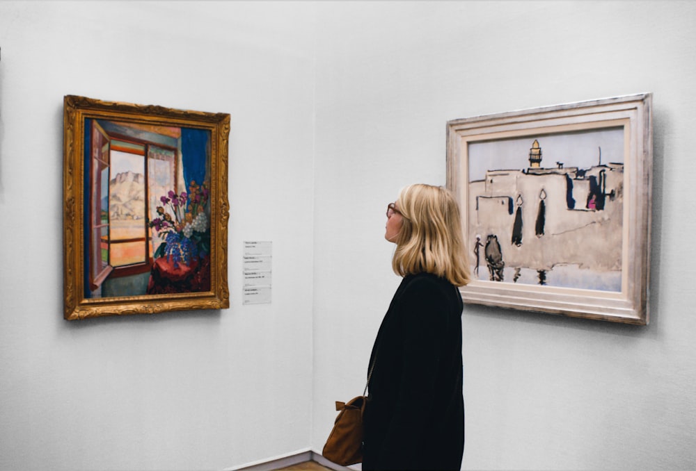
We defined the questions you need to ask yourself to write a meaningful artwork analysis. Then, we identified the main approaches used by art historians while criticizing art: formal analysis, iconographic interpretation, and study of the social context. However, art interpretation is always open to new stimuli and insights, and it is a work of continuous training.
Here are 10 aspects to keep in mind when observing a good artwork (or a bad one!):
- Any feeling towards a work of art is legitimate -whether it is a painting, picture, sculpture, or contemporary installation. What do you like or dislike about it? You could write about the shapes and colors, how the artist used them, their technique. You can analyze the museum setting or its original location; the ideas, or the cultural context to which the artist belongs. You can think about the feelings or memories it evokes. The important thing is that your judgment is justified with relevant arguments that strictly relate to the artwork and its elements.
- Analyzing does not mean describing. A precise description of the work and its distinctive features is essential, but we must go beyond that. Consider also what is outside the frame.
- Strive to use an inquiry-based approach. Ask yourself questions, start with objective observation and then go deeper. Wonder what features suggest. Notice a color…well, why that color, and why there?
- Observe a wide range of visual elements. Artworks are complex systems, so try to look at them in all their components. Not just color, shapes, or technique, but also rhythm, compositional devices, emphasis, style, texture…and much more!
- To get a visual analysis as accurate as possible, it might be very useful to have a comprehensive glossary . Here is MoMA’s one: https://www.moma.org/momaorg/shared/pdfs/docs/learn/courses/Vocabulary_for_Discussing_Art.pdf and Artlex: https://www.artlex.com/art-terms/
- Less is more . Do you want to write about an entire artistic movement or a particularly prolific artist? Focus on the most significant works, the ones you can really say something personal and effective about. Similarly, choose only relevant and productive information; it should aid better understanding of the objects, not take the reader away from it.
- Support what you write with images! Accompany your text with sketches or high-quality photographs. Choose black and white pictures if you want to highlight forms or lights, details or evidence inside the artwork to support your personal interpretations, objects placed in the art room if you analyze also curatorial choices.
- See as much live artwork as possible. Whenever you can, attend temporary exhibitions, museums, galleries… the richer your visual background will be, the more attentive and receptive your eye will be! Connections and comparisons are what make an art criticism truly rich and open-minding.
- Be inspired by the words of artists, art experts, and creatives . Listen as a beloved artwork relates to their art practice or personal artistic vision, to build your personal one. Here are other helpful links: https://www.moma.org/magazine/articles/154?=MOOC
- And finally, trust your intuition! As you noticed in this decalogue, numerous aspects require study and rational analysis but don’t forget to formalize your instinctive impressions as well. Art is made for that, too.
Related Posts:
- A Guide to the Different Types of Sculptures and Statues
- Cost and Price Range of Embroidery Machines: A…
- How to Make Art Prints - A Step by Step Guide
- How to Find Your Art Style - Step by Step Guide
- How to Draw Digital Art - A Complete Guide for Beginners
- How to Make an Art Studio - A Step-by-Step Guide
Writing About Art
- Formal Analysis
Formal analysis is a specific type of visual description. Unlike ekphrasis, it is not meant to evoke the work in the reader’s mind. Instead it is an explanation of visual structure, of the ways in which certain visual elements have been arranged and function within a composition. Strictly speaking, subject is not considered and neither is historical or cultural context. The purest formal analysis is limited to what the viewer sees. Because it explains how the eye is led through a work, this kind of description provides a solid foundation for other types of analysis. It is always a useful exercise, even when it is not intended as an end in itself.
The British art critic Roger Fry (1866-1934) played an important role in developing the language of formal analysis we use in English today. Inspired by modern art, Fry set out to escape the interpretative writing of Victorians like Ruskin. He wanted to describe what the viewer saw, independent of the subject of the work or its emotional impact. Relying in part upon late 19th- and early 20th-century studies of visual perception, Fry hoped to bring scientific rigor to the analysis of art. If all viewers responded to visual stimuli in the same way, he reasoned, then the essential features of a viewer’s response to a work could be analyzed in absolute – rather than subjective or interpretative – terms. This approach reflected Fry’s study of the natural sciences as an undergraduate. Even more important were his studies as a painter, which made him especially aware of the importance of how things had been made. 17
The idea of analyzing a single work of art, especially a painting, in terms of specific visual components was not new. One of the most influential systems was created by the 17th-century French Academician Roger de Piles (1635-1709). His book, The Principles of Painting , became very popular throughout Europe and appeared in many languages. An 18th-century English edition translates de Piles’s terms of analysis as: composition (made up of invention and disposition or design), drawing, color, and expression. These ideas and, even more, these words, gained additional fame in the English-speaking world when the painter and art critic Jonathan Richardson (1665-1745) included a version of de Piles’s system in a popular guide to Italy. Intended for travelers, Richardson’s book was read by everyone who was interested in art. In this way, de Piles’s terms entered into the mainstream of discussions about art in English. 18
Like de Piles’s system, Roger Fry’s method of analysis breaks a work of art into component parts, but they are different ones. The key elements are (in Joshua Taylor’s explanation):
Color , both as establishing a general key and as setting up a relationship of parts; line , both as creating a sense of structure and as embodying movement and character; light and dark , which created expressive forms and patterns at the same time as it suggested the character of volumes through light and shade; the sense of volume itself and what might be called mass as contrasted with space; and the concept of plane , which was necessary in discussing the organization of space, both in depth and in a two-dimensional pattern. Towering over all these individual elements was the composition , how part related to part and to whole: composition not as an arbitrary scheme of organization but as a dominant contributor to the expressive content of the painting. 19
Fry first outlined his analytical approach in 1909, published in an article which was reprinted in 1920 in his book Vision and Design . 20
Some of the most famous examples of Fry's own analyses appear in Cézanne. A Study of His Development . 21 Published in 1927, the book was intended to persuade readers that Cézanne was one of the great masters of Western art long before that was a generally accepted point of view. Fry made his argument through careful study of individual paintings, many in private collections and almost all of them unfamiliar to his readers. Although the book included reproductions of the works, they were small black-and-white illustrations, murky in tone and detail, which conveyed only the most approximate idea of the pictures. Furthermore, Fry warned his readers, “it must always be kept in mind that such [written] analysis halts before the ultimate concrete reality of the work of art, and perhaps in proportion to the greatness of the work it must leave untouched a greater part of the objective.” 22 In other words, the greater the work, the less it can be explained in writing. Nonetheless, he set out to make his case with words.
One of the key paintings in Fry’s book is Cézanne’s Still-life with Compotier (Private collection, Paris), painted about 1880. The lengthy analysis of the picture begins with a description of the application of paint. This was, Fry felt, the necessary place of beginning because all that we see and feel ultimately comes from paint applied to a surface. He wrote: “Instead of those brave swashing strokes of the brush or palette knife [that Cézanne had used earlier], we find him here proceeding by the accumulation of small touches of a full brush.” 23 This single sentence vividly outlines two ways Cézanne applied paint to his canvas (“brave, swashing strokes” versus “small touches”) and the specific tools he used (brush and palette knife). As is often the case in Fry’s writing, the words he chose go beyond what the viewer sees to suggest the process of painting, an explanation of the surface in terms of the movement of the painter’s hand.
After a digression about how other artists handled paint, Fry returned to Still-life with Compotier . He rephrased what he had said before, integrating it with a fuller description of Cézanne’s technique:
[Cézanne] has abandoned altogether the sweep of a broad brush, and builds up his masses by a succession of hatched strokes with a small brush. These strokes are strictly parallel, almost entirely rectilinear, and slant from right to left as they descend. And this direction of the brush strokes is carried through without regard to the contours of the objects. 24
From these three sentences, the reader gathers enough information to visualize the surface of the work. The size of the strokes, their shape, the direction they take on the canvas, and how they relate to the forms they create are all explained. Already the painting seems very specific. On the other hand, the reader has not been given the most basic facts about what the picture represents. For Fry, that information only came after everything else, if it was mentioned at all.
Then Fry turned to “the organization of the forms and the ordering of the volumes.” Three of the objects in the still-life are mentioned, but only as aspects of the composition.
Each form seems to have a surprising amplitude, to permit of our apprehending it with an ease which surprises us, and yet they admit a free circulation in the surrounding space. It is above all the main directions given by the rectilinear lines of the napkin and the knife that make us feel so vividly this horizontal extension [of space]. And this horizontal [visually] supports the spherical volumes, which enforce, far more than real apples could, the sense of their density and mass.
He continued in a new paragraph:
One notes how few the forms are. How the sphere is repeated again and again in varied quantities. To this is added the rounded oblong shapes which are repeated in two very distinct quantities in the compotier and the glass. If we add the continually repeated right lines [of the brush strokes] and the frequently repeated but identical forms of the leaves on the wallpaper, we have exhausted this short catalogue. The variation of quantities of these forms is arranged to give points of clear predominance to the compotier itself to the left, and the larger apples to the right centre. One divines, in fact, that the forms are held together by some strict harmonic principle almost like that of the canon in Greek architecture, and that it is this that gives its extraordinary repose and equilibrium to the whole design. 25
Finally the objects in the still-life have come into view: a compotier (or fruit dish), a glass, apples, and a knife, arranged on a cloth and set before patterned wallpaper.
In Fry’s view of Cézanne, contour, or the edges of forms, are especially important. The Impressionists, Cézanne's peers and exact contemporaries, were preoccupied “by the continuity of the visual welt.” For Cézanne, on the other hand, contour
became an obsession. We find the traces of this throughout this still-life. He actually draws the contour with his brush, generally in a bluish grey. Naturally the curvature of this line is sharply contrasted with his parallel hatchings, and arrests the eye too much. He then returns upon it incessantly by repeated hatchings which gradually heap up round the contour to a great thickness. The contour is continually being lost and then recovered . . . [which] naturally lends a certain heaviness, almost clumsiness, to the effect; but it ends by giving to the forms that impressive solidity and weight which we have noticed. 26
Fry ended his analysis with the shapes, conceived in three dimensions (“volumes”) and in two dimensions (“contours”):
At first sight the volumes and contours declare themselves boldly to the eye. They are of a surprising simplicity, and are clearly apprehended. But the more one looks the more they elude any precise definition. The apparent continuity of the contour is illusory, for it changes in quality throughout each particle of its length. There is no uniformity in the tracing of the smallest curve. . . . We thus get at once the notion of extreme simplicity in the general result and of infinite variety in every part. It is this infinitely changing quality of the very stuff of painting which communicates so vivid a sense of life. In spite of the austerity of the forms, all is vibration and movement. 27
Fry wrote with a missionary fervor, intent upon persuading readers of his point of view. In this respect, his writings resemble Ruskin’s, although Fry replaced Ruskin’s rich and complicated language with clear, spare words about paint and composition. A text by Fry like the one above provides the reader with tangible details about the way a specific picture looks, whereas Ruskin’s text supplies an interpretation of its subject. Of course, different approaches may be inspired by the works themselves. Ignoring the subject is much easier if the picture represents a grouping of ordinary objects than if it shows a dramatic scene of storm and death at sea. The fact that Fry believed in Cézanne’s art so deeply says something about what he believed was important in art. It also says something about the taste of the modern period, just as Ruskin’s values and style of writing reveal things about the Victorian period. Nonetheless, anyone can learn a great deal from reading either of them.
Ellen Johnson, an art historian and art critic who wrote extensively about modern art, often used formal analysis. One example is a long description of Richard Diebenkorn's Woman by a Large Window (Allen Art Museum, Oberlin), which covers the arrangement of shapes into a composition, the application of paint, the colors, and finally the mood of the work. Although organized in a different order from Fry's analysis of Cézanne's still-life, her discussion defines the painting in similar terms.
[Diebenkorn's] particular way of forming the picture . . . is captivating, . . . organizing the picture plane into large, relatively open areas interrupted by a greater concentration of activity, a spilling of shapes and colors asymmetrically placed on one side of the picture. In Woman by a Large Window the asymmetry of the painting is further enhanced by having the figure not only placed at the left of the picture but, more daringly, facing directly out of the picture. This leftward direction and placement is brought into a precarious and exciting but beautifully controlled balance by the mirror on the right which . . . creates a fascinating ambiguity and enrichment of the picture space. . . . The interior of the room and the woman in it are painted in subdued, desert-sand colors, roughly and vigorously applied with much of the drawing achieved by leaving exposed an earlier layer of paint. The edges of the window, table and chair, and the contours of the figure, not to mention the purple eye, were drawn in this way. In other areas, the top layer, roughly applied as though with a scrub brush, is sufficiently thin to permit the under-color to show through and vary the surface hue. . . . [T]he landscape is more positive in hue and value contrasts and the paint more thick and rich. The bright apple-green of the fields and the very dark green of the trees are enlivened by smaller areas of orange, yellow and purple; the sky is intensely blue. The glowing landscape takes on added sparkle by contrast with the muted interior . . . . Pictorially, however, [the woman] is anchored to the landscape by the dark of her hair forming one value and shape with the trees behind her. This union of in and out, of near and far, repeated in the mirror image, emphasizes the plane of the picture, the two-dimensional character of which is further asserted by the planar organization into four horizontal divisions: floor, ledge, landscape and sky. Thus, while the distance of the landscape is firmly stated, it is just as firmly denied . . . . While the mood of the picture is conveyed most obviously through the position and attitude of the figure, still the entire painting functions in evoking this response . . . Lonely but composed, withdrawn from but related to her environment, the woman reminds one of the self-contained, quiet and melancholy figures on Greek funerary reliefs. Like them, relaxed and still, she seems to have sat for centuries. 28
Johnson’s description touches on all aspects of what the viewer sees before ending with a final paragraph about mood. Firmly situated in our understanding of specific physical and visual aspects of Diebenkorn’s painting, her analogy to the seated women on Greek funerary reliefs enhances our ability to envision the position and spirit of this woman. It makes the picture seem vivid by referring to something entirely other. The image also is unexpected, so the description ends with an idea that catches our attention because it is new, while simultaneously summarizing an important part of her analysis. An allusion must work perfectly to be useful, however. Otherwise it becomes a distraction, a red herring that leads the reader away from the subject at hand.
The formal analysis of works other than paintings needs different words. In Learning to Look , Joshua Taylor identified three key elements that determine much of our response to works of sculpture. The artist “creates not only an object of a certain size and weight but also a space that we experience in a specific way.” A comparison between an Egyptian seated figure (Louvre, Paris) and Giovanni da Bologna’s Mercury (National Gallery of Art, Washington, DC) reveals two very different treatments of form and space:
The Egyptian sculptor, cutting into a block of stone, has shaped and organized the parts of his work so that they produce a particular sense of order, a unique and expressive total form. The individual parts have been conceived of as planes which define the figure by creating a movement from one part to another, a movement that depends on our responding to each new change in direction. . . . In this process our sense of the third-dimensional aspect of the work is enforced and we become conscious of the work as a whole. The movement within the figure is very slight, and our impression is one of solidity, compactness, and immobility.
In Mercury , on the other hand, “the movement is active and rapid.”
The sculptor’s medium has encouraged him to create a free movement around the figure and out into the space in which the figure is seen. This space becomes an active part of the composition. We are conscious not only of the actual space displaced by the figure, as in the former piece, but also of the space seeming to emanate from the figure of Mercury. The importance of this expanding space for the statue may be illustrated if we imagine this figure placed in a narrow niche. Although it might fit physically, its rhythms would seem truncated, and it would suffer considerably as a work of art. The Egyptian sculpture might not demand so particular a space setting, but it would clearly suffer in assuming Mercury’s place as the center piece of a splashing fountain. 29
Rudolf Arnheim (1904-2007) also used formal analysis, but as it relates to the process of perception and psychology, specifically Gestalt psychology, which he studied in Berlin during the 1920s. Less concerned with aesthetic qualities than the authors quoted above, he was more rigorous in his study of shapes, volumes, and composition. In his best-known book, Art and Visual Perception. A Psychology of the Creative Eye , first published in 1954, Arnheim analyzed, in order: balance, shape, form, growth, space, light, color, movement, tension, and expression. 30 Many of the examples given in the text are works of art, but he made it clear that the basic principles relate to any kind of visual experience. In other books, notably Visual Thinking and the Power of the Center: A Study of Composition in the Visual Arts , Arnheim developed the idea that visual perception is itself a kind of thought. 31 Seeing and comprehending what has been seen are two different aspects of the same mental process. This was not a new idea, but he explored it in relation to many specific visual examples.
Arnheim began with the assumption that any work of art is a composition before it is anything else:
When the eyes meet a particular picture for the first time, they are faced with the challenge of the new situation: they have to orient themselves, they have to find a structure that will lead the mind to the picture’s meaning. If the picture is representational, the first task is to understand the subject matter. But the subject matter is dependent on the form, the arrangement of the shapes and colors, which appears in its pure state in “abstract,” non-mimetic works. 32
To explain how different uses of a central axis alter compositional structure, for example, Arnheim compared El Greco’s Expulsion from the Temple (Frick Collection, New York) to Fra Angelico’s Annunciation (San Marco, Florence). About the first, Arnheim wrote:
The central object reposes in stillness even when within itself it expresses strong action. The Christ . . . is a typical figura serpentinata [spiral figure]. He chastises the merchant with a decisive swing of the right arm, which forces the entire body into a twist. The figure as a whole, however, is firmly anchored in the center of the painting, which raises the event beyond the level of a passing episode. Although entangled with the temple crowd, Christ is a stable axis around which the noisy happening churns. 33
Although his discussion identifies the forms in terms of subject, Arnheim’s only concern is the way the composition works around its center. The same is true in his discussion of Fra Angelico’s fresco:
As soon as we split the compositional space down the middle, its structure changes. It now consists of two halves, each organized around its own center. . . . Appropriate compositional features must bridge the boundary. Fra Angelico’s Annunciation at San Marco, for example, is subdivided by a prominent frontal column, which distinguishes the celestial realm of the angel from the earthly realm of the Virgin. But the division is countered by the continuity of the space behind the column. The space is momentarily covered but not interrupted by the vertical in the foreground. The lively interaction between the messenger and recipient also helps bridge the separation. 34
All formal analysis identifies specific visual elements and discusses how they work together. If the goal of a writer is to explain how parts combine to create a whole, and what effect that whole has on the viewer, then this type of analysis is essential. It also can be used to define visual characteristics shared by a number of objects. When the similarities seem strong enough to set a group of objects apart from others, they can be said to define a "style." Stylistic analysis can be applied to everything from works made during a single period by a single individual to a survey of objects made over centuries. All art historians use it.
- Introduction
- Personal Style
- Period Style
- "Realistic"
- The Biography
- Iconographic Analysis
- Historical Analysis
- Bibliography
- Appendix I: Writing the Paper
- Appendix II: Citation Forms
- Visual Description
- Stylistic Analysis
- Doing the Research
- The First Draft
- The Final Paper
- About the Author
© Marjorie Munsterberg 2008-2009

- Place order
Formal Analysis Paper Writing Guide

A formal analysis essay, aka a visual analysis essay , is an essay that is written to analyze a painting or a work of art. A properly written formal analysis paper will give the reader both objective and subjective information about an art piece.
This post will teach you the A to Z of how to write a formal analysis essay.
What is a formal analysis essay?
A formal analysis essay is an academic writing that comprehensively describes a work of art (usually a painting, image, or sculpture). An excellent formal analysis essay is one that not only describes a work of art but also analyzes it.
If you are enrolled in an art program in college or university, you will most likely have to complete a good number of formal or visual analysis essays before you graduate. They are common in art programs to help art students to understand and judge art better.
The 4 Main Steps for a Formal Analysis Essay
Every proper formal analysis essay must include four key elements – description, analysis, interpretation, and evaluation. In other words, when writing a formal analysis essay, you must describe, analyze, interpret, and evaluate the work of art.
1. Description
The first thing you need to do when writing a formal analysis essay is to describe the elements of the work of art you see at first glance.
So what can you quickly notice about the work of art you want to analyze? What is it that has been depicted? What medium has the artist used? What painting element? Your answers to all these questions will help you to fully describe the work of art to the reader.
In your description of the work of art, there are several things you must strongly consider and describe.
- Texture : How does the artist use texture? Is it implied or actual?
- Color : How does the artist use colors? What color scheme? Is the image dark, medium, or light?
- Organizing space : How does the artist utilize perspective? Does the artist use linear perspective?
- Mass and volume : How does the artist represent mass and volume? Is the work of art one-dimensional, two-dimensional, or three-dimensional?
- Shape : How does the artist use shapes? Are the shapes soft or hard-edged? Are they small or large? How are the shapes related?
- Line : How does the artist use lines? Are they soft, jagged, straight, mechanical, or expressive? Are they used to describe space?
2. Analysis
The second thing you need to do when writing a formal analysis essay is to analyze the artistic elements of the work of art. This is where the rubber meets the road. It is where your inner artist must come out, and you must discuss the true art aspects of the work of art.
Once you have described the physical or first-glance elements of the artwork, you have to go straight into the analysis aspect. The analysis aspect is all about discussing how the artist employs design aspects in the artwork.
In your analysis of the work of art, there are several things you must strongly consider and analyze.
- Design : What principles of design (art techniques) does the artist use?
- Variety: What elements does the artist use, and how does he use them to provide variety?
- Scale : Is the work to scale? Are all the elements on the same scale?
- Symmetry : Is the work symmetrical or asymmetrical?
- Emphasis : What does the artist use to create emphasis? What movement does the work convey?
- Patterns : What patterns are clear in the artwork?
3. Interpretation
The third thing you need to do when writing a formal analysis essay is to reveal the hidden meanings or aspects of the work of art you are analyzing.
The interpretation part of your formal analysis essay should capture two things – the use of symbolism in the artwork and what it means to the viewer. It is all about revealing the hidden meaning of what may mean one thing at first glance and something deeper upon further inspection.
Interpretations of artworks usually reveal themselves somewhat slowly. This is because one has to look at an art object repeatedly to identify symbolism and get the deeper meaning.
When providing an interpretation for symbolism, you must provide supporting evidence.
4. Evaluation
The last thing you need to do when writing a formal analysis essay is to evaluate the work of art you have described, analyzed, and interpreted.
In the evaluation part of your visual analysis essay, you need to discuss your overall opinion of the artwork. Specifically, you need to discuss what you discovered about it and about yourself when examining it.
A proper evaluation of an art object will detail your opinion and feelings about it. It will also discuss whether you find it pleasing or engaging.
When evaluating an art piece, it is crucial to remember that it is best to evaluate art pieces per the period they were created. This allows for better contextualization and proper evaluation.
Format of Formal Analysis Paper
A typical formal analysis paper will have three key sections – an introduction, a body, and a conclusion. Find out what each section entails in the visual analysis paper outline below.
1. Introduction
The first part of a formal analysis paper is the introduction. The introduction must provide the reader with all the essential information about the artwork to be analyzed. It must also be interesting enough to hook the reader.
The best way to provide the reader with all the essential information about the artwork to be analyzed is to describe it vividly. The vivid description should be followed by information about how the artwork was created and information about the creator.
An introduction with all the above information is sufficient to hook the reader's attention. Nevertheless, if there is something controversial about the artwork, this information must also be provided in the introduction. The purpose of giving this type of information is to ensure the reader is fully aware of all the crucial aspects of the art piece to be analyzed.
2. Thesis statement
A well-written visual analysis paper will have a thesis statement at the end of the introduction. The thesis statement must be clear, concise, and to the point. Moreover, it must quickly tell the reader the paper's main argument.
Think of the thesis statement of your formal analysis paper as your paper's central argument; the argument/claim you will be supporting during your analysis.
The body of a formal analysis essay is where the actual analysis happens. It must have four key elements for it to be considered complete. The elements are – description, analysis, interpretation, and evaluation.
Each element is typically covered in a separate paragraph for good organization and flow. And it supports the thesis statement in the introduction section.
By the time the reader is done reading the body section of the essay, they should have all the art analysis they expected after reading the introduction.
4. Conclusion
The conclusion is the last part of every formal essay analysis. It is where the writer must nicely wrap up the art analysis. This is usually done by first restating the thesis and the main supporting statements. The restatement is frequently followed by information comparing the artwork with similar pieces or information about whether the artwork fits in with the creator's other artworks.
Steps for Writing a Formal Analysis Essay
As an art history student, it is essential to learn how to write a visual analysis paper. This is because you will most likely be asked to write such a paper several times before graduating. Moreover, learning how to write such a paper will also help you become a good art critic, curator, or appraiser.
Follow the steps below to write a brilliant visual analysis essay.
1. Gather general information about the artwork and the creator
The first thing to do to write a formal analysis essay is to gather general information about the artwork and the creator. The most crucial bits of information to collect include:
- The subject – what artwork will you be analyzing? What is it called, and when was it created?
- The creator – who is behind the art? Identify them by their full name.
- The date of creation – when was the artwork created? Is it typical art for the period and the artist?
- The location – where is the art being displayed? Has it been displayed somewhere else before?
- The medium and techniques – what medium was used to create the artwork? What techniques did the artist use?
2. Write the introduction
A good introduction paragraph to a formal analysis essay provides sufficient background information about the subject piece and grabs the reader's attention. Use the information you have gathered in the step above to write a good introduction.
Make your introduction brilliant by ensuring you provide information about the art piece in a logical and flowing manner. After writing your introduction, read it to ensure it can grab the reader's attention. If it can, you are good to go. If it can't, you should rewrite it until it can do so.
The last statement of your introduction paragraph should be your thesis statement (your central argument for the paper). It should quickly tell the reader your overall argument or opinion about the subject artwork. You can only develop a good thesis statement after researching a painting and finding out more about it and the period it was created. Researching an art piece will also help you describe and analyze it more objectively.
If, after writing your paper, you feel your thesis statement doesn't closely reflect its overall argument, you should rewrite the statement to make sure it does. It is totally okay to do so.
3. Describe the painting
After writing your introduction paragraph, you should write the body section of your paper. The body section of a typical formal analysis paper must have at least two distinct parts – the first part describing the painting and the second analyzing it. It can also have an interpretation part to discuss any symbolism or hidden meaning discovered in the art.
The best way to describe the subject painting is to provide all the visible information about it. The visible aspects of the artwork that you must capture in your description include:
- The figures – the characters displayed in the painting and their identities or what they represent.
- The theme – the story or theme depicted in the painting
- The setting – the background of the painting.
- The shapes and colors – the shapes and colors that stand out in the painting.
- The mood – the lighting and overall mood of the subject artwork.
Make sure your painting description is well-organized and has a good flow. If need be, rewrite it to enhance its flow.
Your description can be one paragraph long or two paragraphs long.
4. Analyze the painting
The second part of your paper's body section should be a detailed analysis of the subject painting. Your analysis should focus on the painting's art elements and design principles.
Your professor will most likely focus on the analysis part of your paper, so make sure you do a brilliant analysis. To ensure your professor is impressed with your painting analysis, you should analyze/discuss the art elements and the design principles separately.
The art elements of a painting are the painting techniques used. They are also known as the basics of composition. The art elements that shouldn't miss in your analysis include:
- The lines – what lines does the artist use? Are they implied, thick, curved, or straight? Talk about them in your paper.
- The shapes – what shapes does the artist use? Are they plain or hidden? Are they geometrical or out of proportion?
- The use of light – what is the light source in the painting? Is it obvious or hidden?
- The colors – what colors does the painter use? Are they primary or secondary colors? Is the tone cool or warm?
- The patterns – does the painting have distinct, repeated, textural, or hidden patterns? How do they make it look?
- The use of space – is the painting one-dimensional or two-dimensional? How does the artist show depth?
- The passage of time – how does the painting show the passage of time?
Remember, simply describing the art elements above is not enough. You must analyze them because this step is all about analysis; it is all about going deeper.
The design principles of a painting are the aspects of the painting that provide a thematic or broader perspective. Therefore, your inner artist should come out when analyzing the design principles of the painting.
The following things should feature in your analysis of the design principles of the painting:
- Symmetry and asymmetry – talk about the points of balance in the shapes, colors, patterns, and overall painting.
- Variety – talk about the varied techniques used by the artist and whether the overall feel is of chaos or unity.
- Emphasis – talk about the thematic and artistic points of focus. Mention the colors that the artist emphasizes.
- Proportions – discuss how the figures work together to depict the painting's volume, mass, and scale.
- Rhythm – discuss how the artist displays rhythm using figures and techniques.
Carefully and methodically detailing your analysis of the painting's art elements and design principles will help you to get a good grade in your visual analysis essay.
5. Write the conclusion
After describing and analyzing the painting, you should write the conclusion. A good visual or formal analysis essay conclusion provides an overall evaluation of the subject painting. The best way to write an overall evaluation of the subject painting is to think of the evaluation as your general assessment.
So what do you think of the painting based on your description and analysis? Is it standard, brilliant, or exceptional? Does it meet your expectations? Why yes or why not? Talk about these things in your conclusion to make it perfect.
6. Proofread and edit your essay
After writing your essay, you should proofread and edit it. Doing this will help you to transform it from ordinary to extraordinary.
The correct way to proofread your essay is to proofread it twice – first using a grammar checker like Grammarly and then using your own eyes.
Proofreading your paper using a grammar checker like Grammarly will help you quickly identify and edit basic grammar and typing errors. Proofreading your document one more time using your own eyes will help you to catch any mistakes the checker might have missed. It will also help you to identify and rewrite parts of your paper that are difficult to understand.
Your paper should be ready to submit after you proofread it as described above.
10 tips to help you write a brilliant formal analysis essay
Writing a visual analysis essay is not easy. This is because there are many things to include and consider to ensure the paper is complete. In this section, you will discover what you need to consider to ensure the final draft of your formal analysis essay is perfect.
- Consider your feelings. When analyzing a painting, it is crucial to be objective in your analysis. But at the same time, it is also vital to consider your feelings. All your feelings toward the painting are legitimate. Therefore, do not be afraid to say what you think about an artwork, especially in your analysis and conclusion. Your professor should be able to clearly see your judgment on the subject piece and not just your objective analysis.
- Focus on analysis. When most art students write a formal analysis essay, they spend a lot of time on the description rather than the analysis. This is wrong. It is okay for the first part of your analysis essay to include a description of the painting. However, at least 50 to 60 percent of your essay should be your analysis of the subject painting. Your professor expects this. So if you want to get a good grade, you should focus on analysis.
- Start with the obvious and go deeper. While it is true that a good formal analysis paper must focus on the analysis, a thorough description of the artwork is also a must. The first part of your paper's body section must be a detailed description of the subject painting. It is only after describing the artwork that you should proceed to analyze it. If you write your paper this way, your reader will know what exactly you are talking about in your analysis.
- Use the correct terms. You must use the correct terms to get a top grade when writing your visual analysis essay. This is because professors hate when students use non-official or inaccurate words to describe art elements. If you do not know the correct way to refer to an art element or design principle, you should search for it online in art term glossaries such as MOMA .
- Less is more. There are usually many art elements and design principles to consider when analyzing an art piece. However, discussing or describing all of them in your paper is not a must. Your analysis should focus on discussing the most significant art elements and design principles. You can, and you should, ignore all insignificant art elements and design principles.
- Proofread your work thoroughly. Many students ignore proofreading their papers before submission and end up submitting low-quality essays. You should not do the same. Instead, you should carefully proofread your work twice or thrice to remove all errors and mistakes. This will help you polish your essay to a level that is extremely easy to understand.
- See live artwork regularly. To write great visual analysis essays, you must visit art galleries, museums, and exhibitions frequently. Visiting such art establishments regularly will allow you to see, hear, and familiarize yourself with art critique. Of course, by familiarizing yourself with art critique, the exercise will become like second nature to you. Therefore, it will make it much easier for you to write great visual analysis essays.
- Consider audience and historical context. When analyzing art, you must strongly consider the audience and the historical context. Failure to do so will make your analysis shallow. Think of who the artist was trying to appeal to. Was he trying to appeal to the church? Art people? Or the masses? The target audience obviously influenced the way artists developed their paintings. Think also of the historical context. Judging a Renaissance period painter with Rococo era standards is not appropriate. You can only judge an art piece by the standards of the art period it was created.
Example of a formal or Visual or Formal Analysis Essay
The essay below is a short example of a formal analysis essay. It includes the three key sections of a formal analysis essay – introduction, body, and conclusion. Its body section consists of a brief description paragraph and a brief analysis paragraph.
Analysis of Snow Storm – Steam-Boat off a Harbour's Mouth
Snow Storm – Steam-Boat off a Harbour's Mouth is a chaotic oil on canvas painting by Englishman Joseph William Turner (1775- 1851, England). It is one of Turner's most famous paintings, and it is on display at Tate, one of the most important art organizations in the world. By looking at this painting, it is clear that Turner was a master at drawing abstract, chaotic paintings.
At first glance, this painting reveals a steamboat at the center of what looks like a storm. However, the painting is chaotic, so this is something one cannot tell for sure. Nevertheless, based on the title of the painting, one can see it is shaped like a steam-boat belching heavy smoke. The vessel is surrounded by swirling snow and pitching waves. The sky is somewhat depicted in blue despite the raging storm.
A closer inspection of the painting reveals a well-drawn chaotic artwork featuring long and heavy strokes. The long strokes create dramatic movement and enhance the artist's idea of a steamboat in a raging storm. It also reveals asymmetrical shapes, as is the case with most chaotic oil on canvas paintings.
In terms of design principles, the scale of the boat stands out. It looks somewhat tiny in the middle of a big storm. The tiny size of the vessel, plus the small indication of space above it created by a sliver of blue sky, indicates a scene of danger. The scene is reminiscent of humanity's struggle against powerful forces of nature.
This artwork by Turner is a beautiful work of art. Turner is considered one of the foremost painters of his time, and this work indeed shows that he was a master oil on canvas painter. The work depicts a boat in a big storm. It is a powerful reminder of humanity's struggle for survival in a cold and unforgiving world.
Final words
Professors and instructors know that formal analysis essay assignments help students to understand and judge art better. Because of this, they give such assignments from time to time. Therefore, if you are an art program student, you should learn how to do such assignments perfectly. Doing so will help you get an excellent grade whenever you are given such an assignment.
This post revealed everything crucial that you need to know to write a formal essay. The information includes the four steps for a formal analysis essay, the structure of a formal essay, and the steps to follow to write one. You can use the information to write a brilliant visual analysis essay on any work of art.
If the information is insufficient for you to write an excellent visual analysis essay or you are too busy to write one, you should work with us. If you do so, you will get 100% confidentiality, 100% quality, and 100% on-time delivery. Try Essay Maniacs today for quality assignment help !
Need a Discount to Order?
15% off first order, what you get from us.

Plagiarism-free papers
Our papers are 100% original and unique to pass online plagiarism checkers.

Well-researched academic papers
Even when we say essays for sale, they meet academic writing conventions.

24/7 online support
Hit us up on live chat or Messenger for continuous help with your essays.

Easy communication with writers
Order essays and begin communicating with your writer directly and anonymously.
- Getty Artists Program
- Engaged Student Observers
- Where We Live: Student Perspectives
- School Visits
- Virtual Speaker Series
- On-Demand Webinars
- Curricula and Teaching Guides
- Student Art Activities
- Getty Books in the Classroom
- Getty at Home
- Youth Programs
- Education Department Highlights
Shape and form
How to analyze an artwork: a step-by-step guide
Last Updated on August 16, 2023
This article has been written for high school art students who are working upon a critical study of art, sketchbook annotation or an essay-based artist study. It contains a list of questions to guide students through the process of analyzing visual material of any kind, including drawing, painting, mixed media, graphic design, sculpture, printmaking, architecture, photography, textiles, fashion and so on (the word ‘artwork’ in this article is all-encompassing). The questions include a wide range of specialist art terms, prompting students to use subject-specific vocabulary in their responses. It combines advice from art analysis textbooks as well as from high school art teachers who have first-hand experience teaching these concepts to students.
COPYRIGHT NOTE: This material is available as a printable art analysis PDF handout . This may be used free of charge in a classroom situation. To share this material with others, please use the social media buttons at the bottom of this page. Copying, sharing, uploading or distributing this article (or the PDF) in any other way is not permitted.
READ NEXT: How to make an artist website (and why you need one)
Why do we study art?
Almost all high school art students carry out critical analysis of artist work, in conjunction with creating practical work. Looking critically at the work of others allows students to understand compositional devices and then explore these in their own art. This is one of the best ways for students to learn.
Instructors who assign formal analyses want you to look—and look carefully. Think of the object as a series of decisions that an artist made. Your job is to figure out and describe, explain, and interpret those decisions and why the artist may have made them. – The Writing Center, University of North Carolina at Chapel Hill 10
Art analysis tips
- ‘I like this’ or ‘I don’t like this’ without any further explanation or justification is not analysis . Personal opinions must be supported with explanation, evidence or justification.
- ‘Analysis of artwork’ does not mean ‘description of artwork’ . To gain high marks, students must move beyond stating the obvious and add perceptive, personal insight. Students should demonstrate higher order thinking – the ability to analyse, evaluate and synthesize information and ideas. For example, if color has been used to create strong contrasts in certain areas of an artwork, students might follow this observation with a thoughtful assumption about why this is the case – perhaps a deliberate attempt by the artist to draw attention to a focal point, helping to convey thematic ideas.
Although description is an important part of a formal analysis, description is not enough on its own. You must introduce and contextualize your descriptions of the formal elements of the work so the reader understands how each element influences the work’s overall effect on the viewer. – Sylvan Barnet, A Short Guide to Writing About Art 2
- Cover a range of different visual elements and design principles . It is common for students to become experts at writing about one or two elements of composition, while neglecting everything else – for example, only focusing upon the use of color in every artwork studied. This results in a narrow, repetitive and incomplete analysis of the artwork. Students should ensure that they cover a wide range of art elements and design principles, as well as address context and meaning, where required. The questions below are designed to ensure that students cover a broad range of relevant topics within their analysis.
- Write alongside the artwork discussed . In almost all cases, written analysis should be presented alongside the work discussed, so that it is clear which artwork comments refer to. This makes it easier for examiners to follow and evaluate the writing.
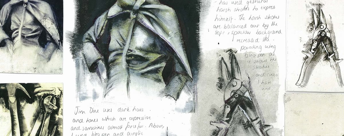
- Support writing with visual analysis . It is almost always helpful for high school students to support written material with sketches, drawings and diagrams that help the student understand and analyse the piece of art. This might include composition sketches; diagrams showing the primary structure of an artwork; detailed enlargements of small sections; experiments imitating use of media or technique; or illustrations overlaid with arrows showing leading lines and so on. Visual investigation of this sort plays an important role in many artist studies.
Making sketches or drawings from works of art is the traditional, centuries-old way that artists have learned from each other. In doing this, you will engage with a work and an artist’s approach even if you previously knew nothing about it. If possible do this whenever you can, not from a postcard, the internet or a picture in a book, but from the actual work itself. This is useful because it forces you to look closely at the work and to consider elements you might not have noticed before. – Susie Hodge, How to Look at Art 7
Finally, when writing about art, students should communicate with clarity; demonstrate subject-specific knowledge; use correct terminology; generate personal responses; and reference all content and ideas sourced from others. This is explained in more detail in our article about high school sketchbooks .
What should students write about?
Although each aspect of composition is treated separately in the questions below, students should consider the relationship between visual elements (line, shape, form, value/tone, color/hue, texture/surface, space) and how these interact to form design principles (such as unity, variety, emphasis, dominance, balance, symmetry, harmony, movement, contrast, rhythm, pattern, scale, proportion) to communicate meaning.
As complex as works of art typically are, there are really only three general categories of statements one can make about them. A statement addresses form, content or context (or their various interrelations). – Dr. Robert J. Belton, Art History: A Preliminary Handbook, The University of British Columbia 5
…a formal analysis – the result of looking closely – is an analysis of the form that the artist produces; that is, an analysis of the work of art, which is made up of such things as line, shape, color, texture, mass, composition. These things give the stone or canvas its form, its expression, its content, its meaning. – Sylvan Barnet, A Short Guide to Writing About Art 2
This video by Dr. Beth Harris, Dr. Steven Zucker and Dr. Naraelle Hohensee provides an excellent example of how to analyse a piece of art (it is important to note that this video is an example of ‘formal analysis’ and doesn’t include contextual analysis, which is also required by many high school art examination boards, in addition to the formal analysis illustrated here):
Composition analysis: a list of questions
The questions below are designed to facilitate direct engagement with an artwork and to encourage a breadth and depth of understanding of the artwork studied. They are intended to prompt higher order thinking and to help students arrive at well-reasoned analysis.
It is not expected that students answer every question (doing so would result in responses that are excessively long, repetitious or formulaic); rather, students should focus upon areas that are most helpful and relevant for the artwork studied (for example, some questions are appropriate for analyzing a painting, but not a sculpture). The words provided as examples are intended to help students think about appropriate vocabulary to use when discussing a particular topic. Definitions of more complex words have been provided.
Students should not attempt to copy out questions and then answer them; rather the questions should be considered a starting point for writing bullet pointed annotation or sentences in paragraph form.
CONTENT, CONTEXT AND MEANING
Subject matter / themes / issues / narratives / stories / ideas.
There can be different, competing, and contradictory interpretations of the same artwork. An artwork is not necessarily about what the artist wanted it to be about. – Terry Barrett, Criticizing Art: Understanding the Contemporary 6
Our interest in the painting grows only when we forget its title and take an interest in the things that it does not mention…” – Françoise Barbe-Gall, How to Look at a Painting 8
- Does the artwork fall within an established genre (i.e. historical; mythical; religious; portraiture; landscape; still life; fantasy; architectural)?
- Are there any recognisable objects, places or scenes ? How are these presented (i.e. idealized; realistic; indistinct; hidden; distorted; exaggerated; stylized; reflected; reduced to simplified/minimalist form; primitive; abstracted; concealed; suggested; blurred or focused)?
- Have people been included? What can we tell about them (i.e. identity; age; attire; profession; cultural connections; health; family relationships; wealth; mood/expression)? What can we learn from their pose (i.e. frontal; profile; partly turned; body language)? Where are they looking (i.e. direct eye contact with viewer; downcast; interested in other subjects within the artwork)? Can we work out relationships between figures from the way they are posed?
What do the clothing, furnishings, accessories (horses, swords, dogs, clocks, business ledgers and so forth), background, angle of the head or posture of the head and body, direction of the gaze, and facial expression contribute to our sense of the figure’s social identity (monarch, clergyman, trophy wife) and personality (intense, cool, inviting)? – Sylvan Barnet, A Short Guide to Writing About Art 2
- What props and important details are included (drapery; costumes; adornment; architectural elements; emblems; logos; motifs)? How do aspects of setting support the primary subject? What is the effect of including these items within the arrangement (visual unity; connections between different parts of the artwork; directs attention; surprise; variety and visual interest; separates / divides / borders; transformation from one object to another; unexpected juxtaposition)?
If a waiter served you a whole fish and a scoop of chocolate ice cream on the same plate, your surprise might be caused by the juxtaposition , or the side-by-side contrast, of the two foods. – Vocabulary.com
A motif is an element in a composition or design that can be used repeatedly for decorative, structural, or iconographic purposes. A motif can be representational or abstract, and it can be endowed with symbolic meaning. Motifs can be repeated in multiple artworks and often recur throughout the life’s work of an individual artist. – John A. Parks, Universal Principles of Art 11
- Does the artwork communicate an action, narrative or story (i.e. historical event or illustrate a scene from a story)? Has the arrangement been embellished, set up or contrived?
- Does the artwork explore movement ? Do you gain a sense that parts of the artwork are about to change, topple or fall (i.e. tension; suspense)? Does the artwork capture objects in motion (i.e. multiple or sequential images; blurred edges; scene frozen mid-action; live performance art; video art; kinetic art)?
- What kind of abstract elements are shown (i.e. bars; shapes; splashes; lines)? Have these been derived from or inspired by realistic forms? Are they the result of spontaneous, accidental creation or careful, deliberate arrangement?
- Does the work include the appropriation of work by other artists, such as within a parody or pop art? What effect does this have (i.e. copyright concerns)?
Parody: mimicking the appearance and/or manner of something or someone, but with a twist for comic effect or critical comment, as in Saturday Night Live’s political satires – Dr. Robert J. Belton, Art History: A Preliminary Handbook, The University of British Columbia 5
- Does the subject captivate an instinctual response , such as items that are informative, shocking or threatening for humans (i.e. dangerous places; abnormally positioned items; human faces; the gaze of people; motion; text)? Heap map tracking has demonstrated that these elements catch our attention, regardless of where they are positioned – James Gurney writes more about this fascinating topic .
- What kind of text has been used (i.e. font size; font weight; font family; stenciled; hand-drawn; computer-generated; printed)? What has influenced this choice of text?
- Do key objects or images have symbolic value or provide a cue to meaning ? How does the artwork convey deeper, conceptual themes (i.e. allegory; iconographic elements; signs; metaphor; irony)?
Allegory is a device whereby abstract ideas can be communicated using images of the concrete world. Elements, whether figures or objects, in a painting or sculpture are endowed with symbolic meaning. Their relationships and interactions combine to create more complex meanings. – John A. Parks, Universal Principles of Art 11
An iconography is a particular range or system of types of image used by an artist or artists to convey particular meanings. For example in Christian religious painting there is an iconography of images such as the lamb which represents Christ, or the dove which represents the Holy Spirit. – Tate.org.uk
- What tone of voice does the artwork have (i.e. deliberate; honest; autobiographical; obvious; direct; unflinching; confronting; subtle; ambiguous; uncertain; satirical; propagandistic)?
- What is your emotional response to the artwork? What is the overall mood (i.e positive; energetic; excitement; serious; sedate; peaceful; calm; melancholic; tense; uneasy; uplifting; foreboding; calm; turbulent)? Which subject matter choices help to communicate this mood (i.e. weather and lighting conditions; color of objects and scenes)?
- Does the title change the way you interpret the work?
- Were there any design constraints relating to the subject matter or theme/s (i.e. a sculpture commissioned to represent a specific subject, place or idea)?
- Are there thematic connections with your own project? What can you learn from the way the artist has approached this subject?

Wider contexts
All art is in part about the world in which it emerged. – Terry Barrett, Criticizing Art: Understanding the Contemporary 6
- Supported by research, can you identify when, where and why the work was created and its original intention or purpose (i.e. private sale; commissioned for a specific owner; commemorative; educational; promotional; illustrative; decorative; confrontational; useful or practical utility; communication; created in response to a design brief; private viewing; public viewing)? In what way has this background influenced the outcome (i.e. availability of tools, materials or time; expectations of the patron / audience)?
- Where is the place of construction or design site and how does this influence the artwork (i.e. reflects local traditions, craftsmanship, or customs; complements surrounding designs; designed to accommodate weather conditions / climate; built on historic site)? Was the artwork originally located somewhere different?
- Which events and surrounding environments have influenced this work (i.e. natural events; social movements such as feminism; political events, economic situations, historic events, religious settings, cultural events)? What effect did these have?
- Is the work characteristic of an artistic style, movement or time period ? Has it been influenced by trends, fashions or ideologies ? How can you tell?
- Can you make any relevant connections or comparisons with other artworks ? Have other artists explored a similar subject in a similar way? Did this occur before or after this artwork was created?
- Can you make any relevant connections to other fields of study or expression (i.e. geography, mathematics, literature, film, music, history or science)?
- Which key biographical details about the artist are relevant in understanding this artwork (upbringing and personal situation; family and relationships; psychological state; health and fitness; socioeconomic status; employment; ethnicity; culture; gender; education, religion; interests, attitudes, values and beliefs)?
- Is this artwork part of a larger body of work ? Is this typical of the work the artist is known for?
- How might your own upbringing, beliefs and biases distort your interpretation of the artwork? Does your own response differ from the public response, that of the original audience and/or interpretation by critics ?
- How do these wider contexts compare to the contexts surrounding your own work?
COMPOSITION AND FORMAT
- What is the overall size, shape and orientation of the artwork (i.e. vertical, horizontal, portrait, landscape or square)? Has this format been influenced by practical considerations (i.e. availability of materials; display constraints ; design brief restrictions; screen sizes; common aspect ratios in film or photography such as 4:3 or 2:3; or paper sizes such as A4, A3, A2, A1)?
- How do images fit within the frame (cropped; truncated; shown in full)? Why is this format appropriate for the subject matter?
- Are different parts of the artwork physically separate, such as within a diptych or triptych ?
- Where are the boundaries of the artwork (i.e. is the artwork self-contained; compact; intersecting; sprawling)?
- Is the artwork site-specific or designed to be displayed across multiple locations or environments?
- Does the artwork have a fixed, permanent format, or was it modified, moved or adjusted over time ? What causes such changes (i.e. weather and exposure to the elements – melting, erosion, discoloration, decaying, wind movement, surface abrasion; structural failure – cracking, breaking; damage caused by unpredictable events, such as fire or vandalism; intentional movement, such as rotation or sensor response; intentional impermanence, such as an installation assembled for an exhibition and removed afterwards; viewer interaction; additions, renovations and restoration by subsequent artists or users; a project so expansive it takes years to construct)? How does this change affect the artwork? Are there stylistic variances between parts?
- Is the artwork viewed from one angle or position, or are dynamic viewpoints and serial vision involved? (Read more about Gordon Cullen’s concept of serial vision here ).
- How does the scale and format of the artwork relate to the environment where it is positioned, used, installed or hung (i.e. harmonious with landscape typography; sensitive to adjacent structures; imposing or dwarfed by surroundings; human scale)? Is the artwork designed to be viewed from one vantage point (i.e. front facing; viewed from below; approached from a main entrance; set at human eye level) or many? Are images taken from the best angle?
- Would a similar format benefit your own project? Why / why not?
Structure / layout
- Has the artwork been organised using a formal system of arrangement or mathematical proportion (i.e. rule of thirds; golden ratio or spiral; grid format; geometric; dominant triangle; or circular composition) or is the arrangement less predictable (i.e. chaotic, random, accidental, fragmented, meandering, scattered; irregular or spontaneous)? How does this system of arrangement help with the communication of ideas? Can you draw a diagram to show the basic structure of the artwork?
- Can you see a clear intention with alignment and positioning of parts within the artwork (i.e. edges aligned; items spaced equally; simple or complex arrangement; overlapping, clustered or concentrated objects; dispersed, separate items; repetition of forms; items extending beyond the frame; frames within frames; bordered perimeter or patterned edging; broken borders)? What effect do these visual devices have (i.e. imply hierarchy; help the viewer understand relationships between parts of artwork; create rhythm)?
- Does the artwork have a primary axis of symmetry (vertical, diagonal, horizontal)? Can you locate a center of balance? Is the artwork symmetrical, asymmetrical (i.e. stable), radial, or intentionally unbalanced (i.e. to create tension or unease)?
- Can you draw a diagram to illustrate emphasis and dominance (i.e. ‘blocking in’ mass, where the ‘heavier’ dominant forms appear in the composition)? Where are dominant items located within the frame?
- How do your eyes move through the composition?
- Could your own artwork use a similar organisational structure?
- What types of linear mark-making are shown (thick; thin; short; long; soft; bold; delicate; feathery; indistinct; faint; irregular; intermittent; freehand; ruled; mechanical; expressive; loose; blurred; dashing; cross-hatching; meandering; gestural, fluid; flowing; jagged; spiky; sharp)? What atmosphere, moods, emotions or ideas do these evoke?
- Are there any interrupted, suggested or implied lines (i.e. lines that can’t literally be seen, but the viewer’s brain connects the dots between separate elements)?
- Repeating lines : may simulate material qualities, texture, pattern or rhythm;
- Boundary lines : may segment, divide or separate different areas;
- Leading lines : may manipulate the viewer’s gaze, directing vision or lead the eye to focal points ( eye tracking studies indicate that our eyes leap from one point of interest to another, rather than move smoothly or predictably along leading lines 9 . Lines may nonetheless help to establish emphasis by ‘pointing’ towards certain items );
- Parallel lines : may create a sense of depth or movement through space within a landscape;
- Horizontal lines : may create a sense of stability and permanence;
- Vertical lines : may suggest height, reaching upwards or falling;
- Intersecting perpendicular lines : may suggest rigidity, strength;
- Abstract lines : may balance the composition, create contrast or emphasis;
- Angular / diagonal lines : may suggest tension or unease;
- Chaotic lines : may suggest a sense of agitation or panic;
- Underdrawing, construction lines or contour lines : describe form ( learn more about contour lines in our article about line drawing );
- Curving / organic lines : may suggest nature, peace, movement or energy.
- What is the relationship between line and three-dimensional form? Are outlines used to define form and edges?
- Would it be appropriate to use line in a similar way within your own artwork?
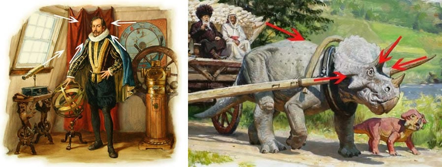
Shape and form
- Can you identify a dominant visual language within the shapes and forms shown (i.e. geometric; angular; rectilinear; curvilinear; organic; natural; fragmented; distorted; free-flowing; varied; irregular; complex; minimal)? Why is this visual language appropriate?
- How are the edges of forms treated (i.e. do they fade away or blur at the edges, as if melting into the page; ripped or torn; distinct and hard-edged; or, in the words of James Gurney, 9 do they ‘dissolve into sketchy lines, paint strokes or drips’)?
- Are there any three-dimensional forms or relief elements within the artwork, such as carved pieces, protruding or sculptural elements? How does this affect the viewing of the work from different angles?
- Is there a variety or repetition of shapes/forms? What effect does this have (i.e. repetition may reinforce ideas, balance composition and/or create harmony / visual unity; variety may create visual interest or overwhelm the viewer with chaos)?
- How are shapes organised in relation to each other, or with the frame of the artwork (i.e. grouped; overlapping; repeated; echoed; fused edges; touching at tangents; contrasts in scale or size; distracting or awkward junctions)?
- Are silhouettes (external edges of objects) considered?
All shapes have silhouettes, and vision research has shown that one of the first tasks of perception is to be able to sort out the silhouette shapes of each of the elements in a scene. – James Gurney, Imaginative Realism 9
- Are forms designed with ergonomics and human scale in mind?
Ergonomics: an applied science concerned with designing and arranging things people use so that the people and things interact most efficiently and safely – Merriam-webster.com
- Can you identify which forms are functional or structural , versus ornamental or decorative ?
- Have any forms been disassembled, ‘cut away’ or exposed , such as a sectional drawing? What is the purpose of this (i.e. to explain construction methods; communicate information; dramatic effect)?
- Would it be appropriate to use shape and form in a similar way within your own artwork?
Value / tone / light
- Has a wide tonal range been used in the artwork (i.e. a broad range of darks, highlights and mid-tones) or is the tonal range limited (i.e. pale and faint; subdued; dull; brooding and dark overall; strong highlights and shadows, with little mid-tone values)? What is the effect of this?
- Where are the light sources within the artwork or scene? Is there a single consistent light source or multiple sources of light (sunshine; light bulbs; torches; lamps; luminous surfaces)? What is the effect of these choices (i.e. mimics natural lighting conditions at a certain time of day or night; figures lit from the side to clarify form; contrasting background or spot-lighting used to accentuate a focal area; soft and diffused lighting used to mute contrasts and minimize harsh shadows; dappled lighting to signal sunshine broken by surrounding leaves; chiaroscuro used to exaggerate theatrical drama and impact; areas cloaked in darkness to minimize visual complexity; to enhance our understanding of narrative, mood or meaning)?
One of the most important ways in which artists can use light to achieve particular effects is in making strong contrasts between light and dark. This contrast is often described as chiaroscuro . – Matthew Treherne, Analysing Paintings, University of Leeds 3
- Are representations of three-dimensional objects and figures flat or tonally modeled ? How do different tonal values change from one to the next (i.e. gentle, smooth gradations; abrupt tonal bands)?
- Are there any unusual, reflective or transparent surfaces, mediums or materials which reflect or transmit light in a special way?
- Has tone been used to help communicate atmospheric perspective (i.e. paler and bluer as objects get further away)?
- Are gallery or environmental light sources where the artwork is displayed fixed or fluctuating? Does the work appear different when viewed at different times of day? How does this affect your interpretation of the work?
- Are shadows depicted within the artwork? What is the effect of these shadows (i.e. anchors objects to the page; creates the illusion of depth and space; creates dramatic contrasts)?
- Do sculptural protrusions or relief elements catch the light and/or create cast shadows or pockets of shadow upon the artwork? How does this influence the viewer’s experience?
- How has tone been used to help direct the viewer’s attention to focal areas?
- Would it be appropriate to use value / tone in a similar way within your own artwork? Why / why not?
Color / hue
- Can you view the true color of the artwork (i.e. are you viewing a low-quality reproduction or examining the artwork in poor lighting)?
- Which color schemes have been used within the artwork (i.e. harmonious; complementary; primary; monochrome; earthy; warm; cool/cold)? Has the artist used a broad or limited color palette (i.e. variety or unity)? Which colors dominate?
- How would you describe the intensity of the colors (vibrant; bright; vivid; glowing; pure; saturated; strong; dull; muted; pale; subdued; bleached; diluted)?
- Are colors transparent or opaque ? Can you see reflected color?
- Has color contrast been used within the artwork (i.e. extreme contrasts; juxtaposition of complementary colors; garish / clashing / jarring)? Are there any abrupt color changes or unexpected uses of color?
- What is the effect of these color choices (i.e. expressing symbolic or thematic ideas; descriptive or realistic depiction of local color; emphasizing focal areas; creating the illusion of aerial perspective; relationships with colors in surrounding environment; creating balance; creating rhythm/pattern/repetition; unity and variety within the artwork; lack of color places emphasis upon shape, detail and form)? What kind of atmosphere do these colors create?
It is often said that warm colors (red, orange, yellow) come forward and produce a sense of excitement (yellow is said to suggest warmth and happiness, as in the smiley face), whereas cool colors (blue, green) recede and have a calming effect. Experiments, however, have proved inconclusive; the response to color – despite clichés about seeing red or feeling blue – is highly personal, highly cultural, highly varied. – Sylvan Barnet, A Short Guide to Writing About Art 2
- Would it be appropriate to use color in a similar way within your own artwork?
Texture / surface / pattern
- Are there any interesting textural, tactile or surface qualities within the artwork (i.e. bumpy; grooved; indented; scratched; stressed; rough; smooth; shiny; varnished; glassy; glossy; polished; matte; sandy; grainy; gritted; leathery; spiky; silky)? How are these created (i.e. inherent qualities of materials; impasto mediums; sculptural materials; illusions or implied texture , such as cross-hatching; finely detailed and intricate areas; organic patterns such as foliage or small stones; repeating patterns ; ornamentation)?
- How are textural or patterned elements positioned and what effect does this have (i.e. used intermittently to provide variety; repeating pattern creates rhythm ; patterns broken create focal points ; textured areas create visual links and unity between separate areas of the artwork; balance between detailed/textured areas and simpler areas; glossy surface creates a sense of luxury; imitation of texture conveys information about a subject, i.e. softness of fur or strands of hair)?
- Would it be appropriate to use texture / surface in a similar way within your own artwork?
Industrial and architectural landscapes are particularly concerned with the arrangement of geometries and form in space… Dr. Ben Guy, Landscape and Visual Impact Assessment using CGI Digital Twins, Urban CGI 12
- Is the pictorial space shallow or deep? How does the artwork create the illusion of depth (i.e. layering of foreground, middle-ground, background ; overlapping of objects; use of shadows to anchor objects; positioning of items in relationship to the horizon line; linear perspective ( learn more about one point perspective here ); tonal modeling; relationships with adjacent objects and those in close proximity – including the human form – to create a sense of scale ; spatial distortions or optical illusions; manipulating scale of objects to create ‘surrealist’ spaces where true scale is unknown)?
- Has an unusual viewpoint been used (i.e. worm’s view; aerial view, looking out a window or through a doorway; a scene reflected in a mirror or shiny surface; looking through leaves; multiple viewpoints combined)? What is the effect of this viewpoint (i.e. allows certain parts of the scene to be dominant and overpowering or squashed, condensed and foreshortened ; or suggests a narrative between two separate spaces ; provides more information about a space than would normally be seen)?
- Is the emphasis upon mass or void ? How densely arranged are components within the artwork or picture plane? What is the relationship between object and surrounding space (i.e. compact / crowded / busy / densely populated, with little surrounding space; spacious; careful interplay between positive and negative space; objects clustered to create areas of visual interest)? What is the effect of this (i.e. creates a sense of emptiness or isolation; business / visual clutter creates a feeling of chaos or claustrophobia)?
- How does the artwork engage with real space – in and around the artwork (i.e. self-contained; closed off; eye contact with viewer; reaching outwards)? Is the viewer expected to move through the artwork? What is the relationship between interior and exterior space ? What connections or contrasts occur between inside and out? Is it comprised of a series of separate or linked spaces?
- Would it be appropriate to use space in a similar way within your own artwork?
Use of media / materials
- What materials and mediums has the artwork been constructed from? Have materials been concealed or presented deceptively (i.e. is there an authenticity / honesty of materials; are materials celebrated; is the structure visible or exposed )? Why were these mediums selected (weight; color; texture; size; strength; flexibility; pliability; fragility; ease of use; cost; cultural significance; durability; availability; accessibility)? Would other mediums have been appropriate?
- Which skills, techniques, methods and processes were used (i.e. traditional; conventional; industrial; contemporary; innovative)? It is important to note that the examiners do not want the regurgitation of long, technical processes, but rather to see personal observations about how processes effect and influence the artwork in question. Would replicating part of the artwork help you gain a better understanding of the processes used?
- Painting: gesso ground > textured mediums > underdrawing > blocking in colors > defining form > final details;
- Architecture: brief > concepts > development > working drawings > foundations > structure > cladding > finishes;
- Graphic design: brief > concepts > development > Photoshop > proofing > printing.
- How does the use of media help the artist to communicate ideas?
- Are these methods useful for your own project?
Finally, remember that these questions are a guide only and are intended to make you start to think critically about the art you are studying and creating.

Further Reading
If you enjoyed this article you may also like our article about high school sketchbooks (which includes a section about sketchbook annotation). If you are looking for more assistance with how to write an art analysis essay you may like our series about writing an artist study .
BIBLIOGRAPHY
[1] A guide for Analyzing Works of Art; Sculpture and Painting, Durantas
[2] A Short Guide to Writing About Art , Sylvan Barnet (2014) (Amazon affiliate link)
[3] Analysing Paintings , Matthew Treherne, University of Leeds
[4] Writing in Art and Art History , The University of Vermont
[5] Art History: A Preliminary Handbook , Dr. Robert J. Belton, The University of British Columbia (1996)
[6] Criticizing Art: Understanding the Contemporary , Terry Barrett (2011) (Amazon affiliate link)
[7] How to Look at Art , Susie Hodge (2015) (Amazon affiliate link)
[8] How to Look at a Painting , Françoise Barbe-Gall (2011) (Amazon affiliate link)
[9] Imaginative Realism: How to Paint What Doesn’t Exist James Gurney (2009) (Amazon affiliate link)
[10] Art History , The Writing Centre, University of North Carolina at Chapel Hill
[11] Universal Principles of Art: 100 Key Concepts for Understanding, Analyzing and Practicing Art , John A. Parks (2014) (Amazon affiliate link)
[12] Landscape and Visual Impact Assessment using CGI Digital Twins , Dr. Ben Guy, Urban CGI (2023)

Amiria has been an Art & Design teacher and a Curriculum Co-ordinator for seven years, responsible for the course design and assessment of student work in two high-achieving Auckland schools. She has a Bachelor of Architectural Studies, Bachelor of Architecture (First Class Honours) and a Graduate Diploma of Teaching. Amiria is a CIE Accredited Art & Design Coursework Assessor.
JOIN OVER 21,000 PEOPLE WHO RECEIVE OUR FREE NEWSLETTER
You will be notified first when free resources are available: Art project ideas, teaching handouts, printable lesson plans, tips and advice from experienced teachers. What are you waiting for?
Email Address*
We send emails monthly. And don’t worry, we hate spam too! Unsubscribe at any time.

If you're seeing this message, it means we're having trouble loading external resources on our website.
If you're behind a web filter, please make sure that the domains *.kastatic.org and *.kasandbox.org are unblocked.
To log in and use all the features of Khan Academy, please enable JavaScript in your browser.
AP®︎/College Art History
Course: ap®︎/college art history > unit 1.
- What is art history and where is it going?
Introduction to art historical analysis
- How to do visual (formal) analysis in art history
- Art historical analysis (painting), a basic introduction using Goya's Third of May, 1808
- A brief history of representing the body in Western painting
- A brief history of representing of the body in Western sculpture
Art as physical object
Conservation, art as visual experience, visual (formal) analysis, art as cultural artifact, subject matter / iconography, function of art, thinking critically, want to join the conversation.
- Upvote Button navigates to signup page
- Downvote Button navigates to signup page
- Flag Button navigates to signup page
Alberti’s Window
An art history blog.
- ancient Near East
- formal analysis
- introductory/survey
Wednesday, August 24th, 2011
Ancient Art: Formal Analysis Example
Note: The following post is intended to be a resource for my ancient art students. If you know of any good examples of basic formal analysis that are available online, please leave links in the comments section below! I would like to build up a list of resources for my students.
Formal elements are things that are part of the form (or physical properties) of a work of art: medium, line, color, scale, size, composition, etc. Formal analysis involves an exploration of how these formal elements affect you, as a viewer.
Formal analysis involves describing a work of art, but formal analysis goes beyond mere description. Instead, description is used as an agent to support the argument-at-hand. Although your essay will likely introduce a work of art with some general descriptions, the rest of your descriptions should be very pinpointed and with purpose. Make sure that such detailed descriptions are used to back up specific points of your argument. For this formal analysis assignment, your argument will revolve around some type of reaction to the work of art.
Your formal analysis should include some type of thesis statement that revolves around your reaction. To help you think about your own assignment and personal reaction, I have written a short sample of formal analysis below (and have underlined the thesis statement). Please also note that I am not basing my reaction on content (i.e. the subject matter, narrative, or symbolism), nor on historical context. Instead, I am focusing strictly on formal (visual or physical) elements:
Great Lyre sound box, c. 2600-2500 BCE
The front panel of the Great Lyre sound box (shown above) is an example of Sumerian art from the Ancient Near East.The panel is divided into four different registers. These registers contain four scenes with figures (mostly animals) involved in various activities. Despite the rather rigid compartmentalization of the four sound box scenes, the overall effect of the front panel of the Great Lyre sound box is one of energy and dynamism. Such energy can be seen in the color of the figures and in curvy compositional lines.
The sound box is comprised of two different colors, a dark black and a light tan. These colors are caused by the medium of the panel. Dark black is the color of bitumen, which is used for the background of the panel and lines. Light tan is the color of the inlaid shell that is used for the bodies of the figures and objects. The stark contrast of light tan against a dark background adds a sense of dynamism to the figures. The figures seem to glow and hum with life. Furthermore, these lightly-colored figures are pushed closer toward the viewer, away from the black background, which gives the figures a sense of presence and energy.
Detail of top registers of Great Lyre sound box, c. 2600-2500 BCE
The composition of the figures also lends itself to this idea of energy. The figures fill the whole space of their respective registers and scenes, giving them a strong, energetic presence. In fact, some figures strain and twist so that their bodies can fill and fit within the register space. Such dynamic twisting is especially seen in the two bulls in the upper-most register (see image above). These bulls are symmetrically placed on either side of a central human figure, creating a “Master of the Animals” motif. The bodies of the bulls twist inward toward the human figure, and but their necks and heads twist outward and slightly downward. The theme of curves and energy is underscored in the beards and hair of these three figures: each lock of hair ends with a bouncy curl.
Energy can be seen in the curvaceous lines of other figures as well. In the second register from the top, the backs and tails of the hyena and lion are comprised of swooping lines. In fact, the lines of the lion’s back are reinforced and highlighted by swooping, short lines that suggest the lion’s bushy mane. While the lion’s mane swoops toward the center of the scene, the lion’s lower back curves in the other direction. These opposing compositional lines give the panel an added sense of energy and movement.
Detail of bottom registers of Great Lyre sound box, c. 2600-2500 BCE
In the second register from the bottom, the back of the bear curves upward and downward in a lyrical, dynamic swoop (see image above). In fact, the whole body of the bear is placed at a more dynamic angle, since the bear is leaning toward the lyre placed on the left side of the scene. Some of the strings of the lyre curve upward toward the right, opposite the angle of the bear’s body, to add more opposing movement and dynamism to the overall composition.
The lowest register of the front panel contains some of the most dynamic curves and lines. The most obvious curve is found in the tail of the scorpion man on the left side of the scene. This tail curls and swoops upward, only to end with a stinger that loops downward. The shape and detail lines of the scorpion tail are also energetic. The tail is comprised of several oval shapes of decreasing sizes. These shapes are combined together to creating a visually dynamic, bouncy outline for the tail. Furthermore, the tail is full of energy because of the multiple lines that appear within each oval shape. These lines look a little like a maze or labyrinth; they visually reinforce the idea of movement through their repetition and interlocking layout.
The front panel of the Great Lyre sound box embodies energy in many ways. This energy can be seen not only because of the colors of the panel, but also through several compositional devices and lines. Such visual interest in energy is fitting for this piece, given that this sound box originally hummed with musical vibrations and the energy created by sound.
For further information about formal analysis, you may want to look at the chapter, “Formal Analysis” by Anne d’Alleva. Preview is available online here .
3 Responses to Ancient Art: Formal Analysis Example —
Wonderful! Thank you.
Hi! I was referred to this blog by a mutual friend, Nik English. I received my bachelor's degree in Art History last year and am looking for opportunities to work or continue to study in this field so if you have any advise he thought you might be able to help.
As far as Formal Analysis examples go I liked this site from the University of Arkansas because these examples also show you the format for the paper as well as the writing style. Hope that helps:
http://ualr.edu/art/index.php/home/undergraduate-information/bachelor-of-arts-in-art-ba-in-art/bachelor-of-arts-in-art-art-history-track/formal-analysis-example-1/
Thanks for the comments!
Samantha, thanks for including the link to the University of Arkansas site. I wasn't familiar with that resource beforehand! It's nice to have some student examples posted online.
Also, I'd be happy to talk with you about job or schooling opportunities. It was kind of Nik to mention me. If you want to write me an email with more information about your background and interests, I can try and give you some recommendations. My contact info is at the top left hand side of my blog homepage.
Entries RSS Comments RSS
Email Subscription
An email notification will be sent whenever a new post appears on this site.
- 18th century (38)
- 19th century (81)
- 20th century (84)
- accidental damage (2)
- act of blogging (5)
- American (1)
- ancient Near East (10)
- architecture (19)
- art crime (21)
- art history humor (6)
- Art Nouveau (1)
- art theory and philosophy (29)
- artistic mediums (2)
- Arts and Crafts (2)
- bad art (1)
- Berenson (1)
- Brazilian – Imperial and Republican (3)
- Brazilian Baroque (9)
- Byzantine (9)
- carnival (3)
- celebrities (8)
- censorship (3)
- Colonial Brazil (6)
- colonialism (8)
- conferences (1)
- contemporary art (46)
- Early Christian (7)
- Egyptian (16)
- Etruscan (6)
- female artists (25)
- female collectors (5)
- films and television (7)
- formal analysis (1)
- German Baroque (2)
- giveaway (12)
- Gombrich (3)
- Greek and Roman (46)
- guest post (4)
- historiography (4)
- Impressionism (6)
- Indigenous art (1)
- intentional damage (7)
- introductory/survey (7)
- Mannerism (7)
- Middle Ages (19)
- Minoan/Mycenaean (10)
- museums and exhibitions (38)
- Nabatean (Hellenistic) (3)
- Neoclassicism (3)
- news and links (81)
- non-Western (16)
- Northern Baroque (28)
- Northern Renaissance (40)
- photography (1)
- pop culture (11)
- portraiture (9)
- Post Impressionism (1)
- Pre Raphaelites (5)
- prehistoric art (11)
- Proto-Renaissance (2)
- Romanesque (4)
- Romanticism (3)
- Seattle Art Museum (9)
- Southern Baroque (47)
- Southern Renaissance (64)
- Spanish America (1)
- student research (1)
- teaching (4)
- textbook errors (7)
- Uncategorized (8)
- Vasari (13)
- William Morris (4)
- Winckelmann (7)
- September 2023 (1)
- August 2022 (1)
- April 2022 (1)
- February 2022 (1)
- December 2021 (1)
- August 2021 (2)
- May 2021 (1)
- February 2021 (3)
- January 2021 (1)
- November 2020 (1)
- September 2020 (1)
- May 2020 (1)
- February 2020 (1)
- October 2019 (2)
- September 2019 (1)
- July 2019 (1)
- May 2019 (1)
- April 2019 (1)
- January 2019 (1)
- December 2018 (1)
- July 2018 (1)
- April 2018 (1)
- March 2018 (1)
- February 2018 (1)
- January 2018 (1)
- December 2017 (2)
- October 2017 (1)
- September 2017 (1)
- June 2017 (2)
- May 2017 (3)
- April 2017 (1)
- March 2017 (2)
- February 2017 (1)
- January 2017 (1)
- December 2016 (1)
- November 2016 (2)
- September 2016 (1)
- July 2016 (1)
- June 2016 (1)
- May 2016 (1)
- April 2016 (2)
- March 2016 (1)
- February 2016 (3)
- January 2016 (2)
- November 2015 (2)
- October 2015 (1)
- September 2015 (1)
- August 2015 (4)
- July 2015 (2)
- June 2015 (3)
- May 2015 (2)
- April 2015 (1)
- March 2015 (2)
- February 2015 (5)
- January 2015 (2)
- December 2014 (1)
- November 2014 (1)
- October 2014 (4)
- September 2014 (2)
- August 2014 (3)
- July 2014 (1)
- June 2014 (1)
- May 2014 (2)
- April 2014 (2)
- March 2014 (3)
- February 2014 (1)
- January 2014 (1)
- December 2013 (1)
- October 2013 (2)
- September 2013 (6)
- August 2013 (2)
- July 2013 (2)
- June 2013 (4)
- May 2013 (3)
- April 2013 (4)
- March 2013 (2)
- February 2013 (4)
- January 2013 (2)
- December 2012 (4)
- November 2012 (4)
- September 2012 (4)
- August 2012 (3)
- July 2012 (4)
- June 2012 (3)
- May 2012 (2)
- April 2012 (3)
- March 2012 (2)
- February 2012 (3)
- January 2012 (3)
- December 2011 (6)
- November 2011 (3)
- October 2011 (2)
- September 2011 (6)
- August 2011 (8)
- July 2011 (4)
- June 2011 (6)
- May 2011 (5)
- April 2011 (6)
- March 2011 (6)
- February 2011 (7)
- January 2011 (8)
- December 2010 (7)
- November 2010 (8)
- October 2010 (9)
- September 2010 (10)
- August 2010 (11)
- July 2010 (7)
- June 2010 (11)
- May 2010 (9)
- April 2010 (7)
- March 2010 (10)
- February 2010 (9)
- January 2010 (11)
- December 2009 (8)
- November 2009 (8)
- October 2009 (13)
- September 2009 (9)
- August 2009 (12)
- July 2009 (12)
- June 2009 (11)
- May 2009 (9)
- April 2009 (9)
- March 2009 (11)
- February 2009 (6)
- January 2009 (8)
- December 2008 (4)
- November 2008 (3)
- October 2008 (8)
- September 2008 (4)
- August 2008 (5)
- July 2008 (3)
- March 2008 (2)
- August 2007 (2)
- July 2007 (1)
@albertis_window
- Art History Flashbook
- Art History Newsletter
- Art History Ramblings
- Art History Salon
- Art History Today
- Art Inconnu
- Art Theft Central
- ARTHistories
- Baroque Potion
- Caravaggista
- Cave to Canvas
- CultureGrrl
- Every Painter Paints Himself
- Experiments in Art History
- Giorgione et al…
- L'Historien Errant
- Martin Kemp
- Medieval Illumination
- Sedef's Corner
- SmART History Timeline
- The Canon 2010
- Three Pipe Problem
- Van Gogh's Chair
- When Art History Goes Bad
<strong data-cart-timer="" role="text"></strong>
Composition in Red Yellow Blue and Black by Piet Mondriaan
- Visual Arts
Formal Visual Analysis: The Elements & Principles of Composition Help students build techniques to interpret what they see into written words using art.
Lesson content.
Formal analysis is an important technique for organizing visual information. In other words, it is a strategy used to translate what you see into written words. This strategy can be applied to any work of art, from any period in history, whether a photograph, sculpture, painting or cultural artifact.
The Elements
The elements of formal analysis are building blocks that can be combined to create a larger structure.
Line is the most basic building block of formal analysis. Line can be used to create more complex shapes or to lead your eye from one area in the composition to another.
Value is the degree of light and dark in a design. It is the contrast between black and white and all the tones in between. Value can be used with color as well as black and white. Contrast is the extreme changes between values.
Shapes are created when lines are combined to form a square, triangle, or circle. Shapes can be organic (irregular shapes found in nature) or geometric (shapes with strong lines and angles such as circles, triangles, and squares).
Forms are three-dimensional shapes with length, width, and depth. Balls, cylinders, boxes and pyramids are forms.
Space is the area between and around objects. Increasing or decreasing the amount of space around an object affects the way we view that object.
Color differentiates and defines lines, shapes, forms, and space. Even black and white images have a huge number of different shades of gray.
Texture is the surface quality that can be seen and felt. Textures can be rough or smooth, soft or hard. Textures are often implied. For instance, a drawing of a rock might appear to have a rough and hard surface, but in reality is as smooth as the paper on which it is drawn.
The Principles
Notice how the following principles integrate the elements of formal analysis and build on one another. Note: Each principle below refers to the photograph of paddlers below to illustrate key concepts. Right-click and select "Open Image in New Tab" to view a larger version of the photo.

Balance is created in a work of art when textures, colors, forms, or shapes are combined harmoniously. In this image, notice how the photographer achieves a sense of balance by dividing the image into two sections: one half occupied by trees, and the other half by the water.
Contrast is the use of several elements of design to hold the viewer's attention and to guide the viewer's eye through the artwork. In this image, the texture of the trees contrasts with the texture of the water.
Movement is the way a viewer's eye is directed to move through a composition, often to areas of emphasis. Movement can be directed by lines, contrasting shapes, or colors within the artwork. In this work of art, our eye moves up through the pattern in the rippling surface of the water to the two paddlers. From there, our eye moves to the contrasting textures and colors of the foliage in the top half of the image.
Emphasis is created in a work of art when the artist contrasts colors, textures, or shapes to direct your viewing towards a particular part of the image. In this image, the colors of the paddlers' kayaks contrasts with the muted tones of the background. Our attention is immediately drawn to the paddlers, even though they are relatively small in scale.
Pattern is the repetition of a shape, form, or texture across a work of art. The light reflecting off of the waves in the water creates a pattern in the bottom half of the image.
Proportion is created when the sizes of elements in a work of art are combined harmoniously. In this image, all of the proportions appear exactly as one would expect; the human figures are much smaller in scale than the natural world that surrounds them.
Unity is created when the principles of analysis are present in a composition and in harmony. Some images have a complete sense of unity, while some artists deliberately avoid formal unity to create feelings of tension and anxiety. In this image, the large areas of contrasting textures, patterns and colors create a sense of balance and unity within the composition.
Once students have an understanding of formal analysis, they will be well prepared to put this theory into practice by making their own images based on the elements and principles of design. Whether in photography, sculpture, or painting, the theory of formal analysis will help students to compose their works of art as professional artists would.
Print Vocabulary

Jeremy Glatstein
Joanna McKee
December 9, 2019
Related Resources
Article art critiques made easy.
One-word answers and grunts don't count as student critiques of art. How to foster interesting and authentic discussion in the classroom.
Article Raising “Art Smart” Students in the 21st Century
So, what are 21st century skills exactly? Why do they matter to “art smart” parents and how do we help our kids?

Article Teaching Students about Self-Assessment in the Arts
Introduction to self-assessment strategies involving observation and reflection.
- Young Artists
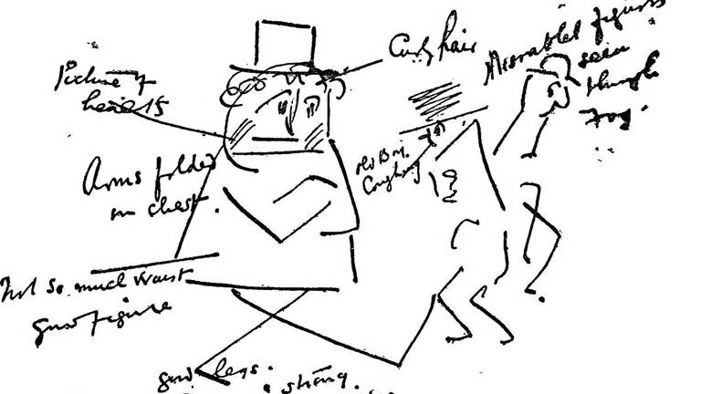
Lesson Media Awareness I: The Basics of Advertising
In this 6-8 lesson, students will examine the influence of advertising from past and present-day products. Students apply design principles to illustrate a product with background and foreground. This is the first lesson designed to accompany the media awareness unit.
- English & Literature

Lesson Exploring Weather
In this 3-5 lesson, students will analyze paintings depicting different types of weather to create an original landscape painting of a weather condition. They will analyze how weather influences culture, daily life, and mood. Students will use the elements of art criteria to discuss and critique paintings.
- Drawing & Painting
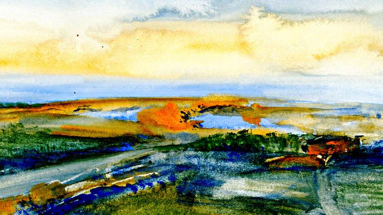
Lesson Painting: The Art of Self Expression
In this K-2 lesson, students will explore elements of art and different artists' techniques to create various styles of paintings. Students will interpret art and describe styles by using key vocabulary terms when discussing paintings.
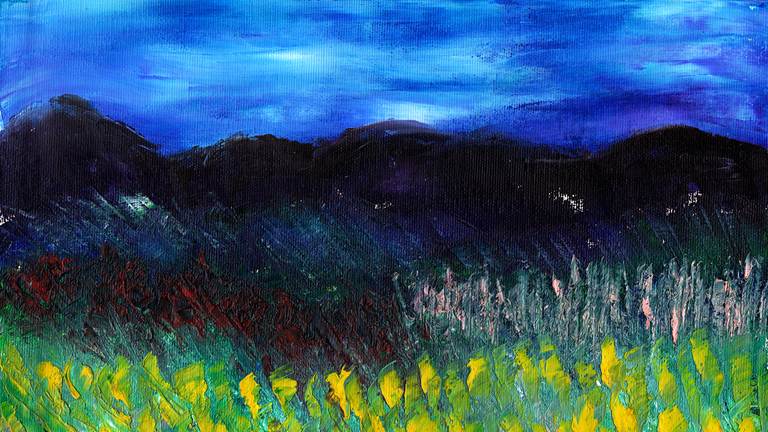
Lesson Photography: From Theory to Practice
In this 6-8 lesson, students will examine works of art and learn tools to analyze and discuss photography. Students will apply what they have learned by using cameras to document daily life in their community. They will prepare artist statements and present their work.
- Photography

Kennedy Center Education Digital Learning
Eric Friedman Director, Digital Learning
Kenny Neal Manager, Digital Education Resources
Tiffany A. Bryant Manager, Operations and Audience Engagement
Joanna McKee Program Coordinator, Digital Learning
JoDee Scissors Content Specialist, Digital Learning
Connect with us!
Generous support for educational programs at the Kennedy Center is provided by the U.S. Department of Education. The content of these programs may have been developed under a grant from the U.S. Department of Education but does not necessarily represent the policy of the U.S. Department of Education. You should not assume endorsement by the federal government.
Gifts and grants to educational programs at the Kennedy Center are provided by A. James & Alice B. Clark Foundation; Annenberg Foundation; the Andrew W. Mellon Foundation; Bank of America; Bender Foundation, Inc.; Carter and Melissa Cafritz Trust; Carnegie Corporation of New York; DC Commission on the Arts and Humanities; Estée Lauder; Exelon; Flocabulary; Harman Family Foundation; The Hearst Foundations; the Herb Alpert Foundation; the Howard and Geraldine Polinger Family Foundation; William R. Kenan, Jr. Charitable Trust; the Kimsey Endowment; The King-White Family Foundation and Dr. J. Douglas White; Laird Norton Family Foundation; Little Kids Rock; Lois and Richard England Family Foundation; Dr. Gary Mather and Ms. Christina Co Mather; Dr. Gerald and Paula McNichols Foundation; The Morningstar Foundation;
The Morris and Gwendolyn Cafritz Foundation; Music Theatre International; Myra and Leura Younker Endowment Fund; the National Endowment for the Arts; Newman’s Own Foundation; Nordstrom; Park Foundation, Inc.; Paul M. Angell Family Foundation; The Irene Pollin Audience Development and Community Engagement Initiatives; Prince Charitable Trusts; Soundtrap; The Harold and Mimi Steinberg Charitable Trust; Rosemary Kennedy Education Fund; The Embassy of the United Arab Emirates; UnitedHealth Group; The Victory Foundation; The Volgenau Foundation; Volkswagen Group of America; Dennis & Phyllis Washington; and Wells Fargo. Additional support is provided by the National Committee for the Performing Arts.
Social perspectives and language used to describe diverse cultures, identities, experiences, and historical context or significance may have changed since this resource was produced. Kennedy Center Education is committed to reviewing and updating our content to address these changes. If you have specific feedback, recommendations, or concerns, please contact us at [email protected] .
By using this site, you agree to our Privacy Policy and Terms & Conditions which describe our use of cookies.
Reserve Tickets
Review cart.
You have 0 items in your cart.
Your cart is empty.
Keep Exploring Proceed to Cart & Checkout
Donate Today
Support the performing arts with your donation.
To join or renew as a Member, please visit our Membership page .
To make a donation in memory of someone, please visit our Memorial Donation page .
- Custom Other

Fall 2018 Art 1010 at Brooklyn College
Prof. Gwendolyn Shaw
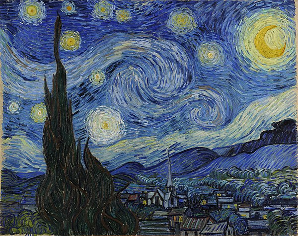
What is Formal Analysis?
Formal Analysis is a method of evaluating a piece of work. The work can be literally anything. The formal analysis of an art piece for example can be a way to evaluate the piece’s central theme or focus. Through formal analysis of an art piece, we can describe multiple characteristics of the art work such as the colors used, the type of canvas used, contrast, the historical context of the art work, and also the scale and size of the art piece. Another important feature of formal analysis is that we are supposed to ask ourselves important questions. For example, “what was the artist going through at time of painting this piece?” Another question might be: “Is this painting for another person at the time or was it painted by the artist to convey a certain message or theme?” You can also dive deep into the historical context of the painting and learn about the politics, culture, religion, or the economics during the time of the artist’s life. The Formal Properties of art work as discusses in class and the text include the lines used in work. The motive behind the size and scale of the work. The type of material of the canvas as mentioned before is another formal property. Other formal properties can be the illusions used (Mimesis). And lastly, the historical overview of the piece of work as mentioned before. For example, the formal properties of the featured art work, “The Starry Night,” by Vincent van Gogh would involve: Colors are mostly blue, black, and yellow, it is an oil on canvas, the time of drawing is 1889 which inspired him to pursue a post-Impressionism-type painting.
2 thoughts on “What is Formal Analysis?”
Rafsan, Our posts were very similar in that you started off with the definition of formal analysis. You also went through the different formal properties as I did (i.e line, art, the focus of the piece, and historical context). We also discussed how analysing a piece can be done by asking important questions. Although both our post pose an example that was analysed, we used different examples. I used the Dior’s ad while you used “The Starry Night,” by Vincent van Gogh. I do appreciate you using artwork outside the class discussion. Also, how you analysed it, showing the date and how it motivated him to paint his post-Impressionism-type artworks. Great Job!
Wow! Thanks for the comment on my post Rachel! The Starry Night is truly an awe-inspiring piece of work!
Leave a Reply Cancel reply
You must be logged in to post a comment.
This site uses Akismet to reduce spam. Learn how your comment data is processed .
Need help with the Commons?
Email us at [email protected] so we can respond to your questions and requests. Please email from your CUNY email address if possible. Or visit our help site for more information:

- Terms of Service
- Accessibility
- Creative Commons (CC) license unless otherwise noted

Purdue Online Writing Lab Purdue OWL® College of Liberal Arts
Writing Essays in Art History

Welcome to the Purdue OWL
This page is brought to you by the OWL at Purdue University. When printing this page, you must include the entire legal notice.
Copyright ©1995-2018 by The Writing Lab & The OWL at Purdue and Purdue University. All rights reserved. This material may not be published, reproduced, broadcast, rewritten, or redistributed without permission. Use of this site constitutes acceptance of our terms and conditions of fair use.
These OWL resources provide guidance on typical genres with the art history discipline that may appear in professional settings or academic assignments, including museum catalog entries, museum title cards, art history analysis, notetaking, and art history exams.
Art History Analysis – Formal Analysis and Stylistic Analysis
Typically in an art history class the main essay students will need to write for a final paper or for an exam is a formal or stylistic analysis.
A formal analysis is just what it sounds like – you need to analyze the form of the artwork. This includes the individual design elements – composition, color, line, texture, scale, contrast, etc. Questions to consider in a formal analysis is how do all these elements come together to create this work of art? Think of formal analysis in relation to literature – authors give descriptions of characters or places through the written word. How does an artist convey this same information?
Organize your information and focus on each feature before moving onto the text – it is not ideal to discuss color and jump from line to then in the conclusion discuss color again. First summarize the overall appearance of the work of art – is this a painting? Does the artist use only dark colors? Why heavy brushstrokes? etc and then discuss details of the object – this specific animal is gray, the sky is missing a moon, etc. Again, it is best to be organized and focused in your writing – if you discuss the animals and then the individuals and go back to the animals you run the risk of making your writing unorganized and hard to read. It is also ideal to discuss the focal of the piece – what is in the center? What stands out the most in the piece or takes up most of the composition?
A stylistic approach can be described as an indicator of unique characteristics that analyzes and uses the formal elements (2-D: Line, color, value, shape and 3-D all of those and mass).The point of style is to see all the commonalities in a person’s works, such as the use of paint and brush strokes in Van Gogh’s work. Style can distinguish an artist’s work from others and within their own timeline, geographical regions, etc.
Methods & Theories To Consider:
Expressionism
Instructuralism
Postmodernism
Social Art History
Biographical Approach
Poststructuralism
Museum Studies
Visual Cultural Studies
Stylistic Analysis Example:
The following is a brief stylistic analysis of two Greek statues, an example of how style has changed because of the “essence of the age.” Over the years, sculptures of women started off as being plain and fully clothed with no distinct features, to the beautiful Venus/Aphrodite figures most people recognize today. In the mid-seventh century to the early fifth, life-sized standing marble statues of young women, often elaborately dress in gaily painted garments were created known as korai. The earliest korai is a Naxian women to Artemis. The statue wears a tight-fitted, belted peplos, giving the body a very plain look. The earliest korai wore the simpler Dorian peplos, which was a heavy woolen garment. From about 530, most wear a thinner, more elaborate, and brightly painted Ionic linen and himation. A largely contrasting Greek statue to the korai is the Venus de Milo. The Venus from head to toe is six feet seven inches tall. Her hips suggest that she has had several children. Though her body shows to be heavy, she still seems to almost be weightless. Viewing the Venus de Milo, she changes from side to side. From her right side she seems almost like a pillar and her leg bears most of the weight. She seems be firmly planted into the earth, and since she is looking at the left, her big features such as her waist define her. The Venus de Milo had a band around her right bicep. She had earrings that were brutally stolen, ripping her ears away. Venus was noted for loving necklaces, so it is very possibly she would have had one. It is also possible she had a tiara and bracelets. Venus was normally defined as “golden,” so her hair would have been painted. Two statues in the same region, have throughout history, changed in their style.
Compare and Contrast Essay
Most introductory art history classes will ask students to write a compare and contrast essay about two pieces – examples include comparing and contrasting a medieval to a renaissance painting. It is always best to start with smaller comparisons between the two works of art such as the medium of the piece. Then the comparison can include attention to detail so use of color, subject matter, or iconography. Do the same for contrasting the two pieces – start small. After the foundation is set move on to the analysis and what these comparisons or contrasting material mean – ‘what is the bigger picture here?’ Consider why one artist would wish to show the same subject matter in a different way, how, when, etc are all questions to ask in the compare and contrast essay. If during an exam it would be best to quickly outline the points to make before tackling writing the essay.
Compare and Contrast Example:
Stele of Hammurabi from Susa (modern Shush, Iran), ca. 1792 – 1750 BCE, Basalt, height of stele approx. 7’ height of relief 28’
Stele, relief sculpture, Art as propaganda – Hammurabi shows that his law code is approved by the gods, depiction of land in background, Hammurabi on the same place of importance as the god, etc.
Top of this stele shows the relief image of Hammurabi receiving the law code from Shamash, god of justice, Code of Babylonian social law, only two figures shown, different area and time period, etc.
Stele of Naram-sin , Sippar Found at Susa c. 2220 - 2184 bce. Limestone, height 6'6"
Stele, relief sculpture, Example of propaganda because the ruler (like the Stele of Hammurabi) shows his power through divine authority, Naramsin is the main character due to his large size, depiction of land in background, etc.
Akkadian art, made of limestone, the stele commemorates a victory of Naramsin, multiple figures are shown specifically soldiers, different area and time period, etc.
Iconography
Regardless of what essay approach you take in class it is absolutely necessary to understand how to analyze the iconography of a work of art and to incorporate into your paper. Iconography is defined as subject matter, what the image means. For example, why do things such as a small dog in a painting in early Northern Renaissance paintings represent sexuality? Additionally, how can an individual perhaps identify these motifs that keep coming up?
The following is a list of symbols and their meaning in Marriage a la Mode by William Hogarth (1743) that is a series of six paintings that show the story of marriage in Hogarth’s eyes.
- Man has pockets turned out symbolizing he has lost money and was recently in a fight by the state of his clothes.
- Lap dog shows loyalty but sniffs at woman’s hat in the husband’s pocket showing sexual exploits.
- Black dot on husband’s neck believed to be symbol of syphilis.
- Mantel full of ugly Chinese porcelain statues symbolizing that the couple has no class.
- Butler had to go pay bills, you can tell this by the distasteful look on his face and that his pockets are stuffed with bills and papers.
- Card game just finished up, women has directions to game under foot, shows her easily cheating nature.
- Paintings of saints line a wall of the background room, isolated from the living, shows the couple’s complete disregard to faith and religion.
- The dangers of sexual excess are underscored in the Hograth by placing Cupid among ruins, foreshadowing the inevitable ruin of the marriage.
- Eventually the series (other five paintings) shows that the woman has an affair, the men duel and die, the woman hangs herself and the father takes her ring off her finger symbolizing the one thing he could salvage from the marriage.

- school Campus Bookshelves
- menu_book Bookshelves
- perm_media Learning Objects
- login Login
- how_to_reg Request Instructor Account
- hub Instructor Commons
- Download Page (PDF)
- Download Full Book (PDF)
- Periodic Table
- Physics Constants
- Scientific Calculator
- Reference & Cite
- Tools expand_more
- Readability
selected template will load here
This action is not available.

1.6: Tools of the Trade – Formal and Art Historical Analysis
- Last updated
- Save as PDF
- Page ID 107351
How to Look At (and Think About) Art
By Sarah Churchill
In the discipline of art history, the artist and his labors form the objects of our scholarly interest. Our research, which considers not only what the art looks like, but what the works means, involves what we call "formal analysis" and "art historical research." With formal analysis, we are trying to understand the appearance of the work as a series of purposeful choices made by the artist. We seek to know why these choices were made and how they contribute to the overall impact and meaning of the work. With art historical research, we seek to understand the social, cultural, economic and historical contexts in which artists live and work. This involves reading primary and secondary resources in order to learn about the conditions of artistic production. We will discuss each of these in greater detail below.
When art historians look at and think about art, many questions come to mind. These may include: Why does a work look as it does? Who made the work? Why did they make it? What does it mean? In what style was the work produced? What is the work's purpose? Who was it produced for? By using both formal analysis and art historical research, we come to understand how the work of art communicates as it does. We can also begin to understand how meaning can change over time or how meaning is impacted by contexts of display (an altar in a church versus an altar on display in a museum for example) and layers of time and space. As Picasso explained, a picture "lives a life like a living creature…the picture lives only through the man who is looking at it.”
Picasso's statement here reminds us that while artists create with specific intentions, works of art are also socially produced, influenced by politics, religion, culture and social circumstances and even by our own biases and experiences. We too bring something to the study of art. According to James Elkins, art doesn’t “speak”, we speak for it. As viewers we bring our own meanings into the study of art and we draw understanding from our own experiences. Therefore, it's important that we understand our own critical thinking. As art historians, we learn to separate subjective responses and opinions from that which is observably true and objective.
Formal Analysis: Making Thinking Visible
Why is art so compelling ? Formal analysis, or a detailed examination of the physical object itself and the elements and principles of design that make up a work of art, gives you the language to describe and understand your experience with art more fully. Basically, formal analysis is the means by which you slow down and observe different aspects of the work of art, like the use of color or textures, and consider how the work's observable characteristics contribute to the meaning or function of the work. It is a process that helps to make our own thinking more visible.
In formal analysis, we temporarily put aside questions of historical context to focus solely on what the work looks like . Here we develop detailed descriptions of the visual properties and analyze the impact and effect of these characteristics on the work as a whole. A series of broken, jagged lines, for example, can communicate aggression. It might make you feel uneasy. Conversely, a smooth, meandering line can signal playfulness. Your response as a viewer may be one of joy or pleasure. Color, composition, texture, etc. all play a part in the way the work of art communicates its meaning to the viewer.
The process of carefully looking and then reflecting on what you're observing reveals what the brain does automatically when you experience a work of art. First you observe, then you analyze and react. Formal analysis slows this process down and helps you to understand it better. It forces you to carefully consider the choices an artist has made and the effects of these decisions upon the viewer.
Although your subjective (personal) response is part of a formal analysis, judgment ("I like" or "I don't like;" "This is beautiful," or "This is not beautiful") is not the end goal in formal analysis. Rather, formal analysis deconstructs our thinking about works of art. With slow, careful observation, we begin to unpack a work of art by understanding the series of choices the artist has made. Formal analysis helps us to understand both artistic intentions and our own thinking more deeply. The video below provides a useful example of formal analysis in action.
Formal (or Visual) Analysis "How To" - a Quick Start Guide
It helps to organize your looking according to the various elements of principles of design (see section 1.2), skipping any that don't necessarily apply to the work your analyzing. Creating a chart or mind map is also a useful way to collect your thoughts. The categories below will help you get started.
- composition
- material (or medium)
- form (or shapes)
- light (or tone)
- textures or patterns
1. Begin by considering the piece as a whole. Note your sensations and subjective reactions but put them aside. You’ll come back to them later.
2. Create a brief “snapshot” that describes, in a sentence or two, what it is you’re looking at. This snapshot might also be understood as the subject matter or narrative of the work Ex. "A portrait of a young woman with red hair in a white dress holding a black cat lovingly in her lap." or "A seascape featuring an enormous clipper ship being tossed in an angry black sea at dusk." Remember that a subject need not be figurative or narrative. Abstract art also has a subject, though the subject might be color or form itself!
3. What do you see? Look at the work in detail. Consider the qualities of color, line, form, etc. and make notes about what you observe. Use the list of categories provided to help organize your observations, or create your own. Use lots of describing words. No detail is too small! Questions listed below will help you get started:
- What colors are used? Are they warm or cool? Are they harmonious or do they clash? Ex. "burnt orange sun - contrasts with cobalt sky"
- What shapes or forms do you see? Are they amorphous, rectangular, figurative etc.?
- What materials are used? (oil paint, graphite, marble, stone, metal, fabric. etc.)
- Are there words, numbers or letters?
- Are there any recognizable figures or is the work abstract?
- Notice line if it exists. Describe it in detail: fluid, curving, sharp, wide, dashed, etc. "solid, thin and snaking line is used to suggest the edges of the various forms of a desk and chair"
- Is the work three-dimensional or flat?
- Is the space deep or shallow? Explain your answer.
- Describe the light. Where does it fall? Are parts of the image obscured by light or lack of it?
4. Support evaluative statements ("I feel like," or "this looks like") with visual evidence. What do you see that makes you say that? Ex. "I think the woman in the painting is sad because she holds her head in hands and looks away from us. Her body language, which is hunched over, suggests that she is in pain." Be careful not to assume anything - always be asking yourself, "what's the visual evidence that supports this idea?"
5. Consider the role of each of the elements you've observed in contributing to the work's meaning or function. Refer back to your initial subjective reaction here. A night sky, for example, may feel peaceful or ominous, depending upon specific choices the artist has made. Ask why different elements of the work operate as they do. Why did the artist choose these colors, textures, composition, etc.?
6. Discuss meaning of the work only after you’ve carefully considered formal properties and analyzed their purpose within the larger work. Revisit your initial reactions. Have they changed? Which of the formal elements you observed made you feel that way? If your feelings have shifted, why?
Art Historical Analysis:
Clearly, there are limits to what art historians can understand about a work just by looking at it! In order to get at the context of how or why a work was produced, or what it might mean, we must incorporate additional resources and information. With art historical analysis, we compare what we see against what we know of the longer timeline of art history. We might, for example, compare a painting or sculpture against other works with which it may share stylistic characteristics. Or, we may look for ways in which the work in question is different from other works from the same period or by the same artist. Comparison can tell art historians an awful lot about meaning and production in art.
We also consult primary and secondary resources to learn about the conditions and circumstances of artistic production. Primary resources are an immediate, first-hand account and include legal documents, newspaper articles, speeches, diaries, letters, interviews, archival records, auto-biographies, economic data, ledgers and photographs. A secondary resource is one step away from the primary resource. The author has consulted the primary resources and is distilling and analyzing them for you, the reader. A secondary resource may include a survey text, an anthology, a biography, a scholarly article or a documentary.
Art historians use both formal analysis and historical research to understand better the history of art. Note in the video below how the narrators, Beth Harris and Steven Zucker, consider Goya's Third of May (1808). They begin with a formal analysis before moving on to a discussion of the subject matter (or narrative). Finally, the historical context of the painting's production is explored. As you watch, make note of all the different kinds of questions Harris and Zucker pose of the painting and then see if you can determine what kinds of evidence and which methods of research (formal or historical) were used to answer them. The video's conclusion illustrates how formal analysis, subject matter and historical research can be brought together to illuminate how and why Goya's Third of May remains such an arresting painting.
Want to create or adapt books like this? Learn more about how Pressbooks supports open publishing practices.
1 Visual Analysis 1: The Elements of Art
Visual analysis 1: the elements of art.
Visual Analysis is the backbone of art appreciation. It takes a bit of practice, but once you have mastered the skills, it can help you to analyze any works of art you come across. It will even help you to understand why things you see every day – ads in magazines, billboards, television shows, movies, really all things visual – are (or are not) effective.
In order to perform a visual analysis, you need to realize that in every visual image there are multiple things at work that affect our response to it: the visual elements (also called formal elements ) that compose the image; the way these elements relate to one another, called composition ; and the cultural context in which the image is made and viewed. Visual analysis only deals with the first two. This introduction will first provide a definition of each visual element, accompanied by examples, and then will define the principles of composition , also with examples. There will be a number of terms introduced here, but the point is not to overwhelm you with jargon. Once you know the terms for things, you see them more clearly. These terms are helpful not only to describe works of art but also to see them. It is important to note that these categories all blend into one another – textured forms existing in space can be made of colored shapes defined by lines!
The Elements of Art
Line : A path either represented or implied Shape : The property of a two-dimensional form, usually defined by a line around it Color : The light reflecting off objects, divided into hue, value and intensity Space : Depth, real or represented, as well as the general area within a work Form : The property of a three-dimensional object Texture : The feeling of a surface, real or represented [1]
Line is the most basic visual element. Lines can be used to define shapes and figures, but also to indicate motion, emotion and other elements. In a woodblock print of the Four Horsemen of the Apocalypse by Albrecht Dürer (ca. 1497–98), contour lines – lines that define shapes – are used to mark the outside of all of the elements of the image. The outline of the hat on one of the horsemen, for example, is clearly made by a few black contour lines. This simple device is so effective that it is hard to remember that there is no hat here, only a few black marks on a creamy white page.
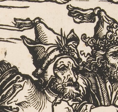
Note, though, that lines are also used to show shading – the representation of shadows caused when light hits one side of an object, leaving the other in shadow. On the hat, for example, the closely spaced lines, called hatching , show that the left side of his hat is in a shadow. This also helps the hat to look more three-dimensional, giving it a sense of form .
Contour lines outline all the figures and forms in the image, creating the illusion of shading and form. In addition, there are horizontal lines in the background. While these do create shading, they also help create the sense that the riders are moving rapidly from left to right. Motion lines may be familiar to you from comic strips, like in the Krazy Kat image below, but they appear in all sorts of work.
In the Dürer print, we can also divide the lines into organic lines and inorganic or geometric lines (See the section on shape below for more on organic and inorganic). Organic lines are loose, curving, irregular lines like those found in nature. In the Dürer woodcut, the lines of the horses’ manes and tails, the figures’ hair, and the ruffled clouds are all organic. Inorganic lines are generally straight or perfectly curving lines, like those found in geometry. In Dürer’s image, most of the lines are organic, but the horizontal hatching lines in the background are inorganic.
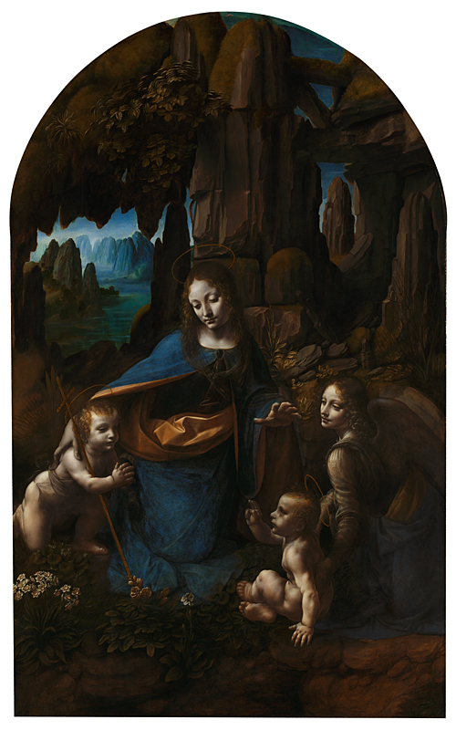
We can also look for implied lines . These are not actually drawn, but we can connect the dots (literally or figuratively) to create the lines in our minds. Leonardo da Vinci’s Virgin of the Rocks (1483-1486) contains wonderful examples. Here, the implied lines are sight lines , which guide us throughout the image. These help us know where to look, and show us what is important in the painting. Follow the gazes of the figures as they look at and gesture toward one another.
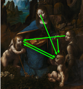
The angel at the right looks at the infant John the Baptist, at the left. He looks at the infant Jesus, who in turn looks back again at him. Above, Mary looks down at Jesus, and also gestures toward him with her hand. Basically, once we make it into the space of the painting, we become locked in a cycle of movement between the holy figures, guided by their sight lines.
Artists can use colors for many reasons other than to simply duplicate reality ( naturalism , discussed below) including setting moods and highlighting importance. The colors of the world can be divided on a few scales. When we use the term “color” casually, what we usually mean is hue. The hues appear on the visual spectrum:

On the spectrum, we see the pure hues. These can be divided into primary colors , secondary colors and tertiary colors , as on this color wheel. Primary colors are, for most art media , red, yellow, and blue (the exception is the additive color system, which is used in computer screens, theater lighting and the like, and has red, yellow, and green as its primary colors).
All the rest of the colors can be made from these. Secondary colors are made by mixing two primary colors: Red and yellow make orange, and so on. Tertiary colors are made by mixing a primary color with a secondary color. The colors opposite one another (like red and green or blue and orange) are complementary colors , which tend to stand out boldly next to one another. These are therefore often used for university colors and sport team logos. Colors next to one another (like red and orange or blue and green) are analogous colors , and these tend to blend together more smoothly.
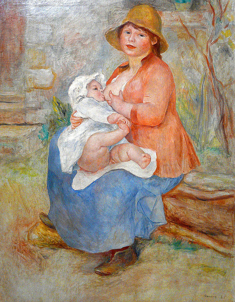
The colors on the left of this wheel are called cool colors and those to the right are warm colors . Using cool or warm colors in an image can create moods. Pierre Auguste Renoir used warm colors for his Mother and Child (1886), creating a warm, cheerful, inviting scene. The oranges, pinks and yellows dominate the image. Jean-Baptiste-Camille Corot presents a similar subject in his Mother and Child (ca. 1860), but through the use of cool colors, instead creates a sad, cold scene dominated by blues and greens. Neither of these artists was worried about portraying the world as it really looked. Instead, they used color to inspire feelings in the viewer.
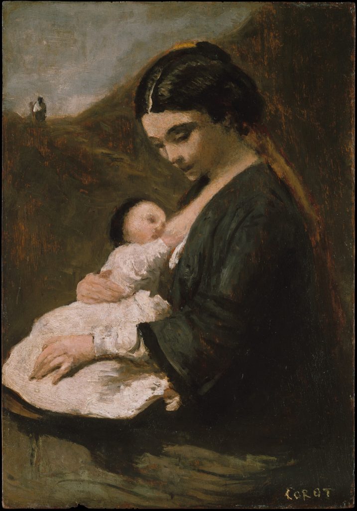
Color can also be considered in terms of value , which is the degree of lightness or darkness of a color. If we add white to a hue, we get a tint . If we add black, we get a shade .
There are many tints in the Renoir’s Mother and Child , and many shades in Corot’s Mother and Child . Tints tend to be more cheerful – pastel colors are all tints. Shades tend to be gloomier. Indeed, some terms for moods are based on these properties. Some speakers of english might say that a cheerful person is “lighthearted,” or that an angry person is “in a dark temper.” It is important to note that the associations that cultures make with colors are somewhat arbitrary, and are not universal. Some cultures see black as the color of death, perhaps inspired by thoughts of the darkness of a grave, while others see white as the color of death, perhaps inspired by the whiteness of bones. Associating white and black with qualities that have nothing to do with appearance is particularly dangerous. For example, we are used to thinking of white as the color of goodness and black as the color of evil, but this arbitrary association reinforces racist modes of thought – think, for example, of “a white knight,” or of someone “going over to the dark side.” These sorts of expressions are extremely common, and most people use them unthinkingly, but they should be reconsidered. The same is true of interpretations of colors in works of art. Such things are rarely – if ever – neutral.
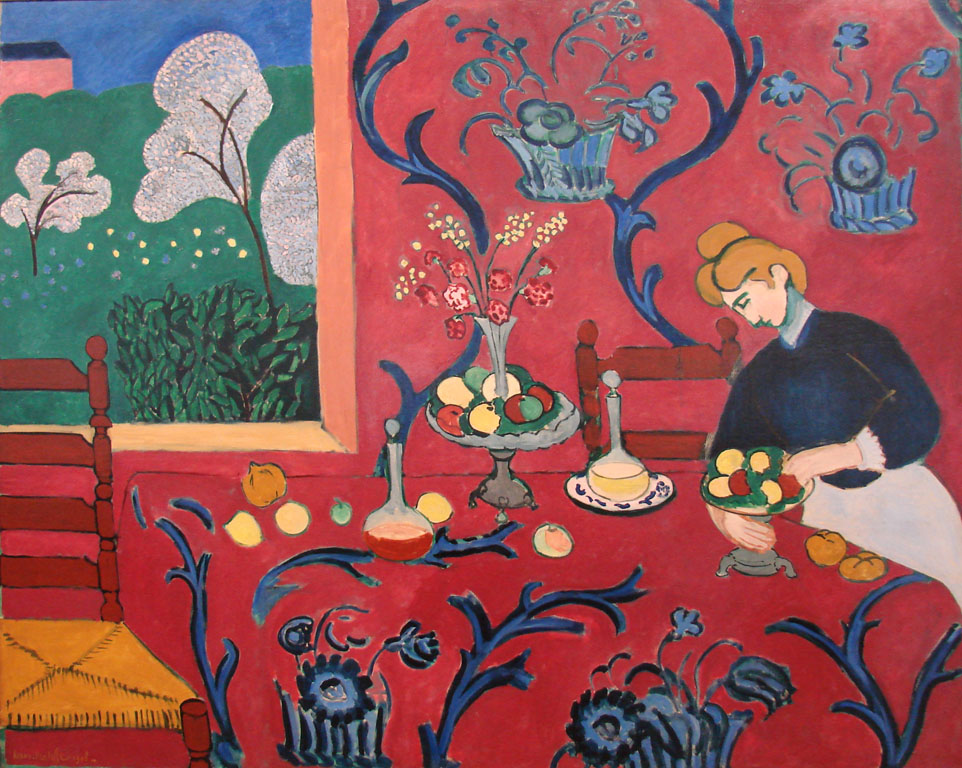
Finally, intensity or saturation is how bright or dull a color is. Henri Matisse tended to use very saturated colors, as in his La Chambre Rouge (1908), whereas in Garden Flowers (1540), painted by a follower of the artist Chen Chun, we see a much more muted palette with very little saturation of colors. The colors in Garden Flowers are mostly washed out. The grey-green of the trees and pinks of the blossoms are low in saturation, and do not stand out sharply from the beige paper on which they were painted. The Matisse painting, on the other hand, is a blaze of colors. The vibrant reds of the wall and tablecloth dominate the image, in sharp contrast with the green grass showing through the window and the blues curving throughout the image.
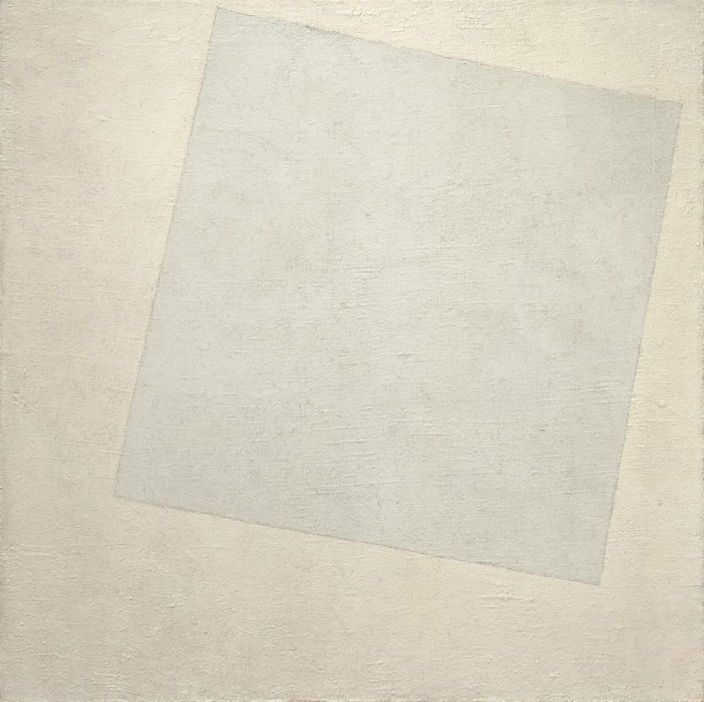
Contrast is the amount of variation between the highest and lowest values in a work of art. This is perhaps most commonly used to talk about photography, but can be applied to any works. Kazimir Malevich’s Suprematist Composition: White on White ( 1918) has very low contrast. There are no dark blacks, no stark whites; everything is in very similar shades of pale gray. The low contrast conveys the soft and gentle feeling of a heavy mist over quite water.
On the other hand, Nagesh Jayaraman’s Freedom is to break free from all shackles……. (2012) has extremely high contrast, meaning that the difference in the whites and blacks is much greater. Indeed, the images is almost entirely black and white. The effect is much sharper and crisper, making an ordinary scene feel weightier. Similarly, Kara Walker’s silhouette image Before the Battle (Chickin’ Dumplin’) (1995), the contrast is absolute.
We see only black and white. In this case, the artist is using the power of this contrast to draw the viewer’s attention to some of the problems in US race relations, and their origins in the institution of chattel slavery, in which people and their children are bought and sold as property. This system of the dehumanization and abuse of human beings was justified by arguments that the world was, in a sense, black and white, that these two colors, when thought of as racial categories, were absolute and absolutely different. Seeing Walker’s images in only black and white. and reduced to two-dimensional cut-outs, is a reminder of the falseness of the racist claims on which the system of enslavement was built. Therefore, while visual elements produce visual effects, it is important to remember that their implications can extend well beyond the purely visual.
Shape and Form
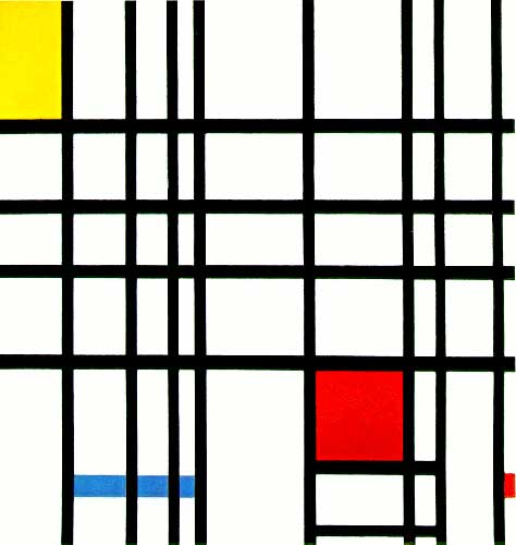
Shape builds on line and color, as it has to be made of one or both of these. Shape is the property of a two-dimensional form, usually defined by a line around it or by a change in color. Like line, there are two main types of shapes, geometric and organic. While most works of art contain both geometric and organic shapes, looking at those that are more completely divided can serve to clarify the qualities. Piet Mondrian is an excellent example of an artist who used geometric shapes almost exclusively. In his Composition with Yellow, Blue and Red (1937-42), Mondrian uses straight, vertical and horizontal black lines to divide his canvas into rectangles of primary colors. Nothing here gives the impression of the natural world. On the other hand, Maori facial tattooing, known as moko , uses primarily organic shapes.

They are still, like Mondrian’s shapes, generally abstract – they do not depict any clear images – but the shapes are like those found in nature, curving, twisting and spiraling across their bearers’ faces. The edges of the lines and shapes are crisp, but the forms are curving fluid.
Form is actual, three-dimensional shape, though it is often used to describe the illusion of three-dimensionality, as well. Like shape, form can be geometric or organic.
A small korvar – a representation of an ancestor – from Indonesia mixes these form types well. While the figure is predominantly geometric, with the squared-off face and the nose shaped like a arrow pointing downward, the curving organic shapes on the panel below the face soften this effect.
Space is used to refer both to depth, real or represented, and also to the general surface area within a work of art. Some periods of art history show a great deal of interest in creating convincing illusions of three-dimensional space in two-dimensional media. Perhaps the most iconic (though certainly not the only) example of this is the Italian Renaissance (ca. 1400-1600), when artists very deliberately worked to created convincing illusions of depth. Look at how Raphael creates an illusion of three-dimensional form in his La Donna Velata (c a. 1515). Through careful variations in value, particularly in shading – the use of darker colors to create the illusion of shadows – Raphael convinces us that the woman in the painting is really there in three dimensions. This is the same effect we saw in the Dürer woodcut print discussed above, but the medium – oil paint – allows for much smoother and finer variations in hue, value, shades and tints, creating a much more convincing illusion of three-dimensional forms.
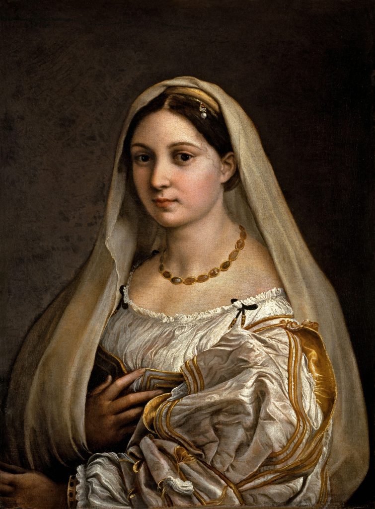
Light seems to strike the woman from her left, casting her right side in shadow. The folds of her voluminous sleeve are a particularly splendid example of the illusion of space. Even examining a small detail of it, it is hard to believe that there is no depth, at all, just thin layers of paint sitting on flat canvas.
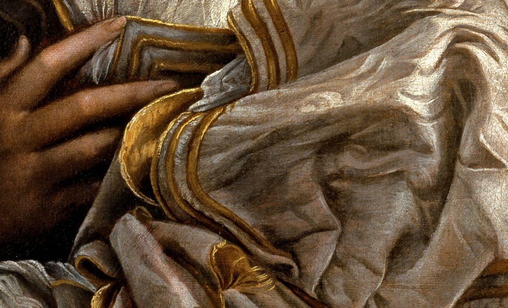
For sharp contrast, we can examine a detail of a page of a medieval Irish Book of the Gospels, ca. 750. Both images show a person in voluminous robes, looking out at us, but this is where the similarities end. Raphael’s figure is lit softly, creating highlights and shadows that create a sense of roundness and weight to her body and clothes. The figure of John the Evangelist from the Irish Gospels, on the other hand, is almost totally flat. There is virtually no shading to his body and the folds on his clothes are purely schematic patterns. If we isolate a small detail of John’s clothing, as we did with La Donna Velata’s , it is difficult to even recall that this series of lines and colors is intended to be seen as a three-dimensional form, at all.
There are various methods used by artists to create the illusion that their figures exist in three-dimensional space. Among the more effective are linear perspective and atmospheric perspective . Another work from the Italian Renaissance will serve to demonstrate both. Pietro Perugino’s Christ Handing the Keys to St. Peter ( 1481-82), uses both linear and atmospheric perspective to create the very convincing illusion of depth.
Linear perspective is based on the optical illusion that parallel lines seem to converge as they recede into the distance. Railroad tracks are the classic example, as in Edouard Baldus’s Gare d’Enghein ( 1855).
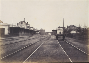
If we overlay the lines used on Perugino’s painting, we can see how he used this effect.
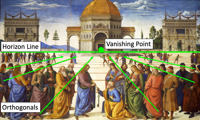
The lines are called orthogonal lines or orthogonals and they meet on the horizon line , at the vanishing point . Note that as all the orthogonals converge, the forms also get smaller. The tool of one-point linear perspective is very simple, and artists can use it to create a convincing illusion of depth with only a few pencil strokes and without the careful measuring and use of a ruler, as in Rembrant van Rijn’s etching of Cottages and Farm Buildings with a Man Sketching ( ca. 1645).
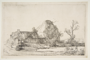
Two- and three-point linear perspective are slightly more complicated, but operate on the same general principles and produce similar results.
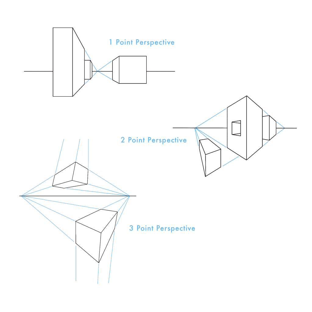
Perugino also uses atmospheric perspective. This is based on the optical effect that makes objects in the distance appear paler, bluer, and less detailed that objects that are close to us. This effect is perhaps most striking when we look at images of mountains in the distance, as in Claude Lorrain’s Landscape with the Trip into Egypt ( ca. 1647). Note how the color of the figures in the foreground – the portion of the image that appears to be closest to the viewer – are more vibrant than the colors in the background .
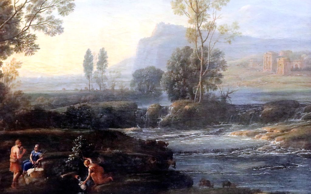
Returning to Perugino’s painting, we can see that he has also relied on this effect, carefully making the figures in the foreground bolder in color and the smaller figures in the middle ground paler, while the hills in the background seem to fade away into pale blues.
It is important to note, though, that the use of various techniques to create a convincing illusion of depth does not make Raphael or Perugino “better” artists than the anonymous medieval monk who painted the page of the Book of the Gospels, nor does it make their works any “better” or more sophisticated. The illusion of depth is one of the many tools in the artist’s toolbox, and it is serves some purposes very well, but it not always the most powerful or effective way to convey an idea. Indeed, sometimes it can be in direct conflict with the intentions of an artist.
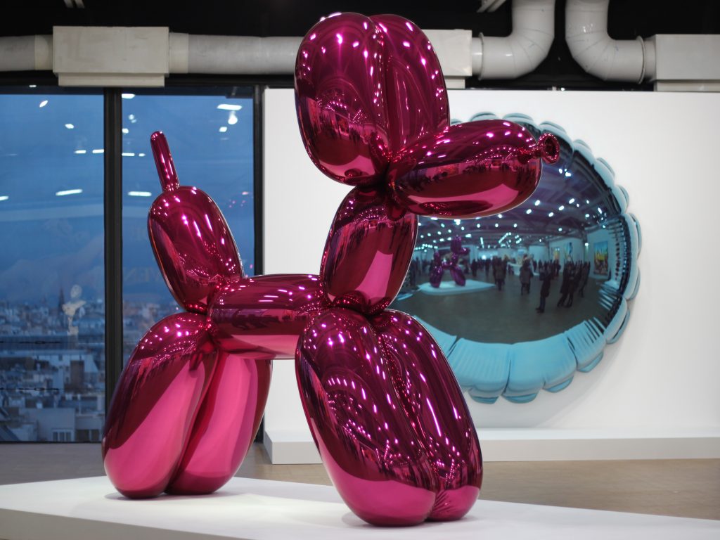
Texture is the feeling of a surface, real or represented. This might refer to the roughness or smoothness of actual objects and art media, or to the illusion of these properties. Jeff Koons’ Balloon Dog (1994) has a perfectly smooth, mirrored surface it is difficult to resist touching (though we must). It is this surface texture that turns these replicas of commonplace, short-lived, disposable items into precious objects. In contrast, the coarse, bristly surface of an ancient Shang Dynasty Fang-Ding – a ritual vessel used in worshipping dead ancestors – grants the work a vibrant energy, but does not invite our touch.
The illusion of texture is no less important to our experience of works of art. Dutch still lifes are justly famous for their careful, illusionistic replication of objects. The smooth silver plates and glass goblet of Pieter Claesz’s Still Life (ca. 1623) seem to tease us, as do the rougher nuts and breads, and the flaky pie. The lemon peel appears to dangle out of the image itself, just beyond our grasp, and therefore makes this magnificent spread all the more tantalizing.
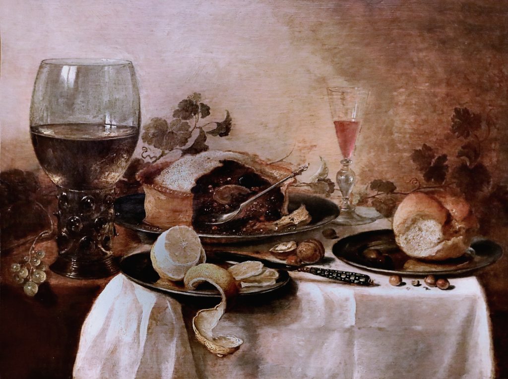
Media Attributions
- Albrecht Dürer, Four Hoursemen of the Apocalypse, woodcut print, ca. 1497/1498 (Metropolitan Museum of Art, New York). Photo: Public Domain.
- Detail of hat, Albrecht Dürer, Four Hoursemen of the Apocalypse, woodcut print, ca. 1497/1498 (Metropolitan Museum of Art, New York). Photo: Public Domain.
- George Herriman, Krazy Kat – Out of My Way Woim, ink on paper, ca. 1920, Photo CC BY-NC-ND 2.0
- Leonardo da Vinci, The Virgin and the Rocks, oil on poplar, thinned and cradled, ca. 1491 (National Gallery, London). Photo: CC BY-NC-ND 4.0.
- Sight Lines in Leonardo da Vinci, The Virgin and the Rocks
- Visible Light Spectrum. Image: Mari H.
- Color Wheel. Image: Mari H.
- Pierre-Auguste Renoir, Maternité, oil on canvas, 1885 (Musée d’Orsay, Paris). Photo: CC BY-NC 2.0.
- Jean-Baptiste-Camille Corot, Mother and Child, oil on wood, ca. 1860 (Metropolitan Museum of Art, New York). Photo: Public Domain.
- Henri Matisse, La Chambre Rouge, oil on canvas, 1908 (State Hermitage Museum, Saint Petersburg). Photo: CC BY-NC-SA 2.0.
- After Chen Chun, Garden Flowers, ink and color on paper, 1540 (Metropolitan Museum of Art, New York). Photo: Public Domain.
- Kazimir Malevich, Suprematist Composition: White on White, oil on canvas, 1918 (Museum of Modern Art, New York). Photo: Public Domain.
- Nagesh Jayaraman, Freedom is to break free from all shackles……. 2012, (CC BY 2.0) https://creativecommons.org/licenses/by/2.0/
- Kara Walker, African’t (detail), cut paper on wall, 1996 (The Broad, Los Angeles). Photo CC BY-NC 2.0
- Piet Mondrian, Composition with Yellow, Blue and Red, oil on canvas, 1937-1942 (Tate Modern, London). Photo: CC BY-SA 2.0.
- Maori, Australasia, 2013 -35
- Raphael, La Donna Velata, oil on canvas, ca. 1512-1515 (Pitti Palace, Florence). Photo: CC BY-NC 2.0.
- Raphael, La Donna Velata, sleeve
- Portrait of Luke, Gospel Book, London, British Library, MS Additional 40618, f. 21v, Ireland, 750-850. Creative Commons CC0 1.0 Universal Public Domain Dedication.
- Detail of clothing, Portrait of Luke, Gospel Book.
- Pietro Perugino, Christ Giving the Keys of the Kingdom to St. Peter, fresco, ca. 1481-1483 (Sistine Chapel, Vatican City). Photo: Public Domain.
- Edouard Baldus, Gare d’Enghein, salted paper print from printed negative, 1855 (Metropolitan Museum of Art, New York). Photo: Public Domain.
- Perugino Diagrammed
- Rembrant van Rijn, Cottages and Farm Buildings with a Man Sketching, etching, ca. 1645 (Metropolitan Museum of Art, New York). Photo: Public Domain.
- Perspectives
- Claude Lorrain, Landscape with the Trip into Egypt, oil on cavnas, ca. 1647 (Gemäldegalerie Alte Meister, Dresden). Photo: CC BY-NC-SA 2.0.
- Jeff Koons, Balloon Dog, mirror-polished stainless steel with transparent color coating, 2014 (Exhibition Center Pompidou, Paris). Photo: Public Domain.
- Fang-ding, bronze, 12th-11th century B.C.E. (Metropolitan Museum of Art, New York). Photo: Public Domain.
- Pieter Claesz, Still Life with Meat Pie, oil on panel, 1640 (Guildhall Art Gallery, London). Photo: CC BY-NC-SA 2.0.
- The Elements of Art and Principles of Composition are here adapted from the J. Paul Getty Museum’s “Understanding Formal Analysis,” (accessed 4/29/2011) http://www.getty.edu/education/teachers/building_lessons/formal_analysis.html (no date). ↵
The process of breaking down works of art into their parts (such as line, color, balance, and symmetry), figuring out how they relate to one another, and considering their effects of viewers.
Line, Shape, Color, Space, Form, Texture
see: visual elements
How the visual elements of a work of art relate to each other
A path either represented or implied
The property of a two-dimensional form, usually defined by a line around it
The light reflecting off objects, divided into hue, value and intensity
Depth, real or represented, as well as the general area within a work
The property of a three-dimensional object; also used to describe the illusion of three-dimensionality
The feeling of a surface, real or represented
a form of printmaking where a wooden block is carved in reverse, inked, and then pressed into paper to create an image
lines that define shapes
The use of darker colors or lines to create the illusion of shadows
closely spaced lines used to create an illusion of shadow
lines used to create a sense of movement in an image
straight or smoothly, evenly curving lines found in geometric diagrams, and not common in nature
loose, curving, irregular lines like those found in nature
lines that are not actually drawn in an image, but can be inferred, such as the sight lines of figures in a work
lines that follow the direction of a figure's gaze
Making an image look like the “real world”
Colors from which all other colors can be made
Colors made by mixing two primary colors
Colors made by mixing a primary color with an adjacent secondary color
the materials used to make works of art, such as oil paint, marble, and steel
Colors opposite one another on the color wheel
Colors next to one another on the color wheel
Colors from green to purple on the color wheel
Colors from yellow to violet on the color wheel
The degree of lightness or darkness of a color
Value produced by adding white to a hue
Value produced by adding black to a hue
How bright or dull a color is
The amount of variation between the highest and lowest values in a work of art
Bright elements of an image that often draw the viewer's attention
A technique used to create the illusion of three-dimensional space on a two-dimensional image, achieved by drawing or implying a series of lines that all converge on one or more vanishing points
The simulation in a work of art of the optical effect that makes objects in the distance appear paler, bluer, and less detailed than objects that are close to us
Lines that meet at the vanishing point in linear perspective
The divide in an image between sky and land or sea
Point on the horizon line where orthogonal lines meet in linear perspective
The portion of the image that appears to be closest to the viewer
The portion of the image that appears to be furthest from the viewer
Images of objects, generally without human or animal figures
Look At This!: An Introduction to Art Appreciation Copyright © 2023 by Asa Simon Mittman is licensed under a Creative Commons Attribution-NonCommercial 4.0 International License , except where otherwise noted.
Share This Book

IMAGES
VIDEO
COMMENTS
Formal Analysis Paper Examples. Formal Analysis Paper Example 1. Formal Analysis Paper Example 2. Formal Analysis Paper Example 3. VISIT OUR GALLERIES SEE UPCOMING EXHIBITS.
Learn how to observe and interpret artworks' features, media, context, and meaning with this guide and example. Find out what questions to ask and what tools to use to write a successful art analysis.
Ellen Johnson, an art historian and art critic who wrote extensively about modern art, often used formal analysis. One example is a long description of Richard Diebenkorn's Woman by a Large Window (Allen Art Museum, Oberlin), which covers the arrangement of shapes into a composition, the application of paint, the colors, and finally the mood of ...
The 4 Main Steps for a Formal Analysis Essay. Every proper formal analysis essay must include four key elements - description, analysis, interpretation, and evaluation. In other words, when writing a formal analysis essay, you must describe, analyze, interpret, and evaluate the work of art. 1. Description.
4.2.5 Examples of Formal Analysis. Snow Storm—Steam-Boat off a Harbour's Mouth by J. M. W. Turner. Snow Storm—Steam-Boat off a Harbour's Mouth by Joseph Mallord William Turner (1775- 1851, England) is a chaotic, atmospheric oil on canvas painting. (Figure 4.1) First, on the level of description, the dark structure of the foundering ...
Following are examples on how to include the visual elements of art and principles of design while doing a formal analysis (a critique) on a work of art. (The visual elements of art and principles of design will be discussed in Chapters 2 and 3.) Let's start by dissecting the visual elements of art. Vincent Van Gogh, The Bedroom, 1889. Oil on ...
Roger Fry (1866-1934) was an English painter and art critic, who also emphasized the importance of the visual qualities of an artwork. Fry is famous for developing Formalism, a movement which focused only on the formal, or visual, aspects of a work of art. He became very influential in how we write about formal analysis.
Transcript. Giovanni Bellini's "Madonna of the Meadow" is a Renaissance painting analyzed using visual tools like scale, composition, pictorial space, form, line, color, light, tone, texture, and pattern. The painting's moderate size, pyramid-like composition, and use of perspective create a sense of depth and intimacy.
The elements of art are components or parts of a work of art that can be isolated and defined. They are the building blocks used to create a work of art. The list below describes each element of art. Learn about the principles of design here. Download a student handout containing a list of the elements of art and their definitions. (PDF, 168KB)
This video by Dr. Beth Harris, Dr. Steven Zucker and Dr. Naraelle Hohensee provides an excellent example of how to analyse a piece of art (it is important to note that this video is an example of 'formal analysis' and doesn't include contextual analysis, which is also required by many high school art examination boards, in addition to the ...
In the past, formal analysis assumed there was some elementary level of universality in the human response to visual form and tried to describe these effects. Today, the method is understood as more subjective, but still valued as a critical exercise and means of analyzing visual experience, especially in introductory art history courses.
A formal analysis does not involve outside research beyond the most basic information on a work of art (artist, title, date, medium, etc.) Instead, it revolves around your ability to look (and look and look) ... This is a 500 word example of a formal analysis of two works (a comparative analysis). Note the student's use of a framing "thesis ...
Formal analysis involves describing a work of art, but formal analysis goes beyond mere description. Instead, description is used as an agent to support the argument-at-hand. Although your essay will likely introduce a work of art with some general descriptions, the rest of your descriptions should be very pinpointed and with purpose.
This strategy can be applied to any work of art, from any period in history, whether a photograph, sculpture, painting or cultural artifact. The Elements. The elements of formal analysis are building blocks that can be combined to create a larger structure. Line is the most basic building block of formal analysis. Line can be used to create ...
Formal analysis is a powerful tool for appreciating art. Armed with it, you can analyze any work based simply on the experience of looking at it. ... As a result, many of the period divisions traditionally used for Western art are based on style. Some examples are Geometric, Orientalizing, Archaic, and Classical in ancient Greece, Romanesque ...
Formal Analysis is a method of evaluating a piece of work. The work can be literally anything. The formal analysis of an art piece for example can be a way to evaluate the piece's central theme or focus. Through formal analysis of an art piece, we can describe multiple characteristics of the art work such as the colors used, the type of ...
Art History Analysis - Formal Analysis and Stylistic Analysis . ... The following is a brief stylistic analysis of two Greek statues, an example of how style has changed because of the "essence of the age." Over the years, sculptures of women started off as being plain and fully clothed with no distinct features, to the beautiful Venus ...
Rather, formal analysis deconstructs our thinking about works of art. With slow, careful observation, we begin to unpack a work of art by understanding the series of choices the artist has made. Formal analysis helps us to understand both artistic intentions and our own thinking more deeply. The video below provides a useful example of formal ...
Visual Analysis 1: The Elements of Art. Visual Analysis is the backbone of art appreciation. It takes a bit of practice, but once you have mastered the skills, it can help you to analyze any works of art you come across. It will even help you to understand why things you see every day - ads in magazines, billboards, television shows, movies ...
In the mid to late 19th century, formal art analysis began to gain recognition amidst the rise of Abstract painting. By the early 20th century, with movements like Cubism at the forefront, Formalism art had reached new heights. ... One of the most famous examples of Formal art is Jackson Pollock's pioneering Abstract Expressionist, work ...