21 Captivating Call to Action Examples to Steal

Want to entice your readers to buy?
Or maybe draw more subscribers to your newsletter?
Or maybe watch your conversion rates explode?
All you need is the right call to action (CTA).
Not only do CTAs give your prospects clarity, they also make your marketing campaigns more effective.
I’ve got a bunch of CTA examples that you can steal for your own campaigns. I’ll also highlight three essential aspects of an effective call to action.
They work in every advertising channel, both traditional and digital.
Let’s get started!

What Is a Call to Action (CTA)?
A call to action is an invitation for a user to take some desired action. You often see call to action examples in persuasive writing . Once a brand has made its case in a blog post or video, for instance, they’ll often include a call to action at the end.
A political action group may write a piece on the importance of voting in the next election, for example. Their piece would probably end with a call for readers to register to vote with a link to a voter registration form.
You will also see a call to action button on homepages, in the right rail or even above the nav bar.
A company will put them anywhere they know their readers are looking to invite them to subscribe, browse products, input information or a number of other desired outcomes.
How Do You Write a Call to Action?
Before you write your call to action, determine the goal you’re trying to achieve:
- Do you want to increase subscriptions?
- Boost sales?
- Move readers to another content piece?
Once you know what you want to do, you can think about how best to do it .
The best call to action phrases are brief and use strong verbs.
They speak directly to the user. Instead of weaker call to action words like click here, an effective call to action phrase example will use more specific words that speak directly to the desired outcome:
Discover your best life
Join our community
Book your next adventure.
Here’s a look at a few different CTAs.

In fact, NPR has great call to action examples all over their page. At the very top, a bright red button invites you to learn more about their car donation program. Just below that, a red heart (clearly implying you have one if you click) appears over the word “donate.”
In the white space below, NPR tells you that they are supported by listeners, and includes yet another link to make a donation.
All of these CTAs serve one purpose: to get people to donate money to them.
Traditional Call to Action Examples
First, let’s take a look at some examples of direct mail promotions from magazines.
Many of these are from magazines encouraging readers to start or renew a subscription. More specifically, they’re from the inserts that often fall out from within the pages while you’re reading, and look something like this:

There are three aspects that all of them have in common. Some are more obvious than others in their execution, but all take a similar approach to driving action.
See if you notice them while you read through this line-up of old CTAs, and I’ll tell you my findings below.
Sales and Marketing Management Magazine
So if you were waiting for the perfect time to seize this opportunity, the time is now. Send for your free issue today.
Outside Magazine
Discover the exciting world of outside. Subscribe today.
Success Magazine
Get a taste of SUCCESS! Send me the form at the top of this letter, and I’ll send you the next issue of SUCCESS absolutely free.
Harpers Magazine
May I send you a free copy? There is no obligation attached to my offer… Please let me know if you’ll accept my offer by January 31.
House & Garden
So indulge—in so much excitement, for so little! Please take advantage of our “Summer White Sale” and save on a subscription to HG today.
Nothing too exciting, right?
To be honest, though, those were some of the more creative ones. The majority read like this:
- Do mail your acceptance to me today.
- So act right now. The postage is paid, and you’ve got nothing to lose but a great garden to gain!
- SEND NO MONEY NOW! But please mail your card today!
- So if you’re looking for knowledge, a rewarding adventure, and the advantage a future perspective can offer, mail the enclosed card today!
See the pattern?
A call to action is often the final instruction to a reader, so it makes sense that for similar products, that instruction is largely the same.
After all, when it comes down to it, each of these magazines needs readers to mail an “enclosed card” to earn a subscription.
So without that directive, it wouldn’t matter how well-written the rest of an ad’s copy was. Even if a recipient liked it, if they didn’t know to mail the card to subscribe, the campaign would be a waste.
Of course, this particular example is exclusive to print campaigns.
You’d never see a digital marketer requiring users to mail something to convert.
And I shudder to think of the abysmal conversion rates if they did.
Even so, there are three things that nearly all of the examples above include that are important for any call to action, regardless of format:

- A no-obligation statement that removes or reduces risk. In many cases, they’re asking for a free trial rather than a purchase. In other words, “try us, you’ll like us.” This gives people the confidence to buy.
- All of them contain some version of “Mail your acceptance card.” This is simple usability. You have to tell people what to do next. Today, it would read, “Click the button below.”
- Encouragement to respond right away. That’s standard direct response. Don’t give people an option to wait and think about it.
Together, these three elements make for a simple, straightforward request that requires little of the consumer.
And for most businesses, that’s pretty ideal.
Now, let’s take a look at how these elements translate into digital campaigns.
Adapting Traditional Techniques for Digital Formats
When marketers first started using digital channels to reach their customers, it was a logical choice to simply replicate their print campaigns in a new format.
After all, why would they spend time rewriting and redesigning what already worked?
That’s why some of the earliest digital marketing campaigns and their CTAs perfectly mirrored old direct mail advertisements.
These ads were an almost identical approach to copy, and simply swapped out the “mail the enclosed card” directive for a link or button.
For example, take a look at this early email campaign from Stansberry Research’s Retirement Millionaire promotion:

Today, this might come across as dated and spammy.
But based on the three call to action elements we covered above, it checks all of the boxes:
- No obligation: “TRY” is in all caps, the email offers a full refund.
- Usability: Readers are directed to click “Subscribe Now.”
- Immediacy: Copy includes the phrase “right away,” and the CTA button uses the word “Now.”
Again, this approach might not work today.
But the fact that many early digital campaigns were fairly similar to their print predecessors wasn’t necessarily a bad thing.
Consumers were used to direct mail advertisements, and keeping the content largely the same likely made them more comfortable with the shift to digital.
They were already familiar with this style of copy, so the only change was that they could now click a button instead of taking a more complex action.
For example, check out this ad from another early digital campaign for Prevention’s Dance it Off! series:

The graphic here makes the ad essentially look like a piece of direct mail, except that it instructs users to “click” instead of mailing something to respond.
Plus, keeping with the best practices above, it encourages readers to “try it free for 21 days!” instead of asking for an immediate purchase.
From here, some advertisers decided to simplify their calls to action as they shifted from print to digital.
W magazine, for example, relied heavily on the “why not” approach in their print campaigns.
The basic idea here is that by addressing readers’ concerns and removing all barriers to action, you create the sense that there’s no reason not to try a product or service. In theory, this increases the chances that potential customers will take action.
Here’s how they used this logic in an old direct mail piece:
“This offer may not last long. So order W now—and see what you think of your free issue. After all, with so much to gain—and with absolutely nothing to lose—shouldn’t you at least take a look?”
The effect they’re hoping to achieve here is clear. By promising that readers have “so much to gain” and “absolutely nothing to lose,” they’re aiming to create a sense that not taking action would be an illogical choice.
If you’re worried that your call to action isn’t compelling enough to make readers want to take action, this can be an effective strategy. It essentially aims to shift a user’s mindset from “why” to “why not?”
As W magazine shifted to digital, they continued to use this approach. But they adjusted it to take advantage of the immediacy that comes along with digital campaigns.
Just take a look at this advertisement for their 1-2-3 Shrink diet program:

Of course, a similar ad could’ve worked in print.
But instead of asking potential customers to pay $4.00, then wait a few weeks to receive the program, they’re offering it immediately following payment.
For a reader who’s already interested in this program, that’s a pretty low barrier to entry. They could have the diet plan within minutes, and all that’s standing in their way is a few bucks.
So, why not?
There’s no significant reason they wouldn’t want to take action.
And W magazine wasn’t the only brand to make full use of this ability to earn immediate responses.
Another magazine, Audobon , attempted to entice readers with something beyond a simple subscription in their CTAs. Here’s an example from one of their old direct mail pieces:
“To begin receiving AUDUBON at once and to enjoy all the other benefits of membership in the National Audubon Society, simply return the enclosed form.”
The ad makes a brief mention of “all the benefits of membership.” For a reader who was aware of what those membership benefits were, this might’ve been a compelling offer.
But even if they returned the subscription card right after they received this advertisement, it would be at least a week — and probably more — until they started seeing any benefits at all.
With digital marketing, that all changed.
Even without direct mail, advertisers gained the ability to make offers that presented immediate benefits to their target audience.
For example, take a look at this early “Off the Grid” promotion from Banyan Hill Publishing’s Sovereign Investor :

In this case, the company encouraged users to reserve their spot “today!” and promised the first installment of an email series immediately.
This was a huge improvement over requiring potential customers to wait weeks for information. Plus, the idea of immediate gratification is much more compelling for most of us.
The ad also promises that there’s “no obligation,” includes a clear directive to “enter your email address below,” and encourages readers to take action “today” — meaning it checks all of the boxes for an effective call to action.
It’s also worth noting that in many cases, digital advertisements can convey much more information in a smaller space.
That’s because they don’t need to spend as much time spelling out complex directives.
For example, take a look at the copy from an old Earthwatch promotion:
“Got some free time? A week? A month? A summer?
Come volunteer for a conservation project in the wilds, an environmental project in the tropics, an archeological dig abroad.
Or if you’re busy now, cheer us on from the sidelines.
If our organization sounds like something that you too would take pleasure in being a part of — whether by participating actively or cheering us on from the sidelines — I urge you to send in the order form at your earliest convenience…so your adventures can begin with the very next issue of EARTHWATCH.”
The copy here is fairly compelling. After all, who doesn’t get at least a little excited about the idea of embarking on an adventure in the tropics?
Plus, it does a nice job of offering a few different options.
Spending a week, a month, or a summer on a conservation project or an archaeological dig abroad simply isn’t a viable option for many people. So it’s wise for Earthwatch to also encourage readers to take the simpler action of subscribing.
Still, it’s a lot of copy for what it’s asking. If the same offer had been presented in a digital campaign, it likely could’ve been a lot more concise.
For example, take a look at this email campaign from Early to Rise:

There’s still a fairly large chunk of copy here, but it’s all relevant to the campaign’s goal of enticing readers to click on either of the links.
It explains exactly what they can expect to gain by clicking, and why the company is qualified to be offering the promised information.
Of course, many of today’s consumers would be skeptical of a company offering the “one secret of multi-millionaires.”
And rightly so.
But remember, this is a campaign from the early 2000s — back when most people weren’t quite as skeptical of everything they read online.
In that context, this email worked and was likely very effective in driving clicks. And readers who did click either link were directed to this dedicated landing page:

There’s nothing on this page but a CTA and a field where readers can enter their email address to gain access to the company’s so-called “secret sauce.”
So once a reader makes it this far, they don’t need to spend time reading lines of complex copy. There’s one simple question — and if the reader’s answer is affirmative, they know how to take action.
A call to action this simple likely wouldn’t have worked in a traditional campaign because it doesn’t fully explain what, exactly, the product is, or how it benefits the user.
But with digital campaigns, where users are already familiar with a product and just need to be encouraged to take a final action that offers immediate results, simplicity works.
In fact, at this point, saying that simplicity works might sound like stating the obvious. But this wasn’t immediately clear to many of the first marketers making the shift from print to digital.
There was a clear learning curve as the industry shifted.
For example, another issue that many traditional marketers found challenging when they first switched to digital campaigns was striking a balance between weak and strong CTAs.
Today, most people are familiar enough with digital marketing that they know what’s expected of them when they arrive on a landing page. Most of us naturally know to look for large, brightly-colored buttons with a clear call to action, since they’re now a common landing page staple.
If your page doesn’t include an obvious call to action, you risk losing potential customers.
For example, take a look at this landing page for Rich Dad Education.

What, exactly, does this page direct visitors to do? What’s the call to action?
The only real directive on this page is “Pick your city.” But what’s the benefit of taking that action? What does it require of the user? And is there an immediate return?
It’s hard to say — because the page doesn’t include those details around this directive. In this case, I’d argue that the page doesn’t have a call to action at all.
There’s nothing compelling, risk-reducing, or benefits-oriented. So there’s little here to compel anyone to respond.
This makes it an ineffective landing page. Or, at the very least, not nearly as effective as it could be with a clear CTA.
But on the flip side, some digital marketers also make the mistake of making their CTAs too strong. I don’t mean that they present too many benefits, or make it too obvious what a reader stands to gain. That would be extremely difficult to do.
Instead, they attempt to force users to convert by making it the only action they can take on a page.
For example, check out this old popup from Joss & Main:

If a user lands on this page and is ready to join (or is already a member), this is likely extremely effective at converting them.
But what if a visitor isn’t ready to take that step? What if they just want to browse the site and see what the company has to offer before becoming a member?
Well, that’s too bad — because the pop-up blocks the rest of the content on the page until they share their email.
This means the user is stuck if they don’t want to respond. They can either “Join Now,” or leave.
This call to action example is a little too high-pressure .
It makes sense to encourage new visitors to sign up, but this ultimatum-style popup likely cost the company at least a few customers who would’ve signed up if they’d been given the opportunity to make that choice on their own.
Fortunately, many companies have learned to strike a balance where they guide visitors to take action without forcing them to do so.
Now, let’s take a look at how Joss & Main earns new members today. Instead of requiring visitors to enter their email upon arrival, they let them freely browse their products without a popup in sight. Users can learn about what the company has to offer and determine whether they’re interested in buying at their leisure.
They can also add various items to their cart as they browse. Then, when they click the cart icon, presumably to start the checkout process, they’re directed to the following page:

Here, they’re required to enter their email address to make their purchase.
But for a user who’s already prepared to spend money and complete a transaction, this isn’t a huge request. In fact, it’s a necessary step in the ecommerce sales process, since customers typically receive order confirmations and shipping updates via email.
By moving this requirement to a later point in the sales process, the company eliminated a barrier that likely cost them a significant amount of customers early on.
Of course, this is just one of many lessons marketers needed to learn in order to effectively shift their campaigns to the new digital landscape. We are sharing great call to action examples for sales on this article. So use them in your favor!
And while some of it might seem obvious in hindsight, that’s simply because many of us already know the standard “best practices” involved in creating online campaigns.

What Makes a Good Call To Action? 3 Things That a CTA Must Present
From the days of magazine mail-in cards to now, marketers have been able to boil an effective CTA down to three elements:
- A no-obligation statement
- Some updated version of “mail your acceptance card”
- sense of urgency around responding right away.
Let’s look at some call to action examples for each of these elements.
A No-Obligation Statement That Removes or Reduces Risk
Care.com’s CTA lets you know right away that you can search their site for free. That means website visitors don’t have to commit before they assess whether or not Care.com is the right portal for them.

All of Them Contain Some Version of “Mail Your Acceptance Card”
The call to action text for Litworth gets straight to the point. Sign up with them (i.e., mail in the acceptance card) and a writer will find paying publications.
For those of you who don’t know, not all publications pay, so this is a pretty attention-grabbing CTA. They continue to entice by listing all the benefits of signing up. Then you find out it’s all free. You’re in.

Encouragement to Respond Right Away
Disney World is the master of creating a sense of urgency. Like most vacation destinations, they run deals throughout the year.
If you respond before a certain date (in this case, October 8) you get a discount on your stay. That looming date is enough encouragement to get a website visitor to view the details and browse vacation options, at the very least.

Call to Action in Writing: Copywriting Techniques For an Effective CTA
We’ve come a long way from those early days of digital marketing. Still, the general approach that many traditional marketers took in their print campaigns can serve as a starting point for writing effective online copy .
And when combined with all of the advantages that digital marketing offers, they can be even more successful in driving results.
So with that in mind, let’s jump into five ways you can use a traditional marketing mindset to improve your online campaigns.
1. Emphasize Low Risk
The first of the three common elements in the traditional CTAs above was a focus on a lack of obligation or risk on the customer’s part.
From a consumer’s perspective, this makes perfect sense. The less you stand to lose from an action, the more comfortable you’ll be with the idea of taking it.
And even as the marketing industry evolves, this concept hasn’t changed a bit. Take a look at this CTA example for Amazon’s Prime Video service:

A free trial alone is enough of an incentive for many people to test the service. But beyond that, this call to action emphasizes that users can sign up “risk free” and “cancel anytime.”
If a visitor has any hesitations after initially landing on the page, these details can ease their fears about committing to the service. The knowledge that they can cancel at any time is likely compelling for users who are worried about forgetting to take this step at the end of the 30 days.
Plus, like every other digital campaign (and the remainder of the examples we’ll cover on this page), this ad gives visitors the option to take immediate action by clicking a button .
In this case, the user can start streaming content from the platform immediately.
And with no risk at all, that’s a fairly appealing offer.
2. Strive For Clarity
You can have the most beautifully designed landing page in the world, with stunning graphics and an impeccable advertising strategy in place for attracting traffic.
But if the copy on that page doesn’t tell visitors why they should take action, it’s useless.
Copy is what connects with visitors, and convinces them that they want to take action. It does this by explaining what they stand to gain by doing so.
Of course, there’s tons of room for creativity within marketing copy. An experienced copywriter can make even the least “exciting” products sound interesting.
But as you develop your CTA copy, remember to be as clear as possible about what you’re offering.
Innovative copy is great for spicing up a page and grabbing visitors’ attention. But if it creates any confusion about what that page is offering, it’s counterproductive.
That’s why the most effective CTAs are extremely straightforward.
For example, take a look at this email from Buffer.

To kick things off, it highlights the importance of Instagram for businesses . If a user isn’t sure why they should be interested in learning about the platform, that uncertainty is addressed within those first two sentences.
From there, the offer is completely benefits-oriented. The copy offers free information, asking for nothing in return.
The reader doesn’t even need to provide an email address or fill out a form. All they have to do is click a button!
And the button itself is more than a vague, uninspiring “click here” command. Its bright blue shade immediately stands out from the rest of the email’s content.
Then, its copy reinforces exactly what a reader will gain (growth tips) by clicking it. And its use of the action verb Get is a great way to inspire a sense of action.
If you’ve ever researched ways to optimize your CTA buttons, you’ve likely heard that it’s considered a “best practice” to incorporate action verbs .
And that’s true.
But if you think back to the traditional CTA examples above, you’ll realize that’s by no means a new concept in the marketing world. Each of the direct mail examples includes some variation of the directive “send,” “mail,” or “return.”
This is simple usability! You need to tell people what you want them to do in order for them to do it.
And although the exact verbs we use today are a bit different, the basic idea remains the same.
So even when using the three principles above, based on traditional campaigns, this Buffer email measures up.
It includes the same basic techniques that work for direct mail, but improves on them, because there’s no bulky paragraph with complex instructions for responding.
Instead, they use that valuable space to clearly explain what they’re offering — so that by the time the user reaches that simple button, they know exactly why they should click it.
3. Highlight Immediate Benefits
As I’ve mentioned a few times already, one of the biggest advantages digital marketing has over its traditional predecessors is the potential to deliver immediate gratification.
You can give your customers downloadable resources, access to tools, and premium services all within seconds of their conversion.
That’s pretty incredible!
Of course, it’s not quite as straightforward for all industries. SaaS companies, for example, can offer instant access to their full product — while ecommerce retailers and service-based businesses typically have a bit of a waiting period.
Still, almost any business can offer immediate payment processing and order confirmation.
And who doesn’t love knowing that they’ve successfully ordered a product to their home, without ever leaving the couch? (That’s a rhetorical question.)
But regardless of industry and business model, any company can offer their customers some type of immediate gratification. Even if it’s not in the form of their main product or service, they can give a lead or prospect something for converting.
Today, one of the most popular ways of doing this is offering free downloadable content.
For example, take a look at this CTA for Optinmonster’s guide to converting abandoned site visitors into subscribers.

If you’re unfamiliar with Optinmonster, it’s important to note that content like this is not their main product. The company sells tools for helping site owners increase their conversion rates and generate more leads.
But most people won’t be ready to sign up for a monthly plan during their first visit to the site.
In order to keep those first-time visitors interested, the company offers this free guide that’s directly related to its product, and highly relevant to anyone who’s considering purchasing a subscription to CRO tools.
After all, if someone is prepared to spend their marketing budget on a product designed to convert site visitors, why wouldn’t they want free information on accomplishing that same goal?
Including this option on their site gives the company the ability to offer all of their visitors an immediate reward for engaging with their content.
And this is a strategy that almost any business can replicate.
Just take a look at this pop-up offer on Rascal Rides:

The site caters to parents shopping for bikes, bike accessories, and safety gear for their kids. So it makes perfect sense that their visitors would be interested in a children’s bike shopping guide.
Even if a visitor isn’t ready to select and purchase a product right away, the site still offers something they can access immediately. Parents can start learning about the factors they need to consider while shopping within seconds of providing their email address.
So as you develop your CTAs, look for ways to provide immediate value to your visitors.
The sooner they can start seeing the benefits of taking action, the more compelled they’ll be to do just that.
4. Include Secondary CTAs
In the previous section, you likely noticed that the examples showing instant gratification weren’t for those companies’ main products or services.
That wasn’t by mistake.
Although your site is likely designed with one specific, high-value action in mind, that shouldn’t be the only action you give users the option to take. You might want all of your visitors to immediately make a purchase — but unfortunately, that’s unrealistic.
And when you limit your site to one call to action, you essentially give your visitors an ultimatum: Take that action, or leave.
When you add some extra options into the mix, however, you reduce odds of a visitor leaving simply because they’re not ready to take your main offer.
The first way to do this, as we covered in the previous section, is to come up with additional “offers” visitors can take advantage of for free.
The second is simply to highlight ways that a user can stay engaged with your content.
For example, take a look at this landing page from T.C. Pharma.

The main CTA button tells visitors to contact the company to learn more.
But if someone doesn’t want to take that action, they’re presented with a clear alternative. The button immediately to the right of the main CTA lets them view the company’s products.
This way, they’re not driven away from the site just because they aren’t far enough along in the buying process. They’re encouraged to stay and learn more — which could help them get closer to a conversion.
5. Establish Credibility
Many digital advertising platforms today offer advanced targeting options that help marketers reach people that are likely to be part of their target audience.
This allows brands to focus their campaigns on website visitors that could be qualified leads and customers. It’s a significant improvement over traditional options, which were typically limited to a particular TV channel or radio station’s target demographic. However, the one advantage of that old-school marketing approach was name recognition.
After all, ads on a local radio station are likely for businesses within a 20-mile radius of you — so there’s a higher chance you’ve heard of those businesses than the ones advertising to you on Facebook today.
So as you create ads for digital platforms, it’s important to remember that even members of your target audience may be unfamiliar with your brand.
And you have a limited amount of time in which to establish your credibility. Even if you’re advertising a free trial or another low-risk offer, you need to show your audience why they should trust you enough to take that step.
For example, take a look at this call to action example on this Facebook ad for a free trial from Pipedrive:

First, it’s important to note that this ad is intended for a target audience that’s already familiar with the concept of a CRM. This alone means that they need to set the rest of their targeting options fairly broad — beyond the other local businesses in their area.
And they show people who may be completely unfamiliar with their brand that they’re trustworthy by including important credentials.
They emphasize that over “50,000 sales teams” use their product to stay organized, and highlight the fact that the platform was “built by salespeople for salespeople.”
If a reader is interested in trying out new CRM software, this is plenty of information to get them interested in the free trial, even if this is their first interaction with the brand.
They know they’re by no means the first to try the tool. And if 50,000 other companies already use and like it, there’s no reason not to at least test out the free trial.
How Do You Know if Your CTA Is Working Well?
Once you’ve created your calls to action, whether they be in email, pop-ups or sprinkled throughout your blog posts, you’ll want to make sure they’re performing for you.
You can double check using website visitor analysis tools.
Understand How Website Visitors Are Interacting With Your Calls to Action
First, use heatmaps and scroll maps to determine whether people are responding to — or even seeing — your CTAs.
A scroll map shows you how far people scroll down your page before they leave. If they’re leaving before they scroll all the way to, say, a call to action at the end of a blog post, you might want to make the CTA a callout toward the top of your post.
A heatmap will let you see how often people are interacting with your call to action. If your CTA button beckons readers to learn more by clicking, the button should be a glowing, warm red, not a cool blue.
You can also use visitor session Recordings to see why users are interacting with your call to action the way they are.
A recording will show you how someone moves about the screen in real-time. Watching one will help you answer questions like, “Are people getting stuck somewhere in particular? Does it seem like they’re confused about the next steps with my CTA?”
A/B Testing Your Call to Action Buttons Is a Must
Once you’ve figured out what you think is the problem with a call to action button, it’s essential that you A/B test a solution. An A/B test will let you publish two versions of the same CTA to see which one performs better.
If your CTA button seems to be in the wrong place, for instance, you can test various placements to see which is more effective.
Start Using Crazy Egg Tools
Look at your CTAs and ask yourself, “What goal am I trying to achieve, here? How is my CTA message encouraging my website visitors to achieve that goal?”
Once you’ve answered those two questions, usability and testing tools can help you create the best CTAs possible.
Marketing has changed a lot over the past few years, but the ultimate goal has remained the same. You need to drive consumers to take action.
CTAs are essential for making this happen. So as a marketer, it’s critical that you learn to write effective ones.
As trends shift and new platforms emerge, the principles of writing effective CTA copy have remained consistent:
- Emphasize a low barrier to entry
- Include a clear directive
- Encourage immediate action
Make your website better. Instantly.
Keep reading about copywriting.
Best Creative Writing Courses Compared
Taking a creative writing course will help you to become a better writer. It will teach you how to tell a story, write descriptively, and…

Want to entice your readers to buy? Or maybe draw more subscribers to your newsletter? Or maybe watch your conversion rates explode? All you need…

Copywriting – Beginner’s Guide
Copywriting has become one of the most in-demand skills of 2020. In fact, copywriting jobs can pay upwards of $100k per year. Why? Every business…

How to Create Winning Headlines in 9 Simple Steps
In any ad, everything depends on the headline. It’s why some copywriters are known to spend 50% of their time on just the headline. As…

The Five Sales Letters Every Marketer Should Know, Hands Down
If you want your visitors to buy, instead of bouncing off your site like a basketball… Ask yourself: What’s missing from my funnel? What’s missing…

15 Habits of Website Visitors That Will Completely Change the Way You Write Website Content
For the most part, website visitors are quite predictable. This gives you, a business owner, a huge advantage. Why? Psychology!

The Biggest Lie in Copywriting
I am an artist. Or at least that’s what 90% of the people I speak to think when I tell them what it is I…

How To Increase Your Landing Page Conversions by Asking a Question
It’s believed that it takes users (who have no idea of what your site does) exactly three seconds to orient themselves and make up their…

Copywriting For Social Media Ads: It’s Not What You Say, It’s How You Say It
Many might say that social media ads are interruption advertising in a modern form. However, there is definitely something less abrasive about a sponsored tweet…

16 Helpful Copywriting Articles To Launch You Into Web Writing Greatness
We all need a little help… from time to time. Actually, as online copywriters striving for greatness, we need all the help we can get….

62 Power Words That Will Help You Sell
Have you ever read a landing page, sales letter or even blog post which has unequivocally sold you on a product? The type of content…

How to Become a Better Copywriter: 21 Tips from the Experts
Want to get better results from your web pages? Then you have to get the copy right. Whether you’re writing landing page copy or tweaking…

How To Increase Conversions By Forgetting The CTA
Your target customer has zero interest in your CTA. He/she doesn’t particularly care about the call, the signup, or even the purchase. He/she isn’t really…

20 Copywriting Lessons from Stephen King
Shock! Horror! That’s what Stephen King’s name calls to mind. But it’s not all he writes. In my opinion, Stephen King has written one of…

Oops! Are You Applying The Right Advice To The WRONG Headlines?
Whether we’re discussing copy, conversions, landing pages, SEO, content marketing, etc., headlines nearly always come up as a crucial piece of the puzzle. But not…
Over 300,000 websites use Crazy Egg to improve what's working, fix what isn't and test new ideas.
- Speech Writing
- Delivery Techniques
- PowerPoint & Visuals
- Speaker Habits
- Speaker Resources
Speech Critiques
- Book Reviews
- Browse Articles
- ALL Articles
- Learn About Us
- About Six Minutes
- Meet Our Authors
- Write for Us
- Advertise With Us
5 Keys to End Your Speech with a Great Call-to-Action
Yet many speakers miss a fantastic opportunity with a call-to-action that is wishy-washy, hypothetical, or ill-constructed. Even worse, some speakers omit the call-to-action entirely.
A poor call-to-action undermines the effectiveness of your speech; a great call-to-action stirs your audience to act enthusiastically.
In this article, we reveal the qualities of a strong speech call-to-action which will lead your audience to act.
What is a Speech Call-To-Action?
A speech call-to-action is an explicit appeal to your audience to take a specific action following your speech. A call-to-action is most often made at the conclusion of a persuasive speech.
“ If you have been persuasive and your audience is emotionally invested, the best time for action is now. ”
For example, you might call on your audience to…
- … adopt a new business process
- … sponsor an event
- … attend an event
- … fund a research initiative
- … register to vote
- … join a club
- … train for a marathon
- … read out loud to their children
- … donate money to a charity
- … travel to Saskatchewan
- … buy a fire extinguisher
- … eat more vegetables
- … use public transit
Guidelines for a Strong Speech Call-to-Action
Your call-to-action and your approach to delivering it may vary according to your audience and your speaking style. While there is no rigid formula, there are a number of guidelines which will improve the effectiveness of your call-to-action.
- Make your call-to-action clear and direct.
- Have your audience act quickly.
- Lower barriers to action.
- Focus on benefits for your audience.
- Customize your call-to-action for each person.
1. Make your call-to-action clear and direct.
Don’t hint. Don’t imply. Don’t suggest.
It’s not a whisper-to-think-about- action; it’s a call-to -action.
Use direct language, and eliminate wishy-washy phrases.
- Instead of “Maybe you could think about joining…”, say “Join…”
- Instead of “It would be good to train for…”, say “Train for… “
Don’t assume that your audience will “figure out” what needs to be done. (I have made this mistake in the past and regretted it.) If members of your audience walk out of the room thinking “Wow, this sounds great, but I’m just not sure what to do…”, your call-to-action was not clear enough.
2. Have your audience act quickly.
If you have been persuasive and your audience is emotionally invested, the best time for action is now. The longer it takes to initiate the action, the more likely that your audience will lose motivation.
So, an ideal call-to-action is one which your audience can act on immediately, perhaps even before they leave the room. If this isn’t feasible, then aim for actions which can reasonably be completed (or at least started) within hours or a day or two.
3. Lower barriers to action.
To help your audience act quickly, eliminate as many (trivial or non-trivial) barriers as you can.
For example, ask the following questions about your audience.
- Do they need to sign up? Bring forms and pens and pass them out.
- Do they need to read additional information? Bring handouts, or copies of books, or website references.
- Do they need approval before they can act? Make the first call-to-action to organize the meeting with stakeholders.
- Do they need to pay? Accept as many forms of payment as possible.
A common psychological barrier is the perception that the suggested action is too big or too risky. This is a legitimate concern, and is often best handled by dividing the call-to-action into several small (less risky) actions.
For example, “train for a marathon” may be too large of a call-to-action for a non-runner. A better call-to-action would be to join a running club or train for a shorter race.
4. Focus on benefits for your audience.
“ A poor call-to-action undermines the effectiveness of your speech; a great call-to-action stirs your audience to act enthusiastically. ”
Always frame your call-to-action in the audience’s best interest.
For example, don’t say this:
- What I’d really like you to do is…
- It would make me so happy if you…
- My foundation has set a target of X that we can reach with your help…
Making you (the speaker) happy is (probably) not highly motivating for your audience.
Instead, say this:
- Build your financial wealth by…
- Make your community a safer place to live for yourself and your children by…
- When you volunteer, you build your skills and gain valuable experience…
Surround the call-to-action with a description of how their lives will be improved when they act. Paint a prosperous vision.
5. Customize your call-to-action for each person.
Audiences don’t act; individuals act. Rather than addressing the group as a whole, focus your call-to-action on each individual in your audience.
Suppose your goal is to have a new business process adopted. Each individual in the room may play a different role in accomplishing this.
- For the person who controls the budget, the call-to-action is to allocate the necessary funds.
- For the personnel manager, the call-to-action is to delegate staff to work on the initiative.
- For others, the call-to-action may be to attend in-depth training about the new process.
Audience analysis is critical . If you know who is in your audience, and understand their motivations and capabilities, you will be able to personalize the call-to-action for them.
Put it into Practice
By working on the planning and execution of the call-to-action in your speeches, you’ll become a more persuasive and effective speaker.
Look back to your last persuasive speech.
- Did you make a clear and direct call-to-action?
- Was your audience able to act quickly on it?
- Did you make an extra effort to lower barriers to action?
- Did you highlight the benefits for your audience?
- Did you address individuals rather than the group with a personal call-to-action?
If the answer to any of the above questions was “no”, then how could your call-to-action have been improved?
Please share this...
This is one of many public speaking articles featured on Six Minutes . Subscribe to Six Minutes for free to receive future articles.
Image credit: Megaphone man at the Metro 4 by Hazzat ( CC BY 2.0 )
Add a Comment Cancel reply
E-Mail (hidden)
Subscribe - It's Free!
Similar articles you may like....
- 10 Ways to End Your Speech with a Bang
- The Ladder of Abstraction and the Public Speaker
- Speech Critique: Dan Pink (TED 2009)
- Bookending Your Speech: A Master Technique
- Speech Analysis: Gettysburg Address – Abraham Lincoln
- Presentation Power: Four Ways to Persuade
Find More Articles Tagged:
11 comments.
This is a great article. I found in it very useful tactics. thanks a lot.
Brilliant!… can’t wait to put into action. thank you
I really like your tips #3 & 4 about focusing on audience benefits and lowering barriers to action.
Not sure how the tip about personalising the call-to-action should work though. Might you have (say) 3 calls to action if there are 3 decision-makers in the audience?
Very useful to my line of work. Thanks. Keep it up
What would be a good call to action for drug abuse?
Thank you, I found this very helpful in some situations. I definitely recommend this.
My teacher sent me here It really helped. Thank you for taking your precious time to make something to help others even though you didn’t have to. It is very much appreciated
Thank you soooo much it really helped me on my essay for school thank you so much .😊😊😊
I am working on reframing a call to action for a speech THANK YOU for the help ahead of time
How do you write a call-to-action about global warming?
I appreciate your six minute articles Thank you
Recent Tweets
5 Keys to End Your Speech with a Great Call-to-Action https://t.co/a8rputDpUk by @6minutes — @red_suraj Nov 6th, 2017
“A poor call-to-action undermines the effectiveness of your speech; a great call-to-action stirs your audience to a… https://t.co/VbYz3VcxvH — @ToppComm Jul 3rd, 2018
Ending a speech in a meaningful, impactful way is CHALLENGING! Luckily, we have helpful guidelines from @6minutes o… https://t.co/3z46iJn6Os — @speakupcamb Aug 7th, 2018
5 Keys to End Your Speech with a Great Call-to-Action https://t.co/8E7KimKeRE by @6minutes — Mel Sherwood – Pitch & Presentation Specialist (@MelSherwood_) Sep 7th, 2018
5 Keys to End Your Speech with a Great Call-to-Action https://t.co/vkMpPLLHwK by @6minutes — Marcie Hill (@Marcie_Hill) Sep 17th, 2018
5 Keys to End Your Speech with a Great Call-to-Action https://t.co/W8ctelzMPc — @surajd_ Oct 25th, 2018
As a #publicspeaker, you want to see your listeners taking action because of you. To help your audience take action… https://t.co/d4Vf5nSgtS — @GregoryCNSmith Nov 14th, 2018
What is a Speech Call-To-Action? In this article, we reveal the qualities of a strong speech call-to-action which w… https://t.co/nrUtrhIzPS — Free You Up VA (@freeyouupva) Dec 29th, 2018
As Toastmasters, or public speakers, we are usually trying to persuade our audience to take action. Check out his… https://t.co/Tf9LF5ocKj — IS Toastmasters 1424 (@istm1424) Mar 4th, 2019
“Surround the call-to-action with a description of how their lives will be improved when they act. Paint a prospero… https://t.co/ZPGExX28nM — Oke’ Toastmasters (@oketoast) Mar 4th, 2019
Featured Articles
- Majora Carter (TED, 2006) Energy, Passion, Speaking Rate
- Hans Rosling (TED, 2006) 6 Techniques to Present Data
- J.A. Gamache (Toastmasters, 2007) Gestures, Prop, Writing
- Steve Jobs (Stanford, 2005) Figures of speech, rule of three
- Al Gore (TED, 2006) Humor, audience interaction
- Dick Hardt (OSCON, 2005) Lessig Method of Presentation
Books We Recommend
Six Minutes Copyright © 2007-2022 All Rights Reserved.
Read our permissions policy , privacy policy , or disclosure policy .
Comments? Questions? Contact us .
5 Steps To Writing an Effective Call to Action (With Examples)

Table of contents

Laura Jane Bradbury
An effective call to action (CTA) encourages content engagement, converts visitors into leads, and helps people discover your business. It should offer value to the reader and explain what to expect from taking action.
If a CTA doesn't have a clear message, feels too generic, or isn’t aligned with your audience’s concerns, readers won't act. This could cost you potential customers and income.
As a professional copywriter with six years of experience, I’ve helped many small businesses reach their goals through calls to action. Here, I'll share the best practices for writing persuasive CTAs.
Key Takeaways
- A call to action encourages readers to engage with your content, purchase a product, and learn more about your brand.
- It should be short, direct, and enticing. Use action verbs to motivate people to act.
- Ensure you clearly explain the value your audience will get from following your CTA.
Examples of great CTAs and why they work
Below are five CTA examples from high-profile businesses. We'll look at why they work, and what techniques you can apply.
Semrush: Use persuasive language
Cta: “get a free trial” .

Blog posts are a great place to put a CTA, as readers are already interested in the topic and more likely to respond to your suggested action. Engaging and relevant content can also lead to higher clickthrough rates, helping more readers learn about and interact with your business.
Semrush provides a great example of how to write a good call to action in a blog post. After sharing a detailed guide on search engine optimization (SEO) for blogs, they suggest readers sign up for a free trial to begin implementing SEO. Putting the CTA at the end of the post lets readers consume valuable information before discovering how to apply it.
The CTA works because:
- It includes the action verb “Get” — grabbing the reader's attention.
- The CTA is clear and eye-catching: The yellow box separates it from the post's content, while the purple highlights the specific action to take.
- The CTA text highlights the value for the reader immediately : The trial is "free" and Semrush conveniently provides "everything" in "one" place, so busy entrepreneurs and marketers don't need to jump from tool to tool.
Here are some action words and phrases (in bold) to consider for your own CTA. Play around with them and see what works best:

LOOKFANTASTIC: Create urgency
Cta: “hurry, this offer is for today only”.

There are many CTAs you can use on social media . If you want to increase engagement, for example, you can ask people to comment on, like, or share a post. In this case, LOOKFANTASTIC wants to encourage its followers to shop a specific brand on its site.
- It offers an incentive — 25% off.
- The use of "Hurry" and “TODAY only” creates urgency : This motivates customers to take advantage of the offer before it's too late.
- LookFantastic addresses the concerns of its customers : The text highlights that the products are "skin-loving."
Career Contessa: Offer an incentive
Cta: “i’m so in”.

Email newsletters can build customer relationships, drive sales, and be an effective digital marketing channel. However, people are increasingly less willing to share their email addresses.
To encourage people to subscribe, Career Contessa has created a signup form in the middle of its homepage. This gives readers a chance to see what the newsletter is about and what type of content they can expect.
Notice how the CTA banner is clear and concise, explaining what people will receive by signing up.
- It uses language that's relatable to its audience: The site’s young, female readers will identify "Level up" as advancing their careers.
- It makes people feel included : "I'm so in" creates the feeling of joining an exclusive group or club.
- There’s an incentive to join : The text offers readers "a shortcut to success."
Uniqlo: Consider the buying stages
Cta: “learn more” .

Customers want to know what they’re signing up for before downloading an app. Uniqlo knows this and tells their customers exactly what to expect from their new app. So, rather than telling people to “Download now,” the CTA suggests readers “LEARN MORE.”
- It’s short and direct , making it easy to understand and follow.
- Customers understand the value — the accompanying illustrations and copy convey the benefits of the app.
- There’s lots of action verbs — “Get”, “Download”, “Sign up”, “Scan + Shop”.
Tip: Before adding a CTA, consider where your customers are in the buying stages. While a regular buyer may instantly click to “shop now,” a new customer may need more information. New products might also require additional context in order to help customers understand their value.
New York Magazine: Use bold visuals
Cta: “subscribe now” .

Most consumers prefer a brand to contact them via email . New York Magazine is a great example of how to write a call to action for email,. You’re immediately drawn in by the newsletter’s image emphasizing that it’s the “LAST CHANCE” to take advantage of its offer.
This encourages readers to take action by triggering the fear of missing out. The publication then describes all the benefits of joining — including its free tote bag — to entice users to click the “SUBSCRIBE NOW” button.
- It creates urgency: “SUBSCRIBE NOW” emphasizes that you should take action immediately.
- The accompanying text is descriptive: “award-winning,” “exciting,” “fresh,” “sharp.” These adjectives suggest the content is unique and high quality, helping convince readers that the magazine is worth investing in.
- The CTA is visually bold: The black button stands out against the white background and contrasts with the colorful main image.
5 key elements to include in your CTA:
Based on the above examples, here are five critical aspects of a great CTA to include in your own:
1. Use simple and direct language
This ensures people understand the desired action. For example, “Subscribe now” is easier to follow than “You can subscribe now by clicking this link.” Make sure the accompanying text promoting your CTA is clear and easy to read .
2. Provide value to your readers
Who is your target audience and how can your CTA solve their concerns? Will a discount code save them money, or can you offer useful expertise and advice? Demonstrate exactly what your CTA will deliver and how.
3. Create a sense of urgency
Include phrases like “limited time offer” and “for today only” to motivate users to act. Pair these with action-oriented words like “subscribe” and “download” to encourage a particular action.
4. Consider your target audience
While “Visit this link” may suit a formal, professional audience, “Check out this link” works for a younger demographic. Be sure to use language and a tone of voice that your customers will understand and relate to.
5. Make your CTA stand out
Your CTA should be eye-catching and easily noticeable so your audience doesn't scroll past it. Use contrasting colors, emojis, bold fonts, and buttons to draw people in.
How AI can help you write better CTAs
Now you know how to write a great call to action, let’s look at how Wordtune’s AI tools can speed up the process.
Shorten text without losing the meaning
A call to action needs to be short and direct, succinctly telling the reader what action to take. Many CTAs are also written on a button, meaning you can only use a few words.
Using the Shorten button in Wordtune Editor can help you create a punchy CTA.

Get Wordtune for Free > Get Wordtune for Free >
Click on the sentence you would like to edit, and press Shorten . The Editor instantly generates alternatives. Notice how Wordtune’s suggestions are more direct, making them easier to understand.
Find alternative words
Whether you’re stuck on which action verb to use or you want to make your CTA’s benefits more descriptive, Wordtune can provide suggestions.

To find alternative synonyms, highlight a particular word and click Rewrite , Casual , or Formal . In this example, I wanted a casual tone for social media, so clicked Casual to generate a list of alternative, informal words.
Use prompts to generate text
Wordtune's Create tool can help you brainstorm and plan your CTA copy.
To generate text, click Create and type in your prompt — no more than 1,000 characters.
AI Prompt: Create persuasive copy to entice customers to download our app to receive 10% off, with a direct call to action.
Using this prompt, Wordtune quickly created an enticing paragraph for me:

Wordtune can generate a specific CTA — “Download our app now” — which can be made into a CTA button. It can also create accompanying text to entice readers. Using the AI-generated copy, you can choose individual sentences to include such as, “With just a few clicks, you can browse our wide selection of products.”
Adjust tone of voice
In addition to suggesting synonyms, Wordtune’s Casual and Formal buttons can alter sentences to match your desired tone.

Here, I clicked the Formal button. In response, Wordtune removed the contraction “you’ll” and made its suggestions more direct, precise, and easy for readers to consume.
Conclusion:
A powerful call to action encourages readers to act, whether that’s by engaging with your content, buying your products, or learning more about your services. This can increase website views, sales, and bookings.
Keep your CTA short and direct, explaining in simple language how it will provide value. Ensure the tone aligns with your target audience, and create a sense of urgency to motivate readers to act quickly. Help your CTA stand out against your text by using contrasting colors, emojis, and bold fonts. Follow these simple steps and you’ll be writing eye-catching CTAs in no time.
Want to learn more? Check out our guides on how to create an effective tone of voice to reach your target audience and how to boost readability to write clear, succinct CTAs.
What type of content should include a call to action?
Any content can be an ideal opportunity for a CTA. From social media and blog posts to landing pages, ads, emails and videos.
Where should you place a call to action?
Calls to action are typically placed at the top, bottom, or side of a webpage. Take into account what your readers need to know before acting to find the best placement. For example, place a discount code at the top of your homepage. Or, if you want readers to share your content, it’s best at the end of the page.
Can you use multiple calls to action on a webpage?
With care, multiple calls to action can be used on the same webpage. For example, ask people to subscribe to your email list via a button while also adding a link to download an ebook. The key is to ensure your calls to action are spread out and organized in a way that doesn't overload the reader.
Share This Article:

The Official Wordtune Guide

An Expert Guide to Writing Effective Compound Sentences (+ Examples)

A Step-by-Step Guide to Writing a Stellar Literature Review (with Help from AI)
Looking for fresh content, thank you your submission has been received.
- How to Write ____
How to Write a Great Call to Action

Table of Contents
Persuasive content writing—website pages, blogs, marketing campaigns, newsletters, and digital ad copy—all have one thing in common. They demand the perfect call to action. If you need more subscribers, sales, or a jumpstart to your leads-to-conversion rates, then it’s time to use a great call to action! And learning how to write a call to action is easier than you might think. Let’s get started.
What Is a Call to Action?
A killer call to action does two things: It tells the reader what you want them to do, and it provides the motivation to do so. It is basically a few words or a phrase that you use to convince the reader to take action and do it now!
Use Action Words
Your goal is to motivate the reader to DO something, to take action. Think of the CTA as a verbal command—you are telling them what to do next and why it is essential. Therefore, you will need to use action words to do the job. Check out these CTA examples that start with an action verb:
- Get It Today
- Join For Free
- Buy It Here
- Watch It Now
- Send Me Specials
Convey a Sense of Urgency
Knowing how to write a compelling call to action is one thing. Knowing how to add a sense of urgency to it is taking it to the next level. When something is time-sensitive, we tend to pay more attention to it. We reread it because we don’t want to miss out by being late. A call to action that employs urgent words or a reminder that time is running out is an excellent way to get the reader to click on the CTA button quickly.
Here are some examples of CTAs that suggest a feeling of urgency:
- Save 15% Today!
- Time Is Limited
- Claim Your Free Trial
- We Need Your Help!
- Limited Edition
- First Order Free—Shop Today!
Short and Sweet
Keeping the call to action short and sweet is the key. Strive to be concise, not too wordy. That being said, there’s nothing wrong with having a call to action that is a full sentence. Or maybe even two. But, in most cases, a shorter, direct CTA is the best bet. Focus on what is most important in your message. Keep it brief and straightforward. Too many words, too many options may spell too many chances for the reader to get distracted and leave the page. So, opt for a succinct, easily identifiable call to action. For example, try these CTAs:
- Sign Up Free
- Get Started
Use a CTA Button
A clickable call to action button is simple to use. It clearly stands out on the page, and the reader knows exactly what to do. Keep it to less than five words. Otherwise, it just looks crowded and messy on the button. Use a contrasting color to grab attention. And avoid using “Click Here” for a CTA button. It’s outdated and will make your marketing look amateurish. Instead, opt for a simple CTA button like these:
- Discover More
- Sign Up and Save 20%
- Start Your Free Trial Today
- Donate Here
Use Hyperlink Text in a Long Form CTA
A call to action can also effectively be used in anchor text—the blue, underlined clickable text in a sentence containing a hyperlink. You may need to offer more incentives or reasons behind why you want the reader to take action. Offer a little backstory. Present an example. Explain how you can help. Check out these examples:
- Ready to build your new home? Let’s start this journey together. Give us a call today .
- When you’re ready to start the application process , we will walk you through it line by line.
- Want to provide food and shelter to an animal in need? Donations to our shelter can save a life. We appreciate your support!
Find Out What Works
It’s important to find out what works… and what doesn’t . Just because you’ve come up with a great call to action doesn’t necessarily mean it’s the right call to action for your ad campaign. Some CTAs rank lower than others in terms of conversion rates. Marketing campaigns often run experiments to see which types of CTAs are more successful than others. For instance, “Sign Up” doesn’t do as well as “Learn More” in some settings. Apparently, users associate “Sign Up” with entering their credit card or ending up on a mailing list. In comparison, “Learn More” doesn’t carry the connotation of commitment.
Therefore, you may have to experiment with a few different CTAs until you find the one that gets you the most clicks.
Writing a great call to action is easy once you understand the basics. Aim to create a CTA that is strong, well-crafted, and geared to your specific audience.
- Business Communication
How to Write an Executive Summary

Writing Your Year-End Performance Review

How To Write A Great Conclusion Paragraph
- Frequently Asked
How to Write an Address

How To Write a Whitepaper Document

How to Write a Business Plan
Join the thousands who have sharpened their business writing skills with our award winning courses..
Copyright © 2024 Businesswritingblog.com.
Facebook Advertising Optimization Tool
- 17 Call To Action Examples (+ How to Write the Perfect Social CTA)
October 21, 2022 46 Comments Mark Quadros
A call to action can make or break the success of your social media campaign. If you use the right words, your CTA will inspire your audience to take action — click on your ad, download your ebook, add an item to cart… you name it. On the other hand, if your CTA isn’t catchy and persuasive, your audience will simply scroll past without noticing it.

Keep reading to learn everything you need to know about social media calls to action : what they are, what makes a CTA successful, and how to craft a persuasive CTA for your next campaign. We’ve also included 17 call to action examples (from social media and beyond) to get you inspired. That’s right: we’ve also included great examples from email campaigns and landing pages — because a good CTA is a good CTA, regardless of where it’s placed.
Let’s jump in!
What is a call to action (CTA)?
A call to action (or CTA) is a text prompt designed to inspire the target audience of a marketing campaign to take a desired action. For example, a call to action can encourage people to click on a link, leave a social media comment, visit an online store, make a purchase, etc.
A call to action can take up different forms:
- Plain text with no link
“Buy Now” or “Download Now” are typical examples of simple calls to action.
But a CTA can run longer, too, such as “Subscribe today so you’ll never miss a post.” The possibilities are endless.

Call to action examples from AdEspresso
A good CTA can help with decision fatigue and give meaning to your content. Even if it’s just a two-word phrase, users need some direction to know what to do next.
CTAs that create a sense of urgency will also help increase conversions .
As long as it encourages potential customers to stay engaged on your site, then your call to action has done its job.
Note that having one CTA highlighted is the most common way. At the same time, some marketers use both primary and secondary call to actions in their marketing. We’ll review some best practices of this later on.
How to write an effective CTA for social media (and beyond)
Social media is all about getting users to click on your posts and ads and engage. However, it’s no longer as easy as it sounds. 22.3% of people using ad blockers say there are “too many ads.”
It’s tough out there.
To combat this, increase your conversions and engagement with a compelling call to action on your ads and elsewhere on the web. Let’s see how you can achieve this.
Use strong action words
Writing short and strong CTAs is not only more persuasive, but it’s also necessary due to the character limits on ads. Start with a verb (“buy”) and follow with an adverb (“now”) or a subject (“ebook”) or both.
Here are two call to action examples to the above statement: “Buy Now” or “Download this ebook now.”
Below are some of the most common call to action verbs broken down by intention. Simply pair them with the offering of your business.
Tip: check your call to action against the LIFT Model (see below).

If we took our example from above, it would look something like this:
Download = relevance
this ebook = clarity
now = urgency
Download this ebook = value proposition
Use the text surrounding your call to action to:
- Reduce distractions (i.e., remove unnecessary links, images, etc.)
- Ease anxiety (e.g., add the disclaimer “no credit card required”)
Provoke emotion or enthusiasm
If you want to evoke an emotional response in your users, opt for a longer CTA. You’ll need to incorporate more modifiers in this case to get the desired effect.
Here are some examples:
- Add numbers: “Buy now and get 50% off!”
- Add adjectives: “Find your dream home with us!”
- Make a promise: “Lose weight in just 6 weeks!”
- Influence their FOMO: “Limited time offer. Get free shipping!”
- Play up your USP: “Order a hand-made soap now!”
Think up your own
You don’t need to stick to the good old examples, though. Get creative and make up your own call to actions.
First, verbalize to yourself what your company does for its customers (or simply look at your mission statement). For example, I run a spa where people get facial treatments.
Next, transform the verbs and modifiers into a 2-5 word call to action. Add relevant information where necessary → “ Get a free mud mask” or “ Treat yourself today!”

“Period better” – Thinx opted for the unique use of the word “period” as a verb in their CTA.
Tip: nobody gets their CTAs right the first time. Run at least one A/B test (but preferably more) on your ad to evaluate the strength of your call to action.
13 of the Best Call to Action Examples for 2022
In the following section, you’ll see what the techniques mentioned above look like in practice. Steal and customize the best CTA examples for your campaigns!
Facebook Ad CTAs
We’ll examine some Facebook ads with classic call to action examples. They may seem simple at first, but there’s more to uncover than what you see on the surface.
This ad from ClickUp is likely part of a retargeting campaign . Even if you don’t watch the video, the ad copy offers plenty of calls to action on its own.

Why it works
- Same CTA in the headline and the first sentence of the ad = the offer is clear (“Get 15% off”)
- The CTA is supported by objection-handling statements, such as “save 1 day a week”, “guaranteed,” and a list of features
- The “Learn More” call to action button assures the audience that they’ll get more info before committing
2. Shaw Academy
Can you spot all the call to actions in this Facebook ad? Hint: there are at least seven. Every element is coordinated here to instill a sense of urgency in the audience. Take note of the exploding colors, the alarm emoji, the many exclamation marks, and the multiple CTAs.

- Beautiful, contrasting colors with a CTA that stands out
- Multiple call to actions
- Sense of urgency to take action
Babbel is a language learning app that comes at you strong with various CTAs for their Facebook offer. It works because even if you don’t know this app, it quickly establishes a trust factor (“over 500,000 5-star reviews”). The post then draws you in with an attractive offer.

- The primary call to action is clear and direct: “Get up to 60% off!”
- They use the “Get Offer” CTA button to instill a sense of gratification in the audience
- Including the action word “join” + the number of reviews in the same sentence is a way to evoke the feeling of belonging to a community
4. Hootsuite
Hootsuite keeps it brief and concise with a few very targeted CTAs.

- All the call to actions are focused at the bottom while benefits are at the top of the post
- The “Learn More” CTA button leaves any extra info for the landing page
Instagram Ad CTAs
Sure, “swipe up” is available on Instagram ads, but you can get more clever than that. Below are some creative call to action examples for your Insta campaigns.
5. Headspace
Headspace’s Instagram ad is the perfect example of a custom-made call to action. “Snuggle up to Headspace” evokes a cozy feeling in users and personalizes the brand. Words like “snuggle” fit into the category of sensory words .

- They (smartly) opt to draw attention to the custom-made CTA and leave the “Get 30% off” as a secondary CTA
- They use the CTA button “Subscribe” after that to make it clear how that snuggling up will happen
- Coupled with a sweet, serene image, the whole CTA experience feels more like a gentle nudge for meditation and less like an ad
6. Elementor
As an event-type ad, Elementor gets it right. It displays all the key information regarding the event (name, speakers, date, and time).

Why it works:
- The two most eye-catching elements on the ad are the headline and the call to action button. They both have the same contrasting colors that stand out against the dark background.
- Both call to action buttons (‘Save Your Seat’ and ‘Book now’) are very concise and direct
- The old-school flair of the ‘save’ icon next to the CTA button works well with the target audience (likely consisting of more technical people)
7. Nøie Skincare
You have probably seen call to action examples like this in the advertising strategy of ecommerce brands. The main goal is to sell. At the same time, the ad focuses on the experience instead of rushing to take the user to a web page. In this case, “Shop Now” is the type of CTA that is direct, yet, the ad copy does most of the selling.

- The emphasis is on the product experience, which makes having just one call to action sufficient
- “Shop Now” is direct and to the point. The prospective customers know where they will be taken from the post
8. VAI Course
Esther Inman’s VAI Course ad keeps it fresh with the colors and a simple call to action button.

- The CTA text on the ad itself boasts about its main USP: the user gets a remote job pack every Friday
- The “See More” call to action button leaves the audience at ease knowing that they can still learn more about the product before signing up
Email conversion rates can soar as high as 15% . Take a look at the following email call to action examples from some brands who are doing it right.
9. Black Illustrations
Design agency, Black Illustrations prefers to use multiple CTAs in their email marketing. You can run your own test on this strategy, but it makes sense to include a few secondary call to action buttons if you have a relatively long email. Black Illustrations also adds a hyperlinked CTA to further help guide users to take action.

- Multiple CTA buttons (and hyperlinks) in a long email can increase your conversion rates.
- “Free with a subscription” stands out and keeps the main message clear for the user
- The color choice for the button works well with the brand yet still stands out
10. Audiense
The audience analysis tool, Audiense, prefers the long CTA route in their email marketing. Phrases like “show me…” or “take me to…” create a clear value proposition and helps the user feel in control.

- Using multiple words and first-person phrasing in your call to action could increase your relatability and CTR
- Users get a better sense of the type of page that awaits them after clicking
- When using a long-form CTA, you get to test a wider variety of versions
Landing page CTAs
Landing pages are great subjects to run a CTA test or two on. Below are some great call to action examples for your next campaign.
11. Tim Ferriss
Tim Ferriss’s email sign-up landing page is as minimalistic as it gets. No top menu, no links, or other distracting web components.

- The distraction-free page keeps the focus on the main CTA: to sign up for the newsletter
- The black headline and black CTA button provide a striking contrast to the white background
- “Get access” is a great call to action to use if you want to establish the feeling of receiving exclusive content in the user
Joy is a Canadian company that offers a razor subscription service for women. Their landing page is concise and fits all information to the visible area. The CTA button stands out as it’s the darkest element on the page.

- The contrasting color of the button helps users easily navigate to the next step
- The CTA copy itself follows ecommerce best practices: “add to cart” is an easy-to-recognize button in the industry
- The small-cap lettering (which fits the brand) lends a unique look to an otherwise highly used CTA
13. Leadfeeder
Leadfeeder’s own lead-generation landing page is simple with a clear value proposition. On the left, you get a summary of the ebook. On the right, you will need to provide some basic info and then click “Get the Guide” to submit your request.

- The CTA button is the only green item on the page
- “Get the Guide” engages the users with a clear offer
Website CTAs
Your landing pages may be the focus of your ad strategy. Still, it’s necessary to create a homepage with just as much converting power. Meet a few thought-out CTA examples below for your website!
14. Touchland
Touchland is here to sanitize your hands without making a mess. The “checklist” on the left (keys, wallet, phone, touchland) is cheeky. It’s a clever storytelling technique to place visitors into a familiar scenario while introducing the product.

- “Get yours” implies that a lot of people already have one – you will only fit in if you get yours
- The transparent call to action button gives the website an airy feel to it, which is on track for a business that sells a mist
With COVID-19 restrictions coming and going, travel sites like Airbnb have to develop ways to stay top of mind. They achieve this by featuring a wishlist of outdoor spaces and a dreamy illustration on their website.

- “Get inspired” is a soft CTA that invites the user to explore ideas for future travel (and remarketing)
- The call to action button itself stands out against the pastel-colored background
16. Smartlook
Smartlook is a user behavior analysis tool. They closely follow website best practices by placing a “hero” section above the fold (tagline+description+CTA). The main goal of the site is to prompt visitors to sign up for a free trial.

- The colorful call to action button provides a stark contrast against the grey and blue background – an immediate eye-catcher
- Using red and yellow colors on the button evokes a mixture of excitement and optimism in hesitant visitors
- The copy on the button says “Create free account” and the supporting text underneath is “No credit card required.” Both copies aim to overcome the subconscious objections of prospective users (Will it cost me anything? Will they charge my credit card?)
17. Ecom World
Ecom World is the website for “The World’s Largest Ecommerce Event.” They placed all of the most important info above the fold: what+when+where+the CTA.

- The call to action button coordinates well with the rest of the design elements. Throughout the site, the most crucial info tends to be highlighted in black.
- Multiple CTAs could increase conversions . Here, the “Buy Tickets” CTA appears three times above the fold alone (main navigation, in the hero, and in the sticky nanobar)
CTA buttons: Why they matter & how to use them
You can — and should — use CTAs on all types of marketing materials and on every platform you’re marketing on. This includes PPC ads of course, but it also includes landing pages, websites, blogs, newsletters, emails, and more. Sometimes, this means that you just need to stick to a plain-text CTA that’s possibly hyperlinked.
In plenty of cases, though, there’s a good chance that you would benefit significantly from clickable CTA buttons.
That’s why even Facebook has short, clickable CTA buttons that you can add to every ad campaign, and why you’ll see so many landing pages with bright “Sign Up Now!” text in a big yellow button. Clickable CTA buttons specifically have been proven many times over to increase conversion rates significantly. One study found that adding a CTA button to their article templates increased conversions by 83%, and it boosted ecommerce conversions by 22%. Copyblogger found something similar; when their CTAs looked like buttons instead of plain text, they saw a conversion rate increase of 45% .
Let’s take a look at a few best practices for CTA buttons and how to use them in ads and on your site (including site pages, landing pages, and even your blog.
Facebook Ads
You know we had to start with Facebook Ads!
For a few years now, Facebook has had clickable CTA buttons built into the native interface. Button options include “Shop Now,” “Learn More,” “Download,” “Send Message,” and more. The idea is that you can use these CTA buttons to reinforce your ads, increasing the likelihood of conversion.
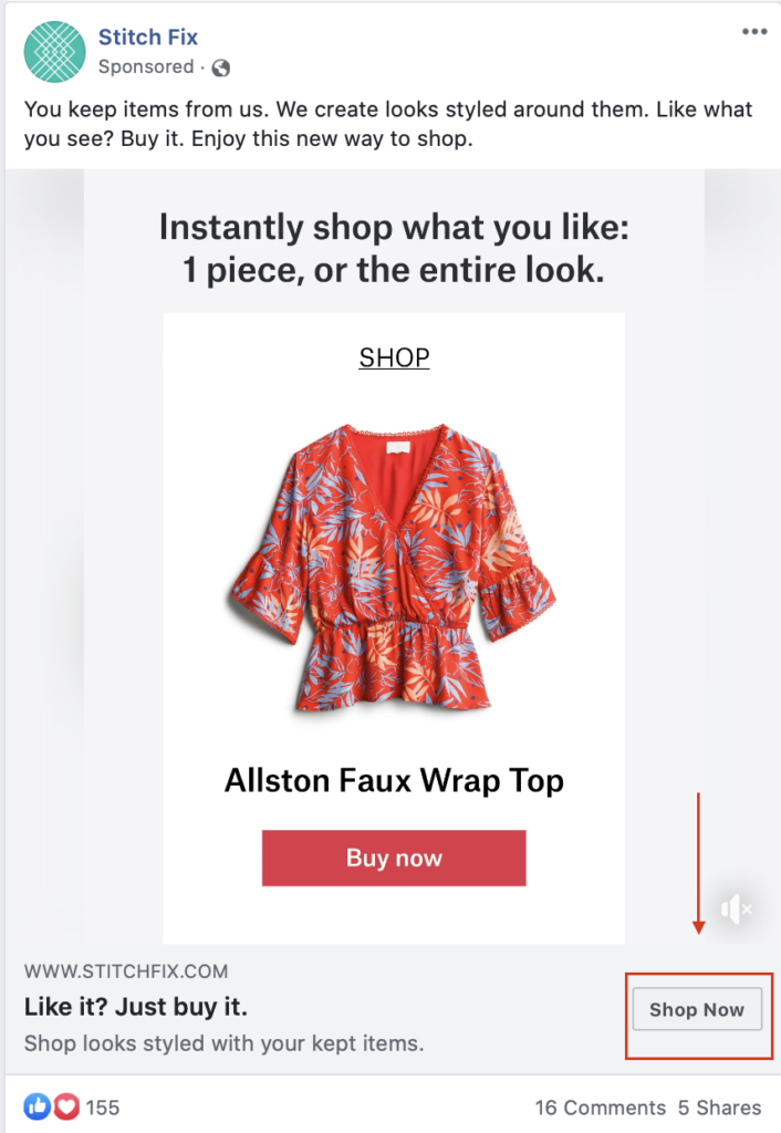
You should absolutely always include a CTA button on your ad campaigns in addition to using a CTA in the headline and/or description copy, too. Users intuitively are more likely to click when they see that button prompting them to take action without even realizing it.
Remember to tailor your CTA based on the ad that you’re running and the stage of the funnel that you’re targeting. Opting for “learn more” for users earlier in the funnel can feel lower-risk and less pressure than starting with a “Shop Now,” but this depends on the ad and the audience.
And if you’re wondering if these CTAs matter, know that they most definitely do. AdEspresso recently ran a $1000 experiment testing different types of CTA buttons on Facebook Ads to see what was most successful – and the result was astounding.
Overall, the top performer (Download) gained 49 conversions for $5.10 each, while the worst performing CTA (no button at all) achieved only 20 conversions at $12.50.
This means that you can end up paying more than twice as much for a conversion depending on the CTA you choose – something we would have never figured out without split testing.
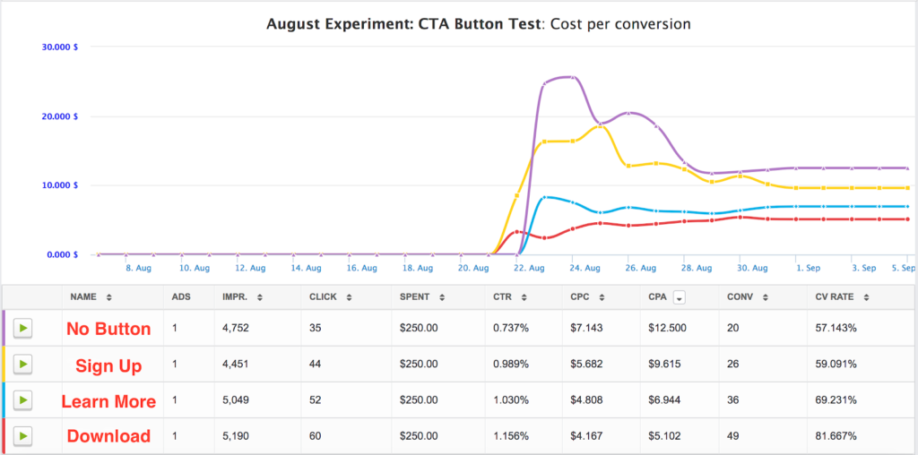
We recommend testing out your CTA buttons using our internal split test engine to see which your audience responds to. This will allow you to test every possible combination of CTAs, and allow you to easily determine which is giving you the most conversions for the cheapest price.
AdEspresso can even automatically pause your underperforming combinations using our Automatic Optimization feature , taking the guesswork out of campaign management altogether.
Your Website & Landing Pages
It’s always a good idea to use clickable CTA buttons to help users navigate through your site and to take certain actions. This is important both for your general website and your landing pages, too.
You can use these buttons to prioritize certain actions or to take users through typical paths that users follow when they’re most likely to convert. (On my site, for example, Google Analytics has shown that people who visit my portfolio page first are 6x more likely to get in touch with me than those who just view my contact page first.)
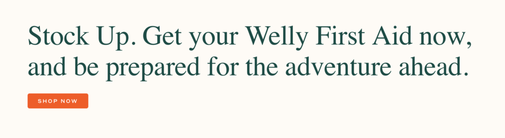
On landing pages and the home page of your website, you’ll want to make sure that the CTA button meets the following criteria:
- It uses contrasting colors to jump out at the user.
- It’s clearly a clickable button designed to improve navigation.
- It utilizes brief copy on the button itself but is often surrounded by copy that adds context and makes it more persuasive (like the example above).
- It should appear above the fold on the page, meaning that users can see at least one CTA button before they’d need to scroll down to see more information on the page. Make sure you take this into account on both desktop and mobile sites.
When you’re creating landing pages and site pages, remember to test them. Most people don’t realize that you can test site pages just like you would PPC campaigns when you’re using tools like Unbounce . Test different types of CTA copy, different placements, or even different colored buttons. Look for what works best, and optimize your pages accordingly. You can learn more about how to do this by checking out our $1000 case study here .
Save Save Save Save
- 1.2K Shares
- Twitter 445
- LinkedIn 600
- Pinterest 0
You may also like reading:
- Social Commerce 101: How to Make Money Selling on Social
- 63 Instagram Caption Examples for 2023 (And How to Write Your Own)
- 15 Fresh Facebook Ad Examples to Inspire Your Next Campaign [2022]
- How to Create a Facebook Business Page (The Easy Way)

February 21, 2018 at 9:03 pm

March 14, 2018 at 1:14 am
What a list! Huge! Thanks for sharing such an incredible list. Either way, keep doing good work!

July 10, 2018 at 2:14 pm
My name is Kevin and I am a Senior Project Manager at IdeaPros, a company that turns ideas into real life businesses – similar to an incubator. Our team consists of experienced professionals, which have the capacity to turn any idea into a successful business. There is one aspect that we are lacking, which is the copywriting and compelling call to actions for landing pages/websites. We need someone that has experience in creating compelling call to actions and copywriting in order to intrigue customers/visitors to purchase a product.
Our company has over 120 clients, which is growing everyday. We are a high-caliber company with constantly growing client list.
We are looking for a marketing professional to refine the copy and call to actions on the websites that we make. From describing the product to creating simple sentences, we need someone to produce this content. There will be numerous projects a week and the work will never end, hence we will negotiate a price that is fair for the long run. Please let me know.
Warm Regards, Kevin Nguyen IdeaPros | Senior Project Manager [email protected]

July 11, 2018 at 11:18 am
Hey Kevin, I think this FREE webinar can be very helpful More Than Words: How To Write the Perfect Facebook Ads Copy It will go live on Tuesday, July 17th, at 10 am (PST). Mark it on your calendar and reserve your spot now by clicking here !

August 9, 2018 at 9:38 pm
Great!! nice to read!! thanks for sharing it Dth Button Bits Exporters

September 15, 2018 at 4:01 am
The information you’ve got shared is extremely attention-grabbing. this may extremely useful for users. Thanks for sharing such a meaty weblog

November 15, 2018 at 9:33 am
Very informative article with good reference. Very useful and informative for front end designers. Keep up the good work.
October 10, 2021 at 2:53 am
Can we have updated version of this article. Web has changed a lot since this was published first. Thanks

November 29, 2018 at 10:44 am
Thanks much, practical suggestions.

December 15, 2018 at 10:28 am
Thanks for the nice article, Ana. Just wondering whether the rules are sort of persisting or a fashion thing. If everyone is doing it the same way, won’t readers get fed up with it and resist the CTA? By the way, Happy New Year!

December 29, 2018 at 3:42 pm
Excellent article! Thanks for sharing exceptional value-added content.

January 8, 2019 at 1:33 am
thanks to sharing this very good article about call to action good examples ..good job

January 8, 2019 at 1:35 am
the wonderful information call to action thank you so much great job thank you

January 16, 2019 at 8:01 am
Thanks for sharing!

January 17, 2019 at 7:29 am
Hi Buddy, thanks for the nice and informational post… Loved it!

February 3, 2019 at 7:29 am
Thank you for sharing this valuable information which is easy to implement.

March 2, 2019 at 4:17 am
Excellent information

April 9, 2019 at 11:45 pm
great post on CTA

April 11, 2019 at 11:53 pm
These CTA examples are very useful.

April 15, 2019 at 10:45 am
Very informative & keep sharing, You are a student and don’t know how to earn? So don’t worry Now, you can Make Money As A Student easily.

April 17, 2019 at 10:09 am
Loved your article!!! Very detail explanation, thanks for sharing the information! I need to try it now 🙂

April 20, 2019 at 4:31 am
I am continually browsing online for ideas that can help me. Thank you! http://rahuldigital.org

April 21, 2019 at 10:48 pm
Nice information. Thanks

April 30, 2019 at 4:41 am
Amazing article – it is good to know, that other websites also name small details as the most crucial ones. We can see, that every step requires personalization, that is the reason why we created unique CTA phrases generator – http://www.ctagenerator.com

July 4, 2019 at 1:36 am
Hey Ana, I want to thank you for shariing your knowledge with us. I really appreciate you for such a great post. You have provided lots of information in an easy and understandable way.

September 20, 2019 at 10:33 am
Thanks for sharing such awesome call to action examples just loved it. definitely going to try these example in our next campagin.

November 9, 2019 at 4:10 am
A call to action is an invitation for a user to take some desired action. You often see call to action examples in persuasive writing. Once a brand has made its case in a blog post or video, for instance, they’ll often include a call to action at the end.
November 30, 2019 at 6:53 am
One of the best uses of FOMO in your CTA is to mention a sale or promotion that your company is holding, and which won’t last forever. You probably get emails with this sort of messaging all the time, I know I sure do. I’m talking about messaging like “Shop today! Sale ends on Monday,” perhaps during a three-day weekend. Or even “buy now while supplies last!” during the holiday season. It’s tough to ignore a prompt like that, especially during a time-sensitive, under-the-gun type of situation (e.g. the Christmas season). Similar to provoking enthusiasm as we discussed earlier, provoking fear of missing out in your CTA is sure to get you some additional clicks.

December 21, 2019 at 2:00 am
Getting the balance of ‘you’ and ‘us’ is important everywhere else in your website (and emails!). (Re #37 above)

January 24, 2020 at 3:14 am
Great post always testing different CTA on both Facebook and Adwords to see what can improve CTR and Conversions. The examples above are highly useful to get me thinking more creatively.

March 7, 2020 at 12:53 pm
Do you have a preferred call-to-action, or perhaps one that surprised you with how well it did? What about one that you were hoping would perform well but ended up bombing? I’d love to hear about it, so feel free to sound off below!

May 20, 2020 at 6:02 pm
I used CRO based CTR label variations with button colors and it helped me to improve leads.

June 7, 2020 at 11:31 am
informative article, thanks for sharing this article.

June 11, 2020 at 10:02 pm
Nice post I learned a lot here thanks.

June 19, 2020 at 2:20 am
Thanks for sharing such awesome call to action examples. you have explained it very will. i have also written on same you can visit my website: Hestabit

July 24, 2020 at 9:01 pm
This list is just what I was looking for. I was in need of a CTA for my ad I was doing so this was timely. Thanks!

January 26, 2021 at 10:38 pm
Absolutely useful article, I’m crafting my first landing page and I so need it.

February 13, 2021 at 2:42 am
You have a very good list of CTA examples here. Thank for working hard to provide these example with great explanations.

May 16, 2021 at 12:51 am
Very much useful article, I have been using this, But in different industries it’s very much useful.
Thanks again.

May 18, 2021 at 6:36 am
Having the right CTA can make all the difference to your business’s bottom line.

May 18, 2021 at 8:23 am
CTAs have always been a weak spot, but this is super helpful. Thanks!
[…] Almost all of your marketing content should have a well-crafted call to actions meant to encourage action. https://adespresso.com/blog/call-to-action-examples/ […]
[…] Call to Action […]
[…] to https://adespresso.com/blog/call-to-action-examples/ you cant just have any call to action, it must be strong enough so people will be convinced enough […]
[…] put a cap on this, without a call to action on your visual content, you risk drawing zero leads to your brand. Your CTA must not be less than three words. Even more […]
[…] 31 Call To Action Examples (And How to Write the Perfect One) https://adespresso.com/blog/call-to-action-examples/ […]
Leave a Reply Cancel reply
Your email address will not be published. Required fields are marked *
Save my name, email, and website in this browser for the next time I comment.
- Work with Us
- Marketing Services
- What’s new
- Facebook Ads Beginners Guide
- Google Ads Beginners guide
From the Blog
- Top Facebook Updates You Can’t Miss (December 2022 Edition)
Business growth
Marketing tips
16 call to action examples (and how to write a CTA)

What comes to mind when I try to think of a powerful CTA (call to action) is the one my dad expertly executed daily by bellowing at me to get a job . Fresh from a college experience that promised the world but mainly delivered a mountain of student debt, I was under the assumption that adulthood was supposed to be full of quirky adventures and unexpected meet-cutes, not unsolicited career advice from a man who still struggles to connect to Bluetooth.
Eventually, his CTA successfully motivated me to become a productive member of society. And that's the magic of a compelling CTA—it jolts you out of your passiveness and into action. In my case, I got a job despite a lifelong belief that work is something to avoid unless absolutely necessary. (Look at me now, Dad!)
Just as personal CTAs can lead to transformative life decisions, marketing CTAs have the potential to significantly impact user engagement and conversion. Want to craft your own magnetic calls to action? Keep reading for tips and examples of what makes great CTAs, well, great.
Table of contents:
Why calls to action work
How to write a call to action, how to design a call to action, call to action testing and iteration, 16 call to action examples (and why they work), what is a call to action.
A call to action is a prompt or message, usually formatted as a button or link, that encourages the audience to take a specific action.
CTAs are commonly used in marketing and sales contexts to guide users toward the next step in their journey, whether that's purchasing a product, signing up for a newsletter, or forwarding that chain email to all of their friends to avoid eight years of bad luck.
I know what you're thinking: "I'm a human adult with a brain. I'm not going to let a shiny button on the internet tell me what to do." But the reality is that the psychology behind CTAs taps into our innate desires and instincts, making us more inclined to follow through. Remember that one time you got lost down a YouTube rabbit hole, and six hours later, you're watching a documentary on bioluminescence in deep sea creatures? You have a few "Watch next" or "Smash that like button!" CTAs to thank.
Types of CTAs
You should calibrate your call to action with the relevant stage of a customer's journey. From the curious browser lured in by a "Learn more" button, to the nearly convinced shopper beckoned with a "Why choose us?" link, and finally to the ready-to-purchase consumer presented with a decisive "Buy now" directive—you want to ensure the user is always met with a suitable and enticing invitation, guiding them seamlessly down the funnel. Here's a primer on some of the most common types of CTAs.
The effectiveness of a CTA depends on its copy, design, placement, and relevance to the user. The choice of words can significantly impact user engagement, as phrases like "Snag your copy" might resonate more than a generic "Download now," depending on your audience. Identify which action(s) will bring the most value to your business, then use your CTA to steer users in the right direction.

As a user of the beloved internet, you've absolutely seen calls to action that were pushy or patronizing, begging the question: "do I really need someone to tell me where to click?" But just like the difference between an aggressive sales rep and a sales rep that actually listens, a CTA that's written with care can get you a conversion without the negative connotations.
Why? Because having a strong CTA in your online sales pitch fits the psychology of your visitors.
For starters, having a clickable link or button coincides with the Action > Reward system our brains love so much. It's the extension of the childlike joy in pressing an elevator button: humans crave interaction, and our curiosity alone is often enough for us to push and click things.
But more than that, a call to action—like any good sales closer—acts as a climax to the pitch. It serves the same function as a joke's punchline, and without a CTA, the visitor is left in a sort of directionless limbo.

A good CTA not only signals that the pitch is over; it also recommends the next course of action. One core tenet of digital design is Steve Krug's rule : don't make the user think. By providing a suggestive call to action, the user doesn't have to wonder what to do next. They see the next step in front of them, and all they have to do is take it.
All in all, the call to action is the best online equivalent we can get to a personalized, face-to-face sales closer. We may not be able to tailor our final pitch to a particular customer, but we can use the same techniques and strategies on a broader, more inclusive scale. And therein lies the art of writing a CTA.

Your calls to action should be unique, specific to where it's featured as well as your particular audience and targets. That said, the best CTAs do share some characteristics that you can apply wherever they may be.
If you're looking for one secret to effective CTAs, here it is: give them a reason to click, share, or hand over their email address . More important than the wording, placement, or color of your CTA is the underlying incentive a person has to follow it. How will answering your call to action help them?
A good call to action restates its benefit bluntly and succinctly.
If you're offering a discount, remind them what percentage.
If they're getting a free PDF, mention the words "free" and "PDF."
Here's where you can borrow from traditional sales techniques, such as adding urgency with a time limit or bringing up the pain point they're trying to avoid. Just remember the CTA shouldn't be too wordy, so stick to the highlights and keep it brief.
If you're using a standard link, typically you write the incentive in your CTA's anchor text (the clickable text). In the case of social media posts and ads, you should reserve the last line in your message for your call to action, so mention any benefits there.

If you're using a button CTA, you have to limit the number of characters you use, so it's better to add secondary text. While the button can say something basic like "buy now," nearby you should include a line or two to remind visitors about the advantages to clicking.
Transparency
One of the biggest reasons CTAs fail is because people don't trust them. Most web users have a healthy suspicion when clicking links online, especially on new or unfamiliar sites. You can mitigate this fear, and increase conversions, by being open and honest.
For starters, say exactly what will happen when you click. Remove all mystery with specifics. For example, saying "start your download automatically" is more descriptive than "click here to download." (For button CTAs, with limited space, you can include secondary text nearby.)
You want to acknowledge any user doubts and assuage their fears. If visitors are worried about security, they're not going to click, so reassure them that you understand their concerns. One of the big fears, in the case of email signups, is spam. You might want to gently remind visitors that you won't share their information and that you'll only email them once a week, twice a month, or whatever the case is, to keep their imagination in check.

You can build trust just by being upfront about everything from the beginning. You'll find people are more receptive to your CTA pitches when they know precisely what to expect.
Command and wording
Don't be shy about calls to action! Some people soften their language to avoid being pushy, but CTAs should be strong and unapologetic. After all, if you followed rule #1 (incentive), then what you're offering is beneficial to the visitor.
That's not to say you should be rude or demanding (please don't); there's a perfect balance somewhere in there between a strong suggestion and a forceful command. Above all, the reader must always feel they have a choice; your call to action is there to convince them of the choice you think they should make.
In practical terms, calls to action should be imperative sentences , which is the grammatical term for commands. A best practice is to start CTAs with an actionable verb :
Share this post
Join our newsletter
Subscribe for more deals
This makes the statement sound stronger, and at the same time, clearly communicates what the user should do.
Likewise, avoid wording that weakens your call to action, including "please" (no matter what Grammarly tells you) and modifiers like "could" and "would." There's a time and place for gentle language, but calls to action are not one of them.

Word choice is important to CTAs, not only for making a persuasive argument, but also for fitting the space allotted.
So which words should you choose? The consensus among professional copywriters is that certain words work better than others for sales and persuasive writing. And while there's no official collection, the words below generally end up on most copywriters' lists:

They're not foolproof, but in my experience, these words tend to improve CTA performance and the effectiveness of most sales copy. And because most of them are short, you should have no problem fitting them into your CTA space.

Now that we've covered the writing, let's talk about how your CTA should look. The design, layout, and typography of your call to action all play major roles in its success.
CTA design best practices
If you're placing your call to action on a web page or other content you design yourself, you want to place it at the top of your visual hierarchy. Your CTA should be the most noticeable element on the page. To achieve this, you want to pull out all your design tricks:
Contrasting colors: CTAs should generally contrast with the rest of the page's design. Visitors shouldn't have to work to find what to do next. Use a vibrant color for your CTA, especially against a dull background. Can you spot it from six feet away? Good.
Optimal size: Make the button and text larger than the surrounding elements but not so large that it overwhelms other content. It should also be easily clickable, especially on mobile devices.
Clear typography: Use a legible font that complements your brand. Ensure the text is large enough to read but doesn't crowd the button. You can play with typography to emphasize key words. Commonly, operative words like "free" are set in a different color or sometimes even a different font to attract more attention.
Negative space: Surround your call to action with plenty of negative, or empty, space. Setting your CTA apart from the other elements makes it more noticeable and gives it more importance in the eyes of your visitors.
Emoji use: Some brands find success with emojis, but if you choose that approach, remember that a little goes a long way.
Consistent styling: While CTAs should stand out, they should still align with your brand's overall design aesthetic. Consistency in design builds trust.
Last but not least, you should evaluate how successful your final call to action is and identify room for improvement. Creating your CTA may feel like a lot of guesswork and shooting in the dark—because it is. Testing it is much more clear cut.
To get a basic idea of your CTA's performance, take a look at your analytics. Compare the page traffic to the number of conversions, and see what percentage of your total visitors clicked.
Don't be alarmed if your conversion rate percentage feels low. Although there's no universal figure that applies to everyone in every industry, a reliable general metric is around 4% . If your conversion rate is higher than 4% but you're still not hitting your goals, try focusing on improving traffic to the site or page rather than tweaking the call to action.
If your conversion rate is significantly lower, it's worth doing an A/B test on your design and copy. Try two different versions of your call to action, experimenting with different phrasing, colors, or fonts, and see which one performs better with your target audience. It's the most efficient way to reveal what works and what doesn't with concrete, empirical data, ensuring your CTA resonates with the target audience and drives the desired action.
Let's dissect some real-life CTA examples to learn how to use strategic copy, design, and placement to transform an ordinary CTA into a magnetic, can't-resist-clicking force.
1. JD + Kate Industries

CTA placement: Exit intent popup
CTA type: Lead to purchase
What it does right: Attention-grabbing, offers a valuable incentive, humorous and lighthearted
The brazen use of "WAIT" isn't a gentle suggestion; it's a command. Like someone grabbing your elbow just as you're about to duck out without a goodbye. It's intrusive, but in a way that makes you think, "Alright, what did I miss?"
Combine that with the sheer audacity of telling someone they've forgotten to buy not just one candle but HUNDREDS of candles. It's dramatic, it's over-the-top, and frankly, it's memorable. With copy like that, it's hard to resist giving away your email address because one can only wonder what their emails would be like.
2. Giftwrap.ai

CTA placement: Display ad
CTA type: Lead generation
What it does right: Engaging, personalized, visually appealing
It's refreshing to see something that doesn't pretend to know you better than you know yourself. Instead of telling you what your significant other might want, it's asking you to fill in the blanks. A little bit of personalization without the personal touch. Clever, really.
As for the CTA button, the emoji is a nice touch. Plus, the use of "show" rather than "buy" or "see" is like a little magic trick. "Voila! Here are your gift options."
3. Who Gives A Crap

CTA placement: Facebook ad
What it does right: Benefit-oriented language makes the CTA more appealing to users and encourages them to take action
By comparing "Us" and "Them," they're not only offering a quantitative argument (385 sheets versus a paltry 299), but they're also injecting a bit of humor. And while I've never been one to count sheets, if you're telling me I get more for my money and it'll look cute next to my collection of HUNDREDS of candles, I'm sold. Also, describing the competitor as "objectively very boring" is a sentiment I've often used to describe my social life, but to see it on toilet paper? Well, that's something.
"28% cheaper than Charmin," followed by a "Shop Now" button isn't just a call to action; it's a call to revolution! A revolution of, well, saving on toilet paper and perhaps bringing a touch of flair to a decidedly unglamorous aspect of life.

CTA placement: Homepage header
What it does right: Creates curiosity, addresses pain points, social proof
There's something oddly reassuring about a direct, no-nonsense headline promising exactly what every website on this overcrowded internet wants: visibility.
The name-dropping of heavy-hitter customers serves as a strong endorsement. It's not saying, "Look who trusts us," but rather, "Look who you'd be in company with." And that "17,961 users joined Ahrefs in the last 7 days" is a nice touch. It's not boastful, but it's certainly not modest. It's a subtle prod to the undecided that says, "While you're contemplating, thousands have already decided."
This CTA is a perfect blend of self-assuredness, social proof, and just the right amount of peer pressure.
5. Ruggable

CTA placement: eCommerce email
CTA type: Limited-time offer
What it does right: Straightforward, creates a sense of urgency, sparks curiosity
There's something unapologetically direct about this ad. "Final hours to save until next week Black Friday"—it's not asking you, it's telling you. Time's running out, and if you're the type who thrives on the thrill of a last-minute decision, this is your moment.
The CTA is a master class in suspense. That "% OFF" lurking behind the button is like when someone says they've got news, but they'll tell you later—except instead of being left alone with your intrusive thoughts, conjuring up worst-case scenarios, you get a sweet discount on a cute, machine-washable rug.

CTA type: Product demo
What it does right: Solution-oriented, benefit-driven, relatable
"Email sucked for years. Not anymore—we fixed it." You mean that thing everyone's been complaining about since the dawn of the internet? It's about time, and I'm all ears.
The rest of the copy succinctly addresses customer pain points and aspirational desires. It paints a picture of a world where checking your email might feel more like reading a postcard from a friend rather than sifting through a pile of bills.
The CTA button, "See how HEY works," is straightforward. No flowery language, no over-the-top promises. Just a simple invitation.
7. Big Blanket Co

What it does right: Creates a sense of urgency, visually appealing, reassuring
The urgency of "limited quantities available...Reserve yours now before it's too late" is classic retail psychology. It's both an announcement and a challenge, like when a kid hears the whistle signaling the end of adult swim and races to be the first one to cannonball into the pool.
The "Limited Restock [Massive 10'x10' Blankets] 100 Night Guarantee + Free Shipping" is the clincher. It promises a combination of rarity, quality, reliability, and convenience, like a call to action Megazord.

What it does right: Addresses pain points, benefit-oriented, actionable
The genius of this homepage lies not just in its promises but in its initial question—a direct prod at the pain point of its target audience that immediately evokes a visceral response. Most, if not all, travelers will mentally answer "yes" to this, recalling their own airport nightmares. It's a calculated reminder of a situation everyone wants to avoid, making the solution they offer even more enticing.
"Get up to $700 compensation per passenger, no matter the ticket price." The clarity here is commendable. They're not promising the world, but a very tangible, specific amount. And the Trustpilot rating is a nod to credibility. It's like a friend vouching for a restaurant they swear by, but in this case, it's 157,892 friends.
The two fields for the departure and destination airports are a clever touch. It's interactive, pulling me in, like when a quiz promises to tell me which '90s sitcom character I am based on my questionable life choices. (I'm George Costanza.) The button, with its sharp contrast to the rest of the page, effectively captures attention while still aligning with the brand's colors and aesthetic. "Check compensation" offers an inviting, low-effort action, subtly guiding users toward their potential relief without overwhelming them.
In a world where we're constantly sold solutions to problems we didn't know we had, this CTA addresses a very real grievance with a straightforward promise. And in the often convoluted world of travel woes, that's a breath of fresh, cabin-pressurized air.
9. Crazy Egg

What it does right: Actionable, benefit-oriented, simple
Crazy Egg's CTA isn't trying too hard to impress. It's just good—well thought out, concise, and to the point.
First, the headline: "Make your website better. Instantly." A rather bold proclamation but commendably straightforward. Its use of the word "instantly" suggests that Crazy Egg has the answers, and they're not going to waste your time.
The "Show me my Heatmap" CTA button is, once again, admirably direct. It's not pleading for a click or asking for a moment of your time. It's telling you, in no uncertain terms, what's on the other side of that click.

What it does right: Clear and concise, visually appealing, strong call to action verb
First off, big ups to Zappos for not making me do math. Half off? I'm already intrigued and haven't even seen the shoes yet.
"Reveal today's deals" feels like a game show moment. What's behind door number one? A pair of boots? New house slippers? It's that momentary thrill, like unwrapping a gift—even if you end up paying for it yourself.
In an endless sea of emails screaming for attention, this one from Zappos does what it needs to do: it grabs you, shakes you gently by the shoulders, and says, "Hey, want something good for half off?" And in this economy, who can say no?

CTA placement: Landing page header
What it does right: Interactive and dynamic, personalized, sparks curiosity
By providing three clear choices (drive or deliver, eat, and ride), Uber shows that they understand and cater to the diverse needs of their users. This personalized approach instantly makes the user feel valued and attended to, whether they need a ride to the airport or just want to stuff their face.
The interactive nature of this dynamic content creates a sense of empowerment and involvement for the user. Even the tens of people unfamiliar with all of Uber's offerings will be intrigued by the distinct options, sparking curiosity and potentially leading them to explore other services beyond their original intention.
12. CareerBuilder

What it does right: Clear and concise, click-worthy secondary CTA
"Find your next job…fast!" Who are you, my dad? Although I suppose if someone's clicking their way onto a job-finding website, they're there for one reason: to snag a job, and preferably one that doesn't make them want to put a campfire out with their face.
CareerBuilder doesn't dilly-dally—they allow you to type in your wildly specific and/or desperate job requirements. And who's going to turn down the resume help offered in the secondary CTA? Talk about a lead magnet.
13. Airtable

CTA type: Gated content
What it does right: Social proof, sneak preview, clear and concise
You may be wondering why I included a very basic "submit" button in a CTA showcase, but pairing a straightforward button with great supporting elements like the headline, social proof, and sneak preview, is like sipping top-shelf wine from an old jelly jar. Sometimes, the simple stuff just ties everything together.
The large headline is as direct as my comments on whether a hotdog is a sandwich. (It's not.) Aimed at the so-called professionals in campaign planning, it speaks to a certain crowd, much like literally anything speaks to Swifties looking for Taylor's latest Easter egg.
The mention of leading companies like Shopify, Time magazine, Spotify, and Hearst adds credibility and trustworthiness. It's basically saying, "If these giants trust us, maybe you, in your comparatively minuscule existence, should, too."
The bullet list detailing what's inside the eBook provides clarity on the content, letting users know exactly what to expect, including insider tidbits from recognized brands. So, not only do you get smarter, but you also get to casually name-drop at the next girls' night. "I've been implementing campaign planning strategies inspired by Equinox and Taylor Guitars. NBD."

CTA type: Closing the sale
What it does right: Showcases diverse selection, clear and concise, highlights affordability
Max presents an impactful CTA through the Neapolitan ice cream of hero images, featuring Anderson Cooper, Ketel Marte, and Margot Robbie with Ryan Gosling. Collectively, these three flavors depict a panoramic view of Max's offerings, emphasizing a wide variety of choices only rivaled by the Cheesecake Factory menu.
In a world drowning in content, they've managed, quite succinctly, to sum it all up with "It's all here. Plans start at $9.99/month." The ensuing "Sign up now" button invites visitors to subscribe, anchoring the CTA by providing a straightforward pathway to accessing all the consumable content your heart desires.
15. Adobe Stock

CTA placement: Google Search ad
CTA type: Free trial
What it does right: Benefit-oriented, actionable, relevant to the target audience
This paid search ad nails the CTA with a clear and easy-to-understand message. The headline "Free trial - Find the right image faster" immediately grabs attention by offering a low-risk way to experience the service. It also addresses a common pain point for users, highlighting the platform's efficiency.
In very few words, Adobe found a way to combine attention-grabbing language, address user concerns, highlight the platform's strengths, and offer a valuable deal, making for a cleverly crafted CTA. If I were into such things, I might even click on it. But I have people for that.

CTA placement: Email
CTA type: Event promotion
What it does right: Multiple engagement opportunities, attention-grabbing, personalized
Much like the free sample stations at Costco, the strategic placement of three CTA buttons ensures the reader has multiple opportunities to engage, regardless of how far they wander (or scroll).
The header image immediately grabs attention with its vibrant graphic detailing key event highlights. This provides a quick snapshot of what to expect and builds anticipation.
Personalizing the body of the email to address readers by name creates a sense of intimacy. Instantly, they're all ears and feeling special.
Improve your CTAs now, free!
While my dad's approach might have lacked the finesse of a well-designed button or the allure of clever copy, the sentiment was clear. And that's the heart of every good CTA. Whether you're nudging a visitor to make a purchase or nudging your offspring out of the nest, the principle remains the same. CTAs are about engaging your audience, prompting action, and, occasionally, a very pointed reminder to update your LinkedIn profile.
Now it's our turn to practice what we preach— try Zapier for free !
Related reading:
How to write great copy
eCommerce email marketing: A beginner's guide
How to write better
How to treat and prevent common marketing copy maladies
Get productivity tips delivered straight to your inbox
We’ll email you 1-3 times per week—and never share your information.

Allisa Boulette
Based in New England, Allisa is a content marketer and small business owner who hopes to make the internet a more interesting place than she found it. When she’s not working, you can find her lying very still not doing anything.
Related articles

The best marketing newsletters in 2024

How will AI change SEO content production?

12 stunning and time-saving newsletter templates for Word
12 stunning and time-saving newsletter...

How Hunter built 174 backlinks from DR70+ domains through guest blogging
How Hunter built 174 backlinks from DR70+...
Improve your productivity automatically. Use Zapier to get your apps working together.

Master Call-to-Action Writing: Boost Your Essays Now!
Unlock the power of persuasive writing: what is a call to action.
If you’ve ever wondered “what is a call to action in writing?”, you’re not alone. In writing, especially in an essay, a call to action (CTA) is essentially a sentence or a phrase that encourages readers to take a specific action. This is a compelling message that requests the reader to respond in some way, helping to boost engagement and response rates.
Examples of a Call To Action in an Essay
To illustrate, let’s go through some clear examples of the call to action:
- “Buckle your seat belts, it’s about to get intense! Continue reading below!”
- “Convinced about the urgent need for climate action? Join the movement today!”
- “Intrigued by our discussion so far? Click here to find out more!”
Each of these examples serves to invite the reader to engage further, whether it be reading further, joining a movement or clicking a link.
How To Use A Call To Action In Your Essays
To effectively use a call to action in your essays, it’s important to identify your essay’s intent. Are you trying to persuade your audience to believe in a certain perspective? Or perhaps you’re informing them about a particular topic and would like them to delve deeper?
Once you have identified the purpose of the essay, use your CTA to draw your readers towards that purpose. Be clear and specific about the action they should take. And remember equation – compelling reasons plus a splash of personal touch equals a highly effective CTA. Like, intrigued by the vastness of the universe? Subscribe to our astronomy newsletter for regular updates!
Boost Your Essays With Strategic Calls To Action
The difference between an ordinary essay and an engaging one often lies in effectively utilising techniques like call to action. By integrating this tool strategically, you won’t just enhance your essay writing but also make your content more interactive and compelling.
Common Questions About Call To Action In Writing
Here are answers to a few common queries about how to use a call to action in your essays:
“Can a call to action be at the beginning of an essay?”
Definitely! An early call to action can create immediate engagement and sets the tone of the essay right from the start. However, make sure that it aligns with your essay’s purpose.
“What is the need for a call to action in an essay?”
Without a clear call to action, your audience may read your essay and feel informed or entertained but not know what to do next. A call to action tells them where to go or what to look for after finishing your read.
Master the Art of Call-to-Action Writing
Knowing the answer to “what is a call to action in writing?” is only the beginning. The real test lies in applying it effectively in your essays. Keep practicing, learn from your successes and setbacks, and you’ll soon master the art of crafting compelling calls to action!
So next time you’re penning down your thoughts, remember, strategic CTAs are not just for marketers but for every writer aiming to make their work interactively compelling. Happy writing!
Download CHATMUNK for free to practice speaking in foreign languages
Leave a Reply Cancel reply
Your email address will not be published. Required fields are marked *
Save my name, email, and website in this browser for the next time I comment.
What Is a Call to Action in Writing?

Written by Rebecca Turley

How do you inspire readers to take action?
A Call to Action (CTA) in writing is your opportunity to motivate readers to take some type of action. Can your writing and accompanying CTA be compelling enough to motivate your readers to take the next step, make the next move?
That’s the million-dollar question.
Call to Action: What It Is, What It Isn’t, and How to Successfully Use It in Your Writing
So, what exactly is a Call to Action and how can you best utilize it as a writer?
A CTA in writing is a clear and direct message that should elicit a strong response from readers to do something . In marketing lingo, this something is called a “conversion” – turning observers into doers.
Think of it as a “hook, line, and sinker” moment – you want to inspire the reader to do what you want them to do. Maybe it’s subscribe to your online newsletter, book a service, or buy a product—a CTA is a one-liner that gets the job done. It can be an outstanding marketing tool that keeps your reader engaged and ready to act.
It may be a small, two-word phrase or as long as a sentence, but its goal remains the same: to provide your reader with direction on what to do next. You provided them with compelling, interesting text; now’s not the time to leave them hanging! Finish it off with a great CTA and you’ve accomplished your goal.
CTAs are most often used to make a sale by providing a direct path to the product or service you want them to buy. But they can also be helpful for building your customer base and generating leads for future sales. Most CTAs are used as hyperlinks that take the reader where you want them to go, but they can also motivate the reader to make a phone call, download a brochure, or complete a similar activity.

Creating an Effective Call to Action
Once you understand the goal of the CTA, it becomes rather easy to write one yourself. But there are some tried-and-true rules to follow to ensure your CTA is everything it can be.
A CTA is NOT:
- Overly wordy
Start your CTA with a strong action verb .
A CTA doesn’t take time to get to the point. It accomplishes its goal by telling the reader exactly what to do.
Think “authoritative” when choosing your words for a CTA. Those action verbs should inspire and convince the reader to do something, so now’s not the time to underwhelm them. When choosing that action verb, think about how best to direct your reader:
Use words that excite and motivate the reader.
Get them motivated and curious to make the move. Think about persuasive language here, about intriguing your reader to want to know more or make a move. Persuasive language speaks to saving them money, saving them time, or improving their lives in some way:
- Sign up to join the millions of others who are taking steps to save the planet!
- Click here to start saving money today!
- Call today to book your dream vacation!
Create a sense of urgency.
You can create a sense of urgency in a number of ways. Add an adjective, make a promise, or elicit FOMO.
- Order yours today, while supplies last!
- Get free shipping for a limited time!
- Lose weight in just 4 weeks!
- Call today and enjoy 50% off your purchase!
Eliminate wordiness.
You have one opportunity to capture their attention and motivate them to click. Don’t waste it by overloading your CTA with unnecessary words or confusing text. Think straightforward, clear, concise, and to the point.
If you aren’t getting the response you hoped for, switch it up.
You never really know if your CTA is going to be effective unless you give it a whirl. If you aren’t getting the response you hoped for, it never hurts to try another tactic. Remember that CTAs are not a one-size-fits-all approach, so you may need to experiment to find one that works best for your audience.

Need a little inspiration to create the perfect CTA? Here are popular CTA phrases designed to boost your conversion efforts.
Do you want customers to sign up or subscribe to something?
- Subscribe now
- Don’t miss out
- Get started now
- Stay up-to-date
- Remain in the know
Do you want customers to keep reading your content?
- Find out more
- Discover more
- Become part of our community
Do you want customers to take advantage of a deal or discount?
- Claim your offer
- Claim your discount
- Redeem your discount
- Start your free trial now
- Start shopping now
- Claim our limited time offer
Adding a Secondary Call to Action: Another Tool in the Writer’s Toolkit

A secondary CTA is not simply reciting the primary CTA twice or rewording the primary CTA. It serves as another option for the reader.
Here’s a good example:
Primary CTA: Donate now to help save endangered white rhinos!
Secondary CTA: Sign up for our weekly e-newsletter to stay up-to-date on conservation efforts for the endangered white rhino.
The primary CTA is a great example of providing the reader with an immediate opportunity to act. But not all readers may be ready to pull out their wallets and make a donation. That’s there the secondary CTA comes in. You’ve captured the interest of the reader enough to inspire them to sign up for your weekly e-newsletter, which could translate into a donation somewhere down the road. Secondary CTAs provide the reader with another opportunity to take action, thereby allowing you to boost your conversion rate.
The secondary CTA should be featured less prominently than the primary CTA because you ultimately want the reader to click on the primary CTA. Remember: The primary CTA should be the most desired action you want your reader to take. A secondary CTA shouldn’t compete with the primary CTA; it should complement it.
But the secondary CTA is certainly an excellent option for those who don’t find the primary CTA appealing. The secondary CTA captures that reader who may have moved on from your website or blog without taking any action at all (i.e., lost conversions). By keeping your reader engaged and returning to your site with the secondary CTA, you’re naturally increasing your chances of enticing the reader to act on the primary CTA in the future.
Secondary CTAs may also be used to simply grow your social reach. A great example of a secondary CTA in this case is to simply encourage the reader to follow you on Twitter, Facebook, or LinkedIn. You can also encourage the reader to share your article or blog on their social media platform of choice. Either way, it’s a great way to boost your social media presence.
COMMENTS
A call to action is an invitation for a user to take some desired action. You often see call to action examples in persuasive writing. Once a brand has made its case in a blog post or video, for instance, they'll often include a call to action at the end. A political action group may write a piece on the importance of voting in the next ...
In marketing, a call to action, or CTA, is a written statement that invites consumers to perform a company's desired action. Calls to action can direct traffic to a business' website, encourage new customers to interact with a company and increase profits for an organization. Writing an effective call to action involves providing a clear ...
Ultimately, A/B testing and experimentationwill help you uncover your purpose's perfect call to action. Use these examples as a jumping-off point, and tweak and test as appropriate. 1. Pipedrive removes barriers to conversion. One of the biggest factors preventing readers from converting is the unknown.
When it comes to incorporating a call to action in your writing, using synonyms or alternate words can add variety and impact to your message. Here are four options to consider: 1. Entreaty. An entreaty is a sincere and earnest request or plea. While similar to a call to action, an entreaty often carries a sense of urgency or desperation.
Surround the call-to-action with a description of how their lives will be improved when they act. Paint a prosperous vision. 5. Customize your call-to-action for each person. Audiences don't act; individuals act. Rather than addressing the group as a whole, focus your call-to-action on each individual in your audience.
Demonstrate exactly what your CTA will deliver and how. . 3. Create a sense of urgency. Include phrases like "limited time offer" and "for today only" to motivate users to act. Pair these with action-oriented words like "subscribe" and "download" to encourage a particular action. . 4. Consider your target audience.
Example 2: Call to action: Use eco-friendly straws Revised call to action: When you drink using plastic straws, you have a higher risk of using materials that pollute ocean life. Use eco-friendly straws to minimize the impact of pollution under the sea and worldwide. Learn how to write a call to action, including using action verbs and a unique ...
The call to action which comes right before the end of a persuasive speech is where you clearly tell the audience a role they can play after they leave your talk. The CTA gives audience members concrete tasks to tackle, and these tasks are ones that must be completed in order to bring your ideas to fruition. And, it's a key part of what makes ...
How to Write a Call to Action. 1. Keep Context in Mind. First and foremost, keep in mind that the length and style of a call to action will depend on its context. A call to action within a blog post, for example, will tend to be a sentence or two that follows naturally from the rest of the piece.
Use Hyperlink Text in a Long Form CTA. A call to action can also effectively be used in anchor text—the blue, underlined clickable text in a sentence containing a hyperlink. You may need to offer more incentives or reasons behind why you want the reader to take action. Offer a little backstory. Present an example.
51 call-to-action examples Here are 51 call-to-action examples: CTA for marketing Marketing campaigns use calls to action for attracting new customers or encouraging people to buy a new product. Here are some examples: Download our app for free: This call to action is succinct because it clearly advertises what people should try, the company's app, and the incentive for doing so, it's free, so ...
A call to action (or CTA) is a text prompt designed to inspire the target audience of a marketing campaign to take a desired action. For example, a call to action can encourage people to click on a link, leave a social media comment, visit an online store, make a purchase, etc. A call to action can take up different forms: Text link; Button
Benchmarks for Call to Action Success. In a study by Leighton Interactive, the firm noted that limited data addresses an average click-through rate for calls-to-action. They studied the performance of calls to action that received at least 100 clicks over the past five months and found an average universal click through rate of 4.23%. Button ...
A call to action is a persuasive statement that encourages the reader to take action. It is the final part of your essay, where you tell the reader what they should do next. This statement should ...
A call to action is a prompt or message, usually formatted as a button or link, that encourages the audience to take a specific action. CTAs are commonly used in marketing and sales contexts to guide users toward the next step in their journey, whether that's purchasing a product, signing up for a newsletter, or forwarding that chain email to ...
A call to action is a word or phrase that prompts action. It is a marketing term to describe urging your audience to act in a certain way. A call to action can appear as a clickable button or simply as a piece of text. Call-to-action buttons and phrases can appear at any place in the user journey that you want to direct your audience.
Or if not, the creativity of the no button at least gives you a memorable impression of that brand. Let's take a look at some examples. 22. No, I don't want to grow my business. This "no" call to action button is pretty standard. "No, I don't want to grow my business" is a good way to imply the value of the offer. 23.
Calls to action convince customers to act. Now that we understand how to write calls to action that'll convince customers to act, let's look at a few examples of companies using these 5 golden principles. 1. Crazy Egg 's Show Me My Heat Map. Crazy Egg sells a risk-free guarantee.
In writing, especially in an essay, a call to action (CTA) is essentially a sentence or a phrase that encourages readers to take a specific action. This is a compelling message that requests the reader to respond in some way, helping to boost engagement and response rates.
Here are six elements to include in your CTA strategy: 1. Start with an imperative. The whole reason behind a call to action is to convince a person to do something. Start strong. Use authoritative language and action verbs that direct people, like "shop," "join," or "click.". 2.
A CTA in writing is a clear and direct message that should elicit a strong response from readers to do something. In marketing lingo, this something is called a "conversion" - turning observers into doers. Think of it as a "hook, line, and sinker" moment - you want to inspire the reader to do what you want them to do.